
REFRESH
A strategic wine label REFRESH to match a premium cellar door experience

CASE STUDY
Client / Category
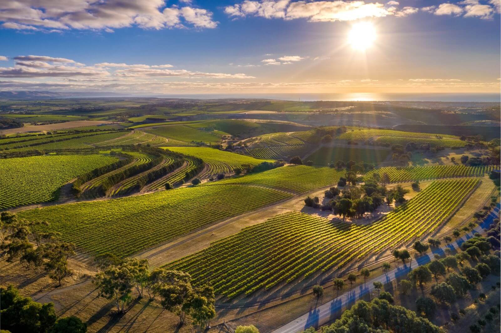
Chalk Hill Wines — Established McLaren Vale Winery
Challenge
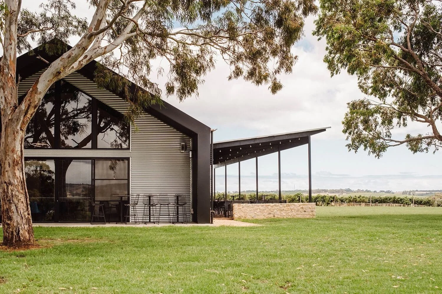
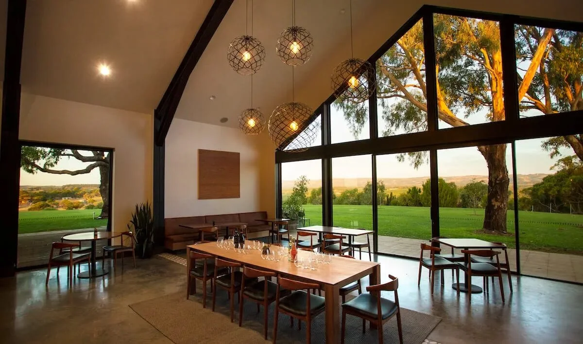
A new cellar door experience intended to attract an image-aware audience, but the existing labels no longer reflected that ambition
Solution
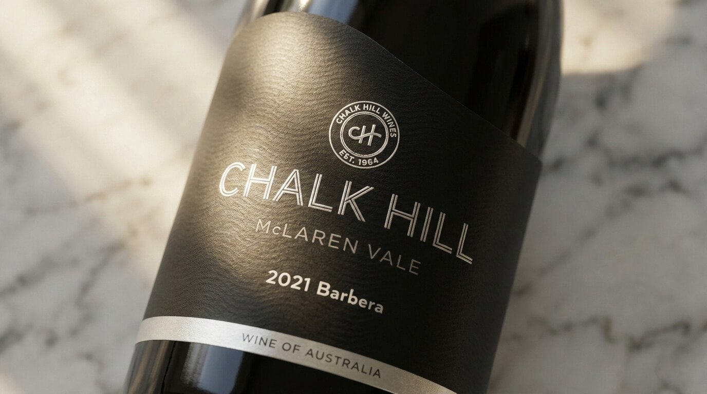
REFRESH — strategic label refinement across the existing range
Outcome
A modern, premium appearance aligned to the cellar door experience, strengthening first impressions and purchase confidence
Built through a clear three-stage approach
Clarity → Visibility → Consistency
THE CHALLENGE
Chalk Hill Wines was already well regarded for quality and regional reputation. The opening of a new destination cellar door marked a significant investment, designed to attract a younger, visually literate audience seeking modern, premium experiences.
However, the existing labels had been created for a different moment in the brand’s evolution. While familiar and recognisable, they no longer reflected the elegance, restraint, and confidence of the new cellar door environment. This mismatch risked undermining the investment by creating a disconnect between the experience visitors encountered on site and the product they took home.
The challenge was to lift perception without losing the equity already earned — protecting recognition while aligning the wines with the ambition of the new cellar door experience.
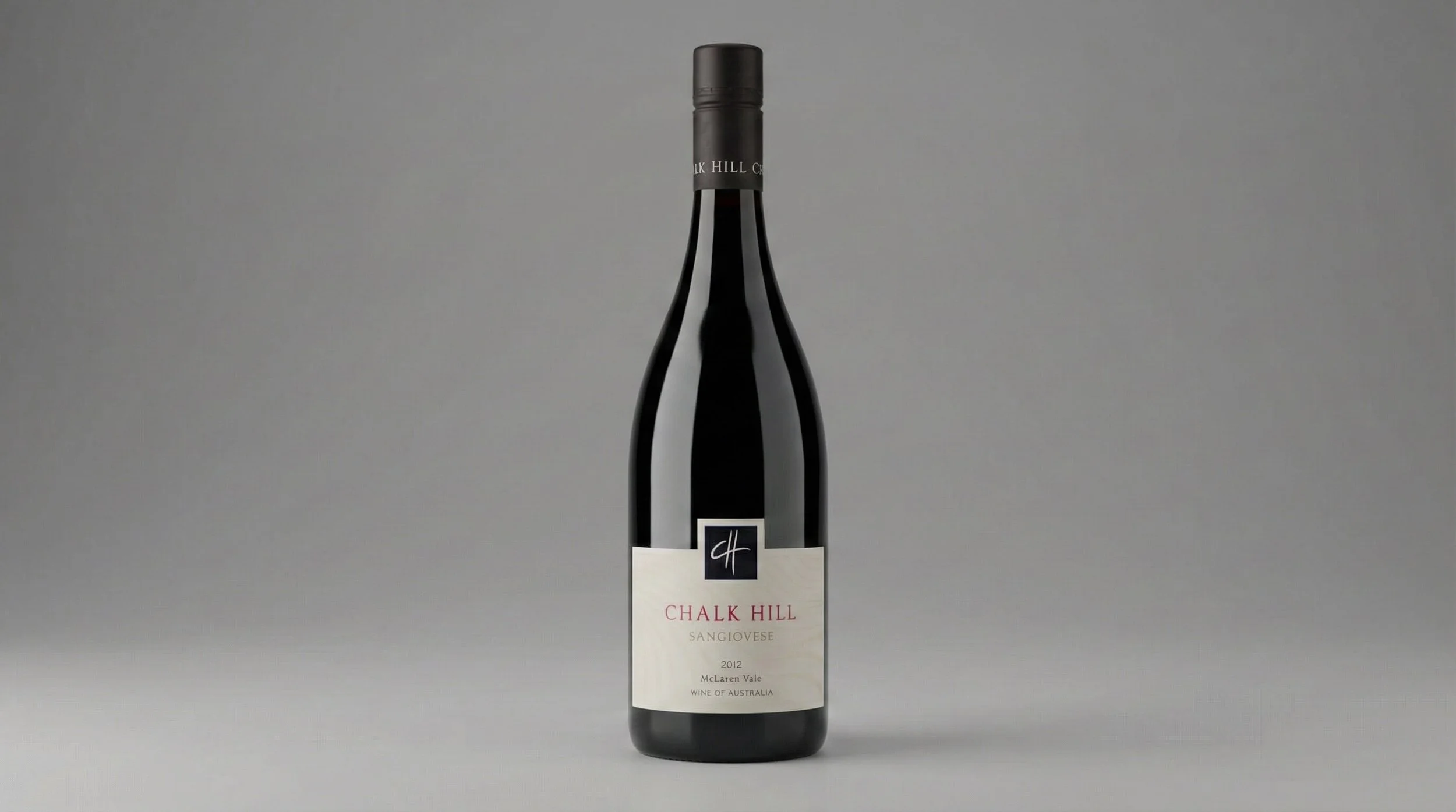
Before
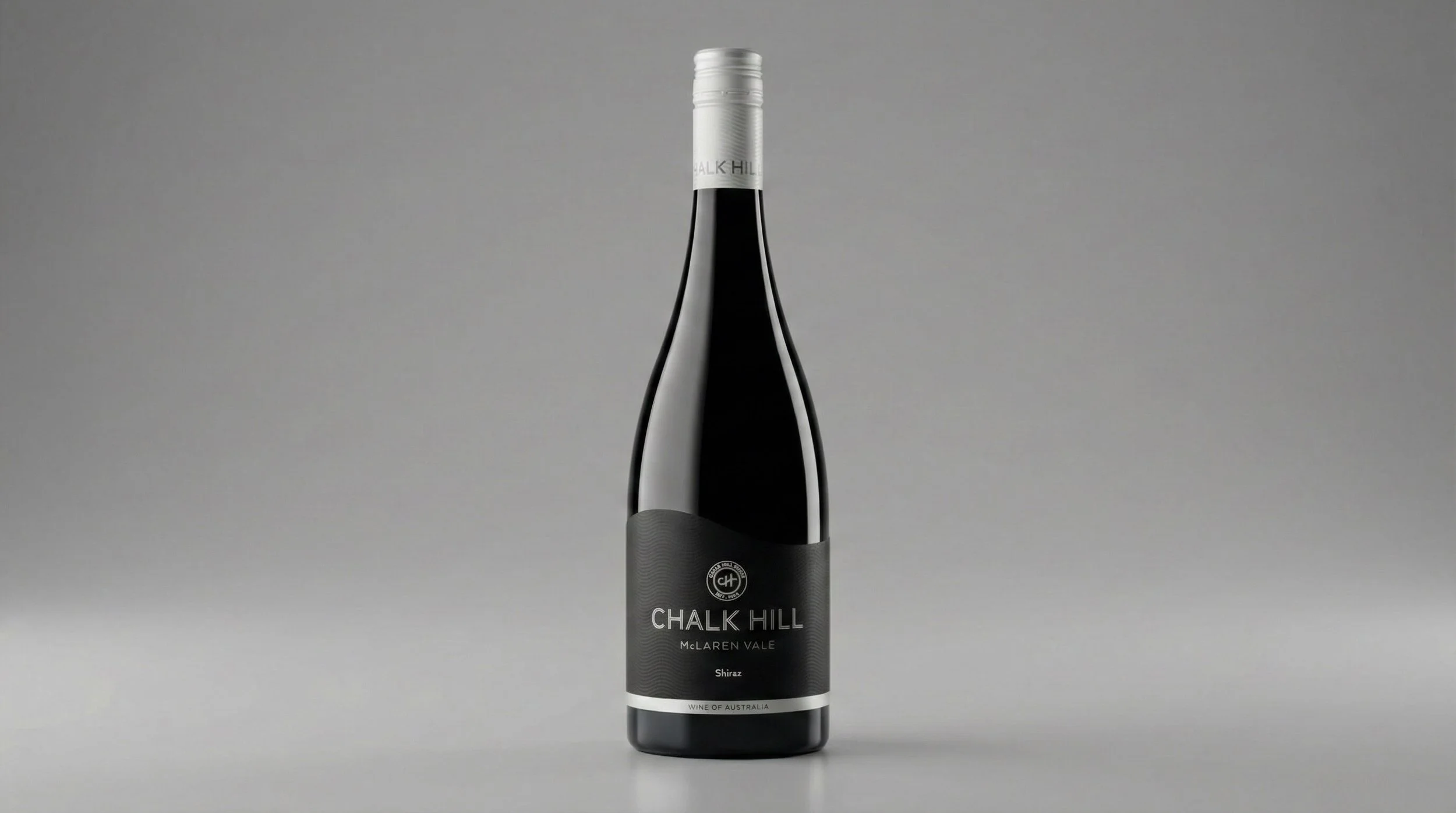
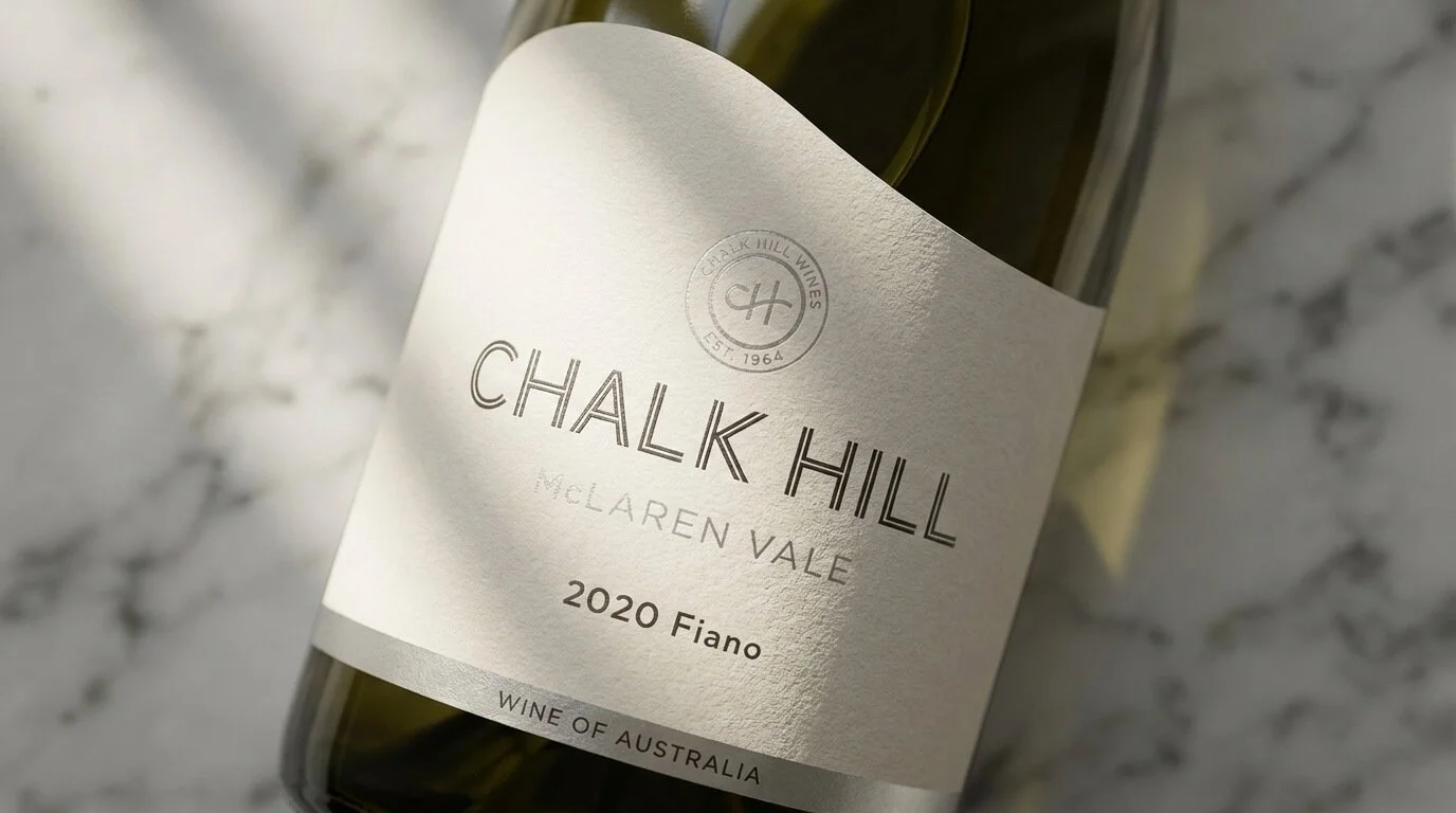
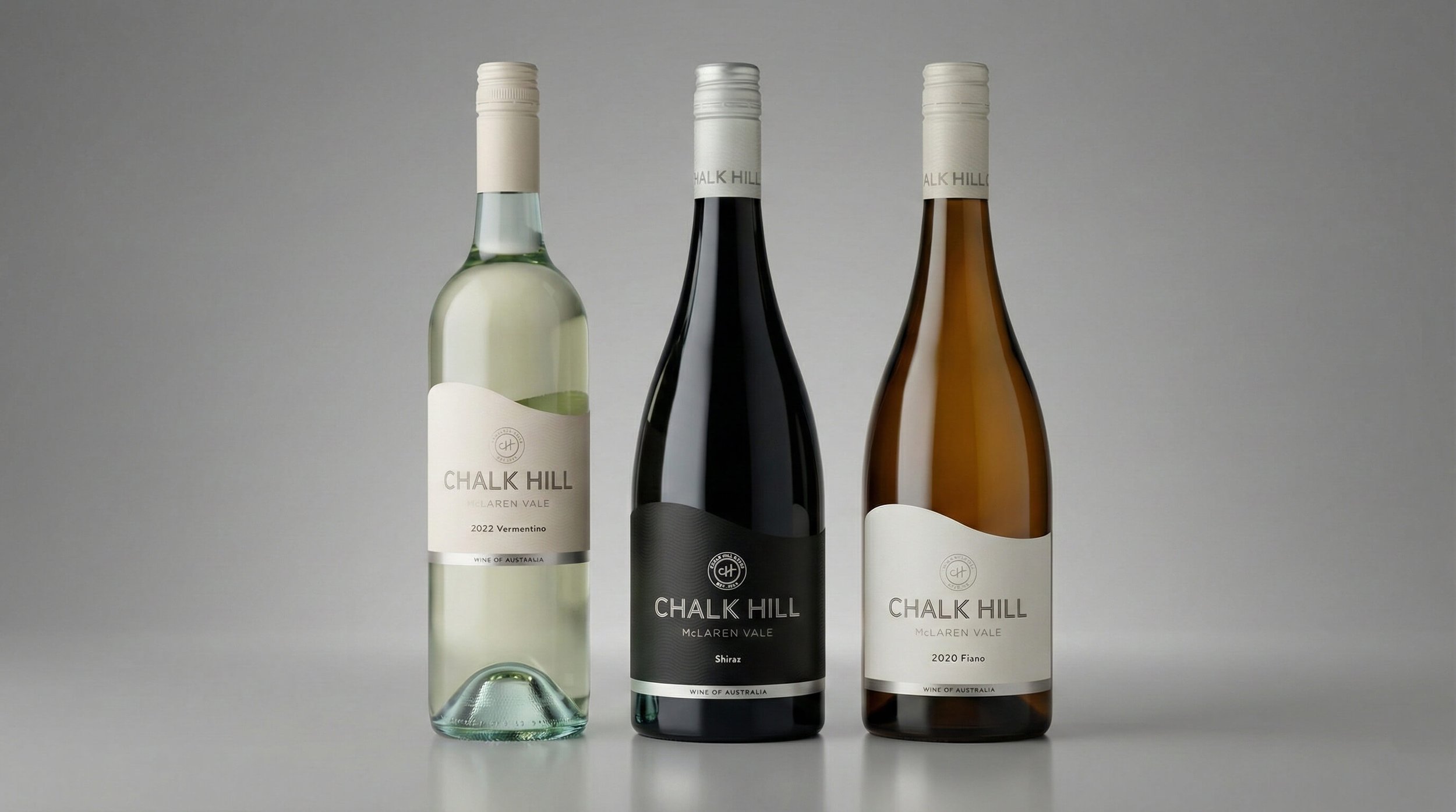
After
THE INSIGHT
A typical response would have been to overhaul the brand to look more modern.
That approach would have introduced unnecessary risk. Chalk Hill already held trust for quality, and changing too much at the moment of increased visibility could have weakened confidence.
The real issue wasn’t the brand itself. It was how clearly the wines signalled quality and restraint to a new audience encountering them at the cellar door.
OUR APPROACH
The work was guided by a simple principle: lift perception through restraint, not reinvention.
Key decisions included:
Clarifying how each wine should be understood at a glance
Strengthening signals of quality without adding excess
Giving the Chalk Hill name more confidence and presence
Ensuring the range felt calm, modern, and aligned with the cellar door experience
Deliberately, No rebrand was undertaken. The name and recognisable elements were retained to protect trust and avoid unnecessary disruption.
THE RESULT
Externally, the refreshed labels aligned far more closely with the cellar door environment, supporting strong first impressions and reinforcing purchase confidence among a younger, premium-oriented audience.
Internally, the business gained confidence that the packaging now reflected both the quality of the wine and the ambition behind the destination cellar door investment.
The result was a clearer, more confident range that supported the new cellar door experience. Strengthening first impressions and reinforcing purchase confidence without risking brand equity.
WHY IT WORKED
The outcome was driven by protecting brand equity while refining how quality and restraint were communicated. Rather than changing what Chalk Hill was, the work clarified how it was seen.
This demonstrates a core Influx belief: clarity and restraint can elevate perception without the risk of reinvention. The same approach is repeatable for established producers whose experiences have outgrown their packaging.
IS THIS FOR YOU?
You’re an established wine producer investing in cellar door or destination experiences
Your brand needs packaging to match a more modern, premium audience
You’re a producer serious about protecting brand equity and improving how your products are perceived
You’re an owner-led business seeking confidence without the risk of rebranding
It is not for start-ups or early-stage brands, projects seeking dramatic visual reinvention, trend-led or purely aesthetic redesigns.