
REBRAND
Creating an export-ready luxury wine REBRAND that breaks from category expectations.


CASE STUDY
Client / Category
Nightfall Wines — Family Owned Winery
Challenge
Enter a new export market without being constrained by the domestic brand
Solution
REBRAND – strategic brand design
Outcome
A premium brand presence aligned with export buyer and channel expectations
Built through a clear three-stage approach
Clarity → Visibility → Consistency
THE CHALLENGE
The winery had built a strong local reputation, underpinned by exceptional wine quality and highly awarded varietals. This credibility attracted early interest from export distributors, creating a clear growth opportunity beyond the domestic market.
However, the existing brand was not suited to that next step. While it worked locally, it did not meet the expectations of international luxury buyers or the environments the wines were being positioned for. Export partners were seeking a more modern, premium presence — one that could stand alongside high-end luxury goods, not traditional wine brands.
This mattered immediately. Export conversations were already underway, and delaying risked missing a narrow market entry window. Any solution also needed to satisfy multiple stakeholders and work as a standalone brand across both domestic and export channels.
THE INSIGHT
The obvious move would have been to create a familiar luxury wine label — something that looked premium, recognisable, and safe.
That approach would not have worked.
These wines were not being made for traditional wine buyers. They were entering settings where wine competes with fashion, design, and luxury goods — nightclubs, fine dining, and high-value gifting.
In those environments, traditional wine cues would have felt out of place and easy to overlook.
What was needed instead was a new, standalone wine brand — built to travel, built to scale, and built to reflect the quality of the wine without relying on category shorthand.
OUR APPROACH
The guiding principle was simple: build for the people and places this wine needed to succeed in — not for traditional wine conventions.
The brand needed to feel premium and confident at a glance, while holding up under closer inspection. It had to work in export markets, luxury venues, and gifting contexts without explanation.
Key decisions included:
Defining the export audience and buying context before any creative decisions
Creating a standalone brand so the wine could enter new markets without domestic baggage
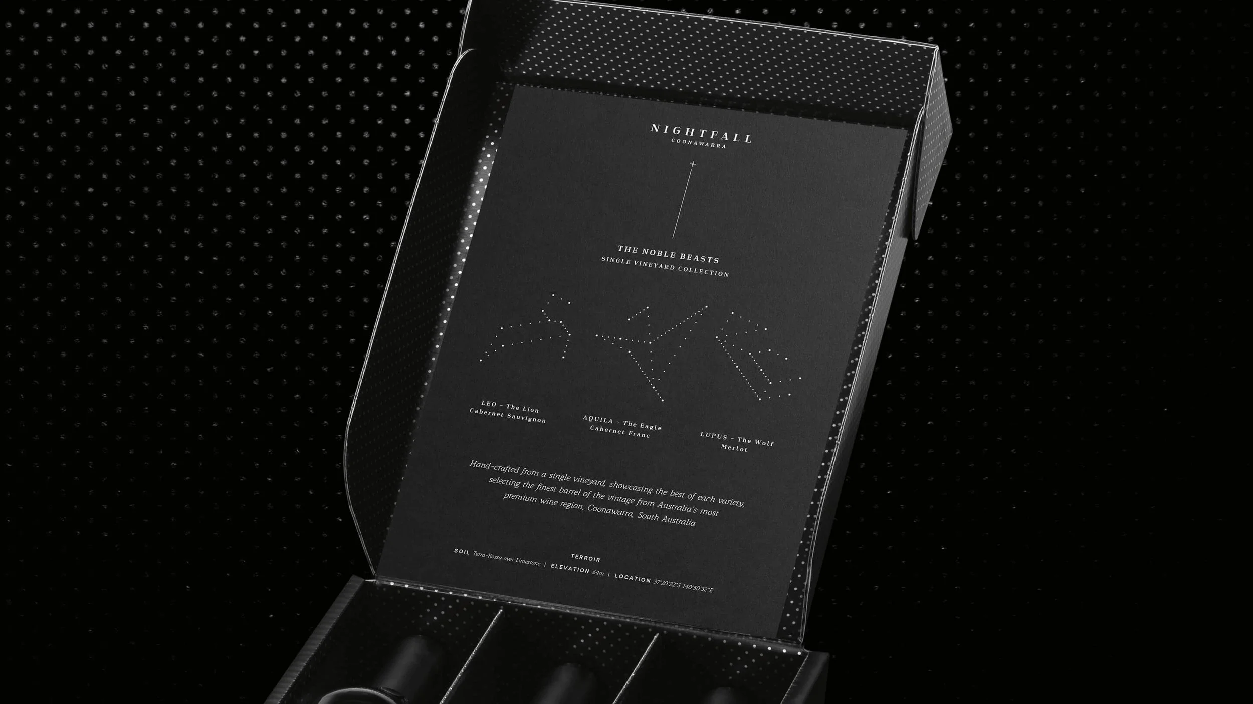
Building a premium brand system aligned with luxury goods, not wine category norms
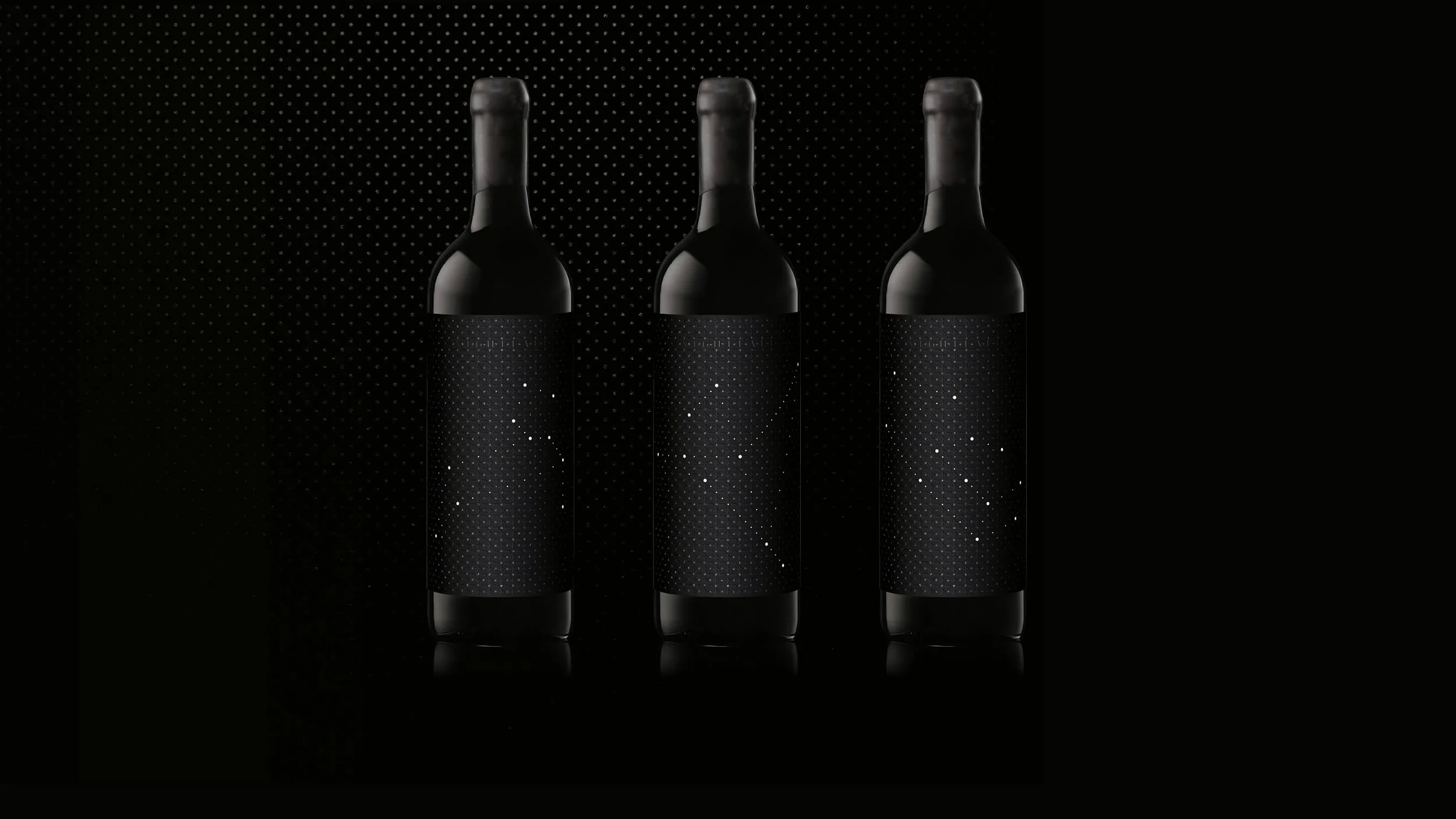
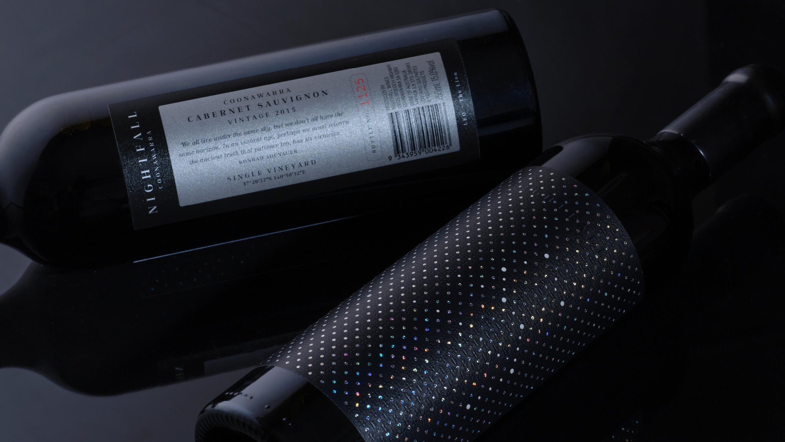
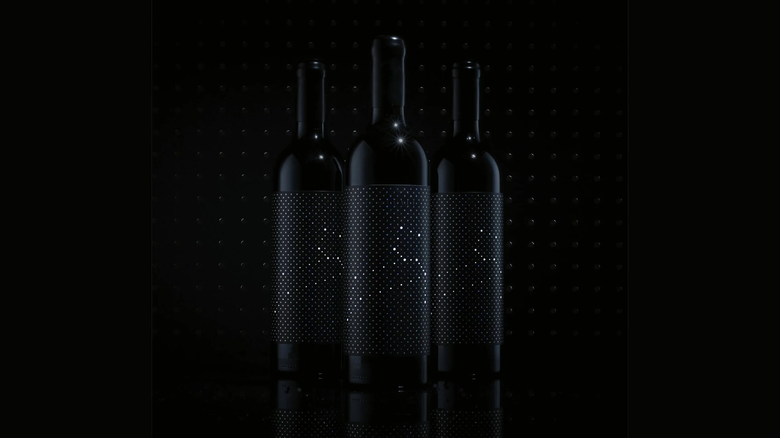
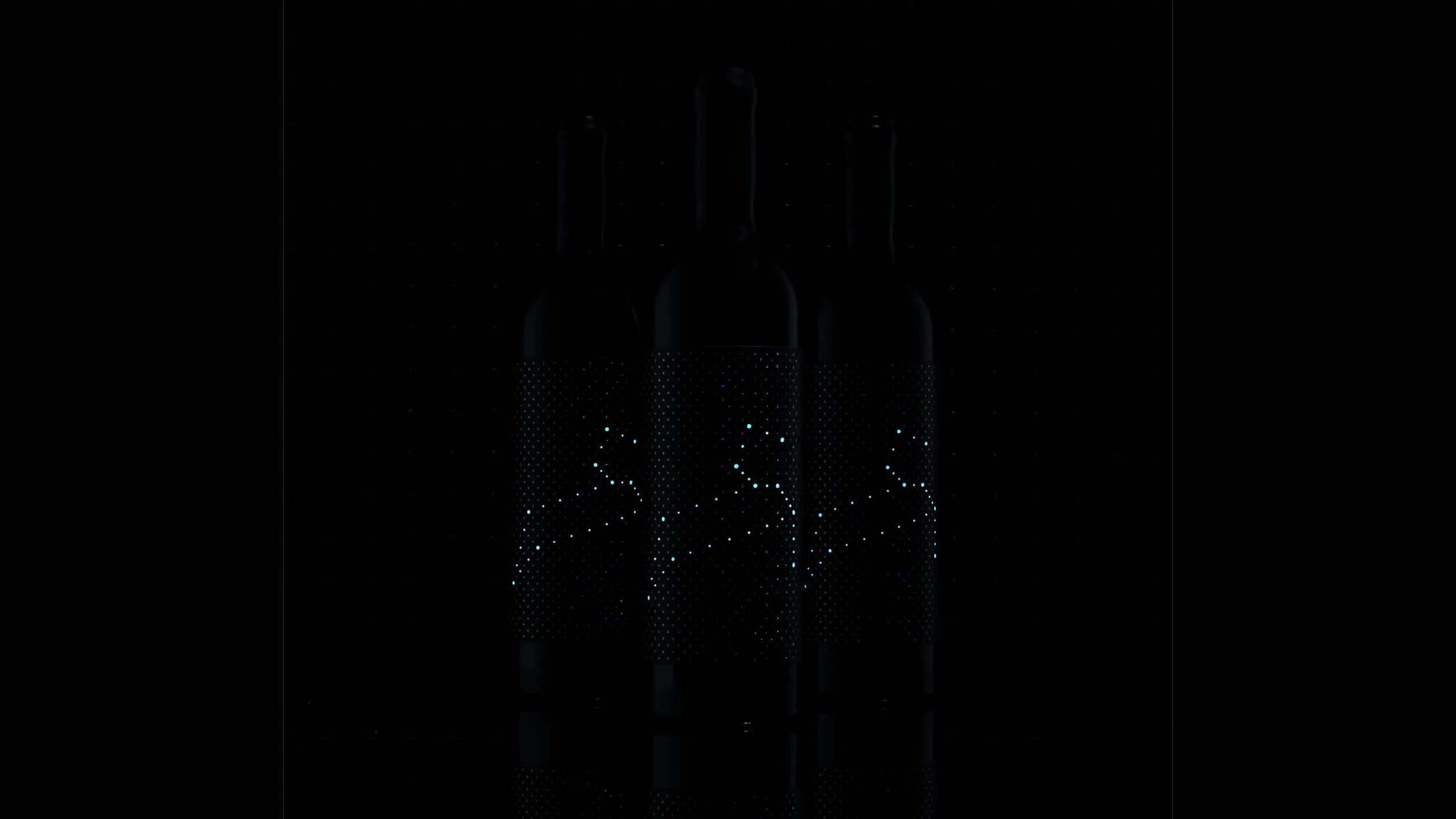
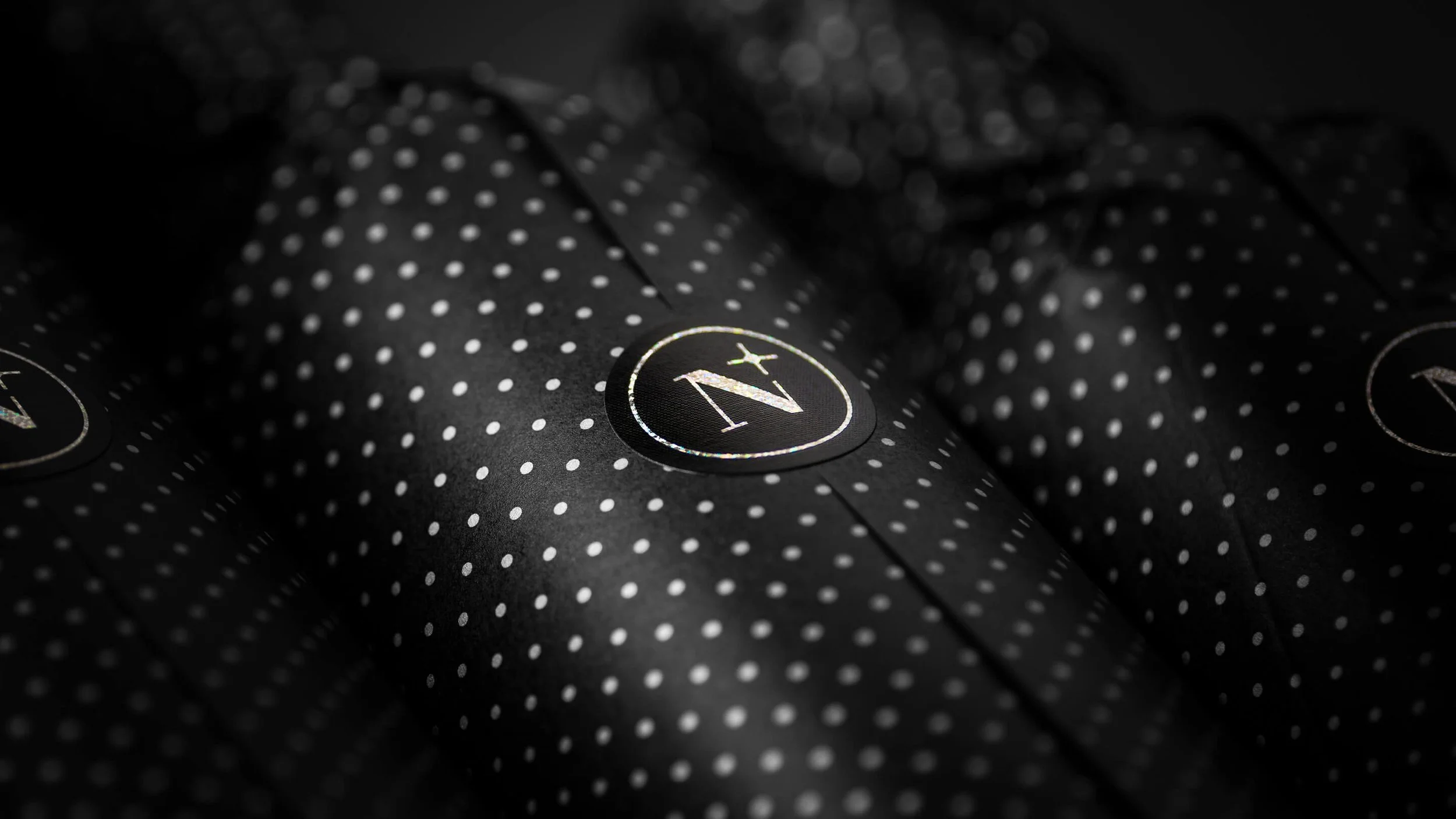
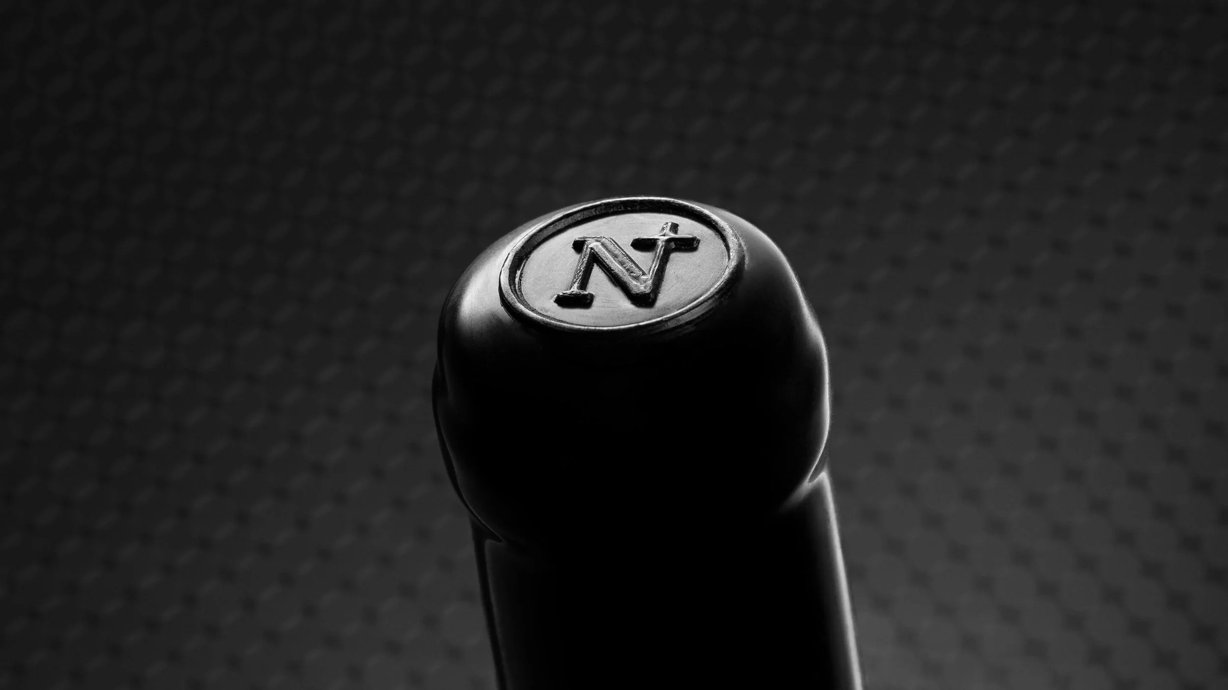
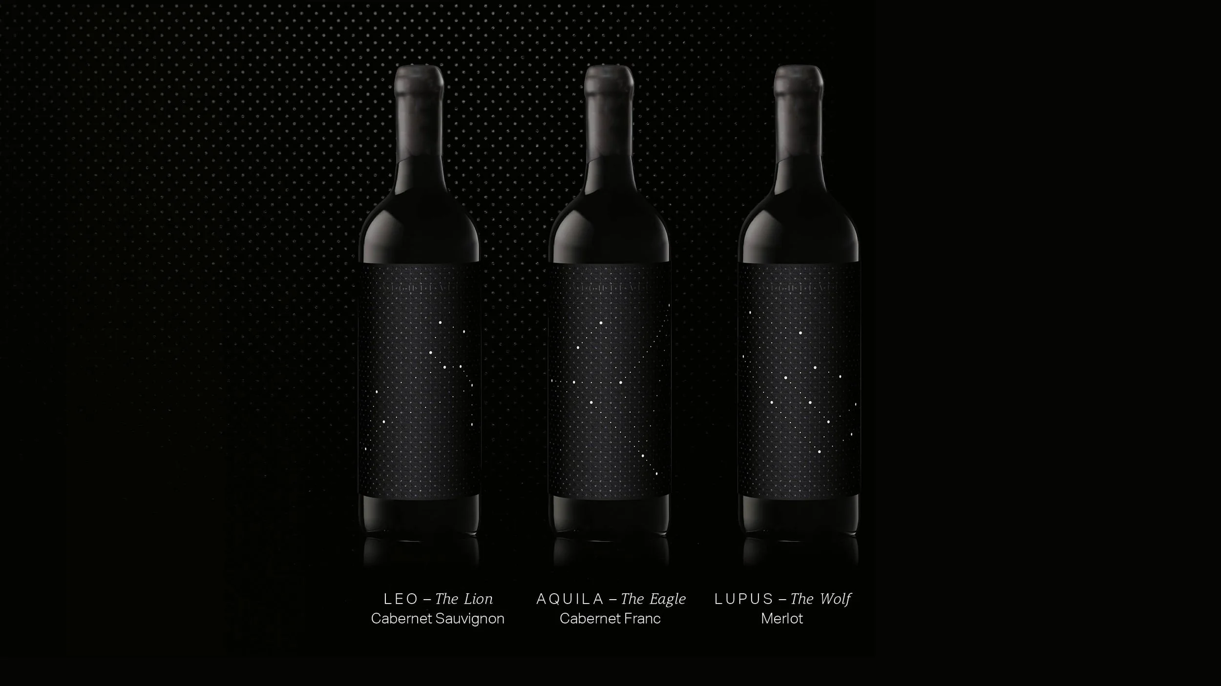
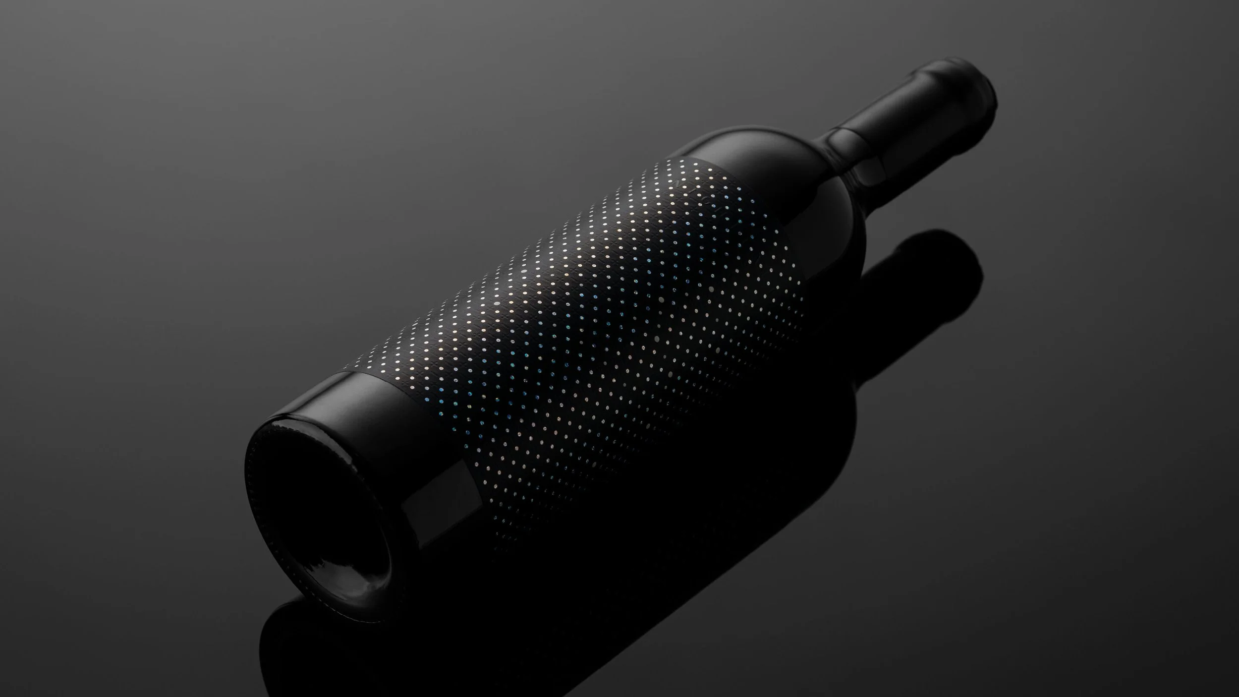
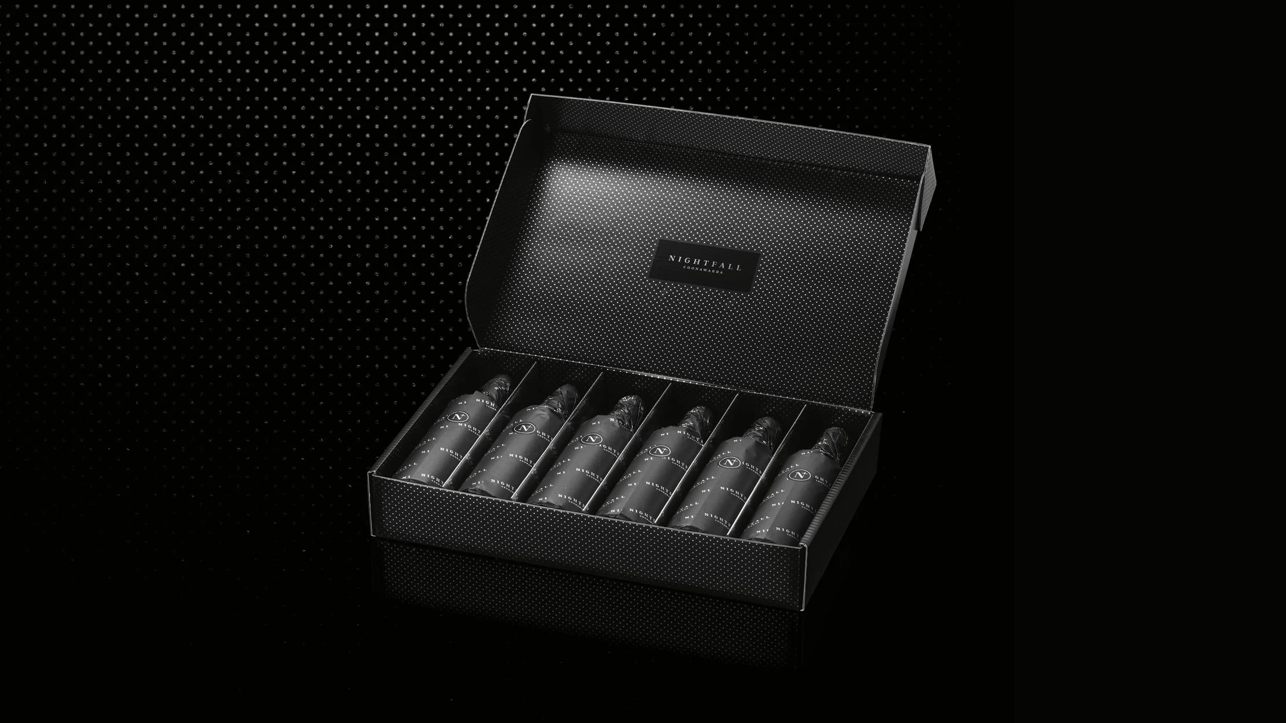
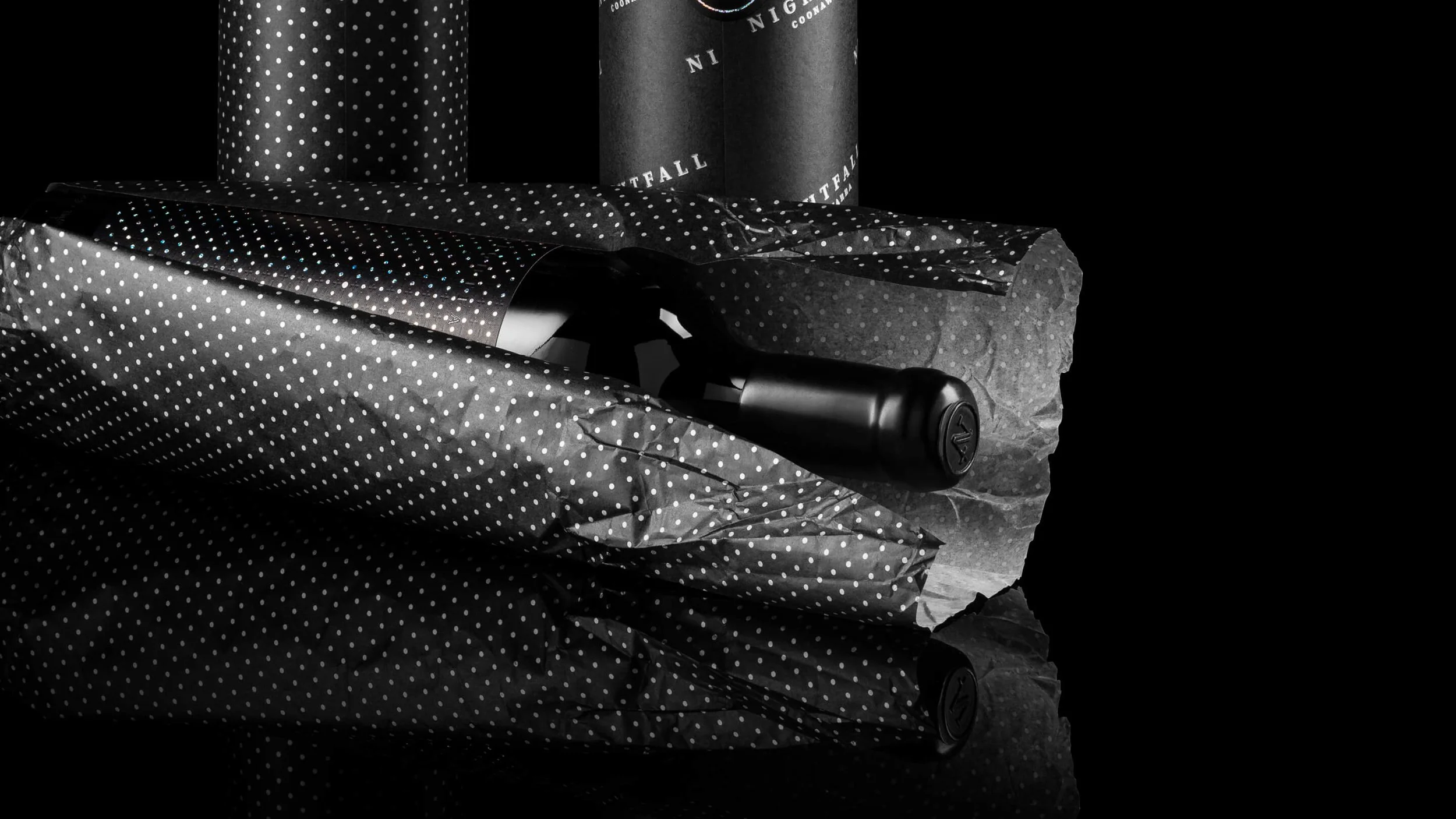
We deliberately avoided familiar luxury wine signals. There was no prominent logo or varietal-led front label. Instead, value was communicated through restraint, detail, and material choices.
Subtle constellation patterns were embedded into the label surface, revealing themselves gradually as light moved across the bottle. The result was packaging that felt quiet at first glance, then increasingly distinctive — rewarding attention without demanding it.
THE RESULT
Externally, the REBRAND was met with strong distributor and export partner response. The distinctive packaging immediately stood apart, creating a clearly differentiated offer within the winery’s portfolio and opening access to new premium channels. The work also received international recognition through multiple design and wine awards.
Internally, the project delivered confidence. Stakeholders gained clarity around how to pursue export opportunities while also activating new domestic pathways through a separate brand range.
Results were both qualitative and quantitative, supported by distributor feedback and industry recognition that validated the contemporary, export-ready positioning.
WHY IT WORKED
This worked because the brand was built for its audience and context first — not for category comfort.
By making deliberate decisions about where to follow convention and where to step away, the winery reduced risk while creating something genuinely distinctive.
The result was a brand that aligned product, buyer, and channel from the outset — supporting export growth without compromise and creating a foundation that can scale over time.
IS THIS FOR YOU?
You’re a producer needing a standalone premium brand for new channels
You’re preparing for export or luxury market entry
You value strategy before execution
You’re comfortable making bold, considered decisions
You’re not looking for a cosmetic update or category-safe solution
AWARDS
Packaging Award – Communication Arts (USA) 63rd Design Annual, 2022
Packaging Award – AGDA (Australian Graphic Design Association) Awards, 2021
Packaging Award – AADC (Adelaide Advertising and Design Club), 2021