REBRAND
REBRAND: Turning loose apples into a premium retail product.
Client / Category
Lenswood Apples — Premium Adelaide Hills fruit producer and grower cooperative
Challenge
A high-quality apple variety had no viable route to market after failing in pre-packed retail formats
Solution
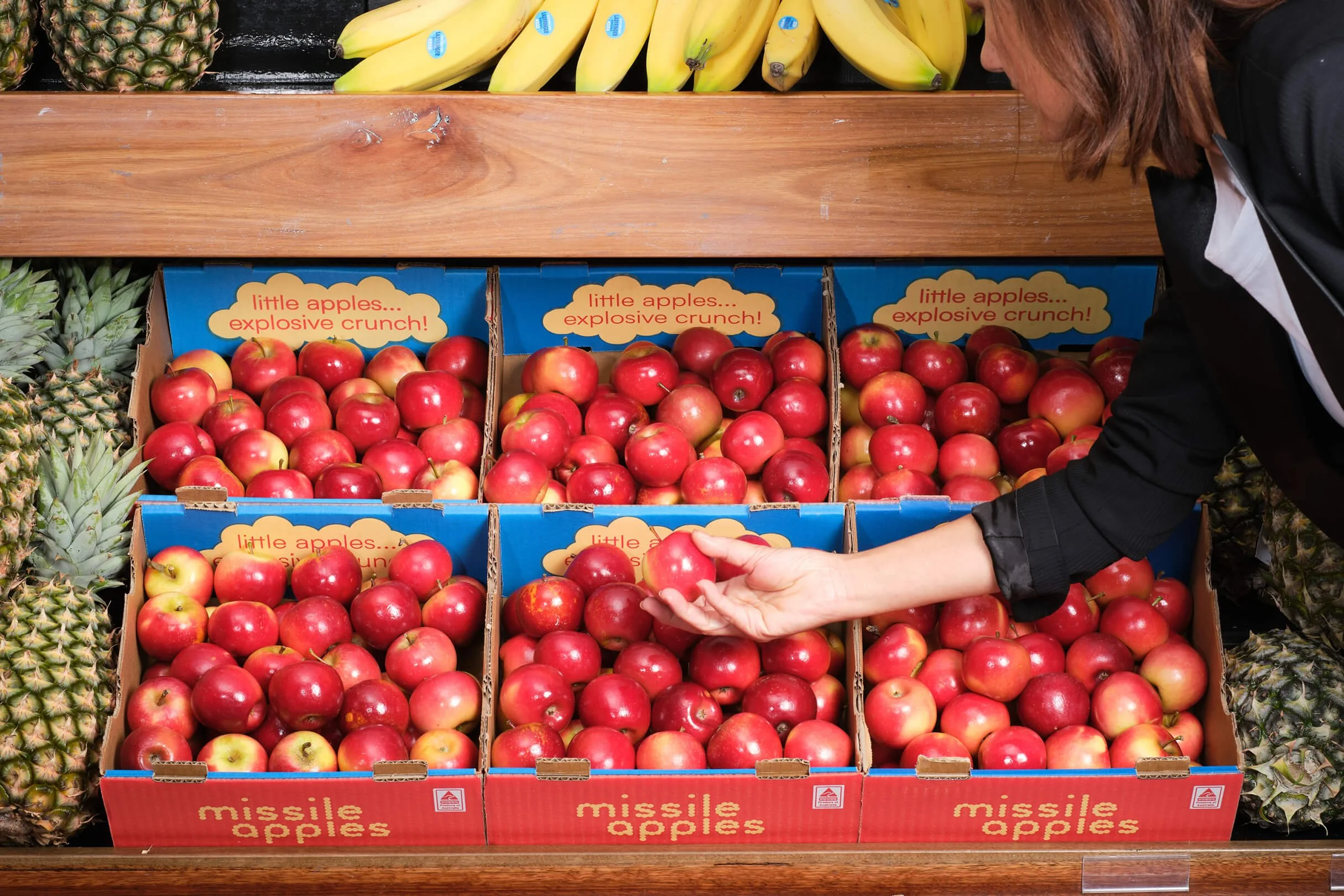
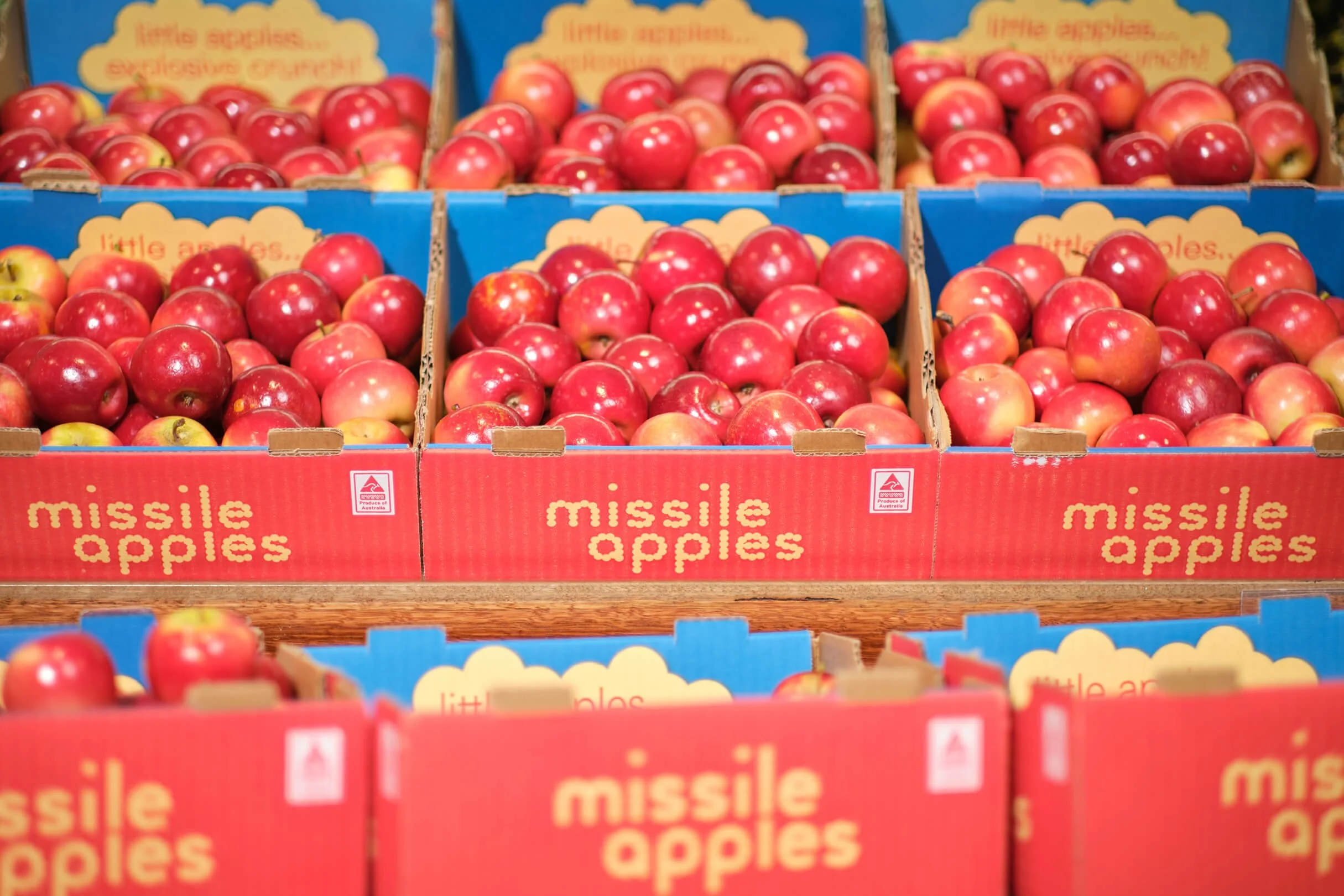
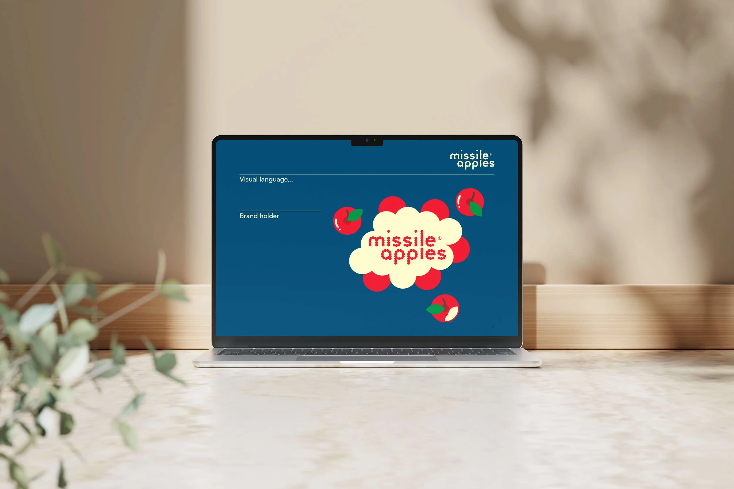
REBRAND — creation of a standalone brand built for loose, per-kilogram retail
Outcome
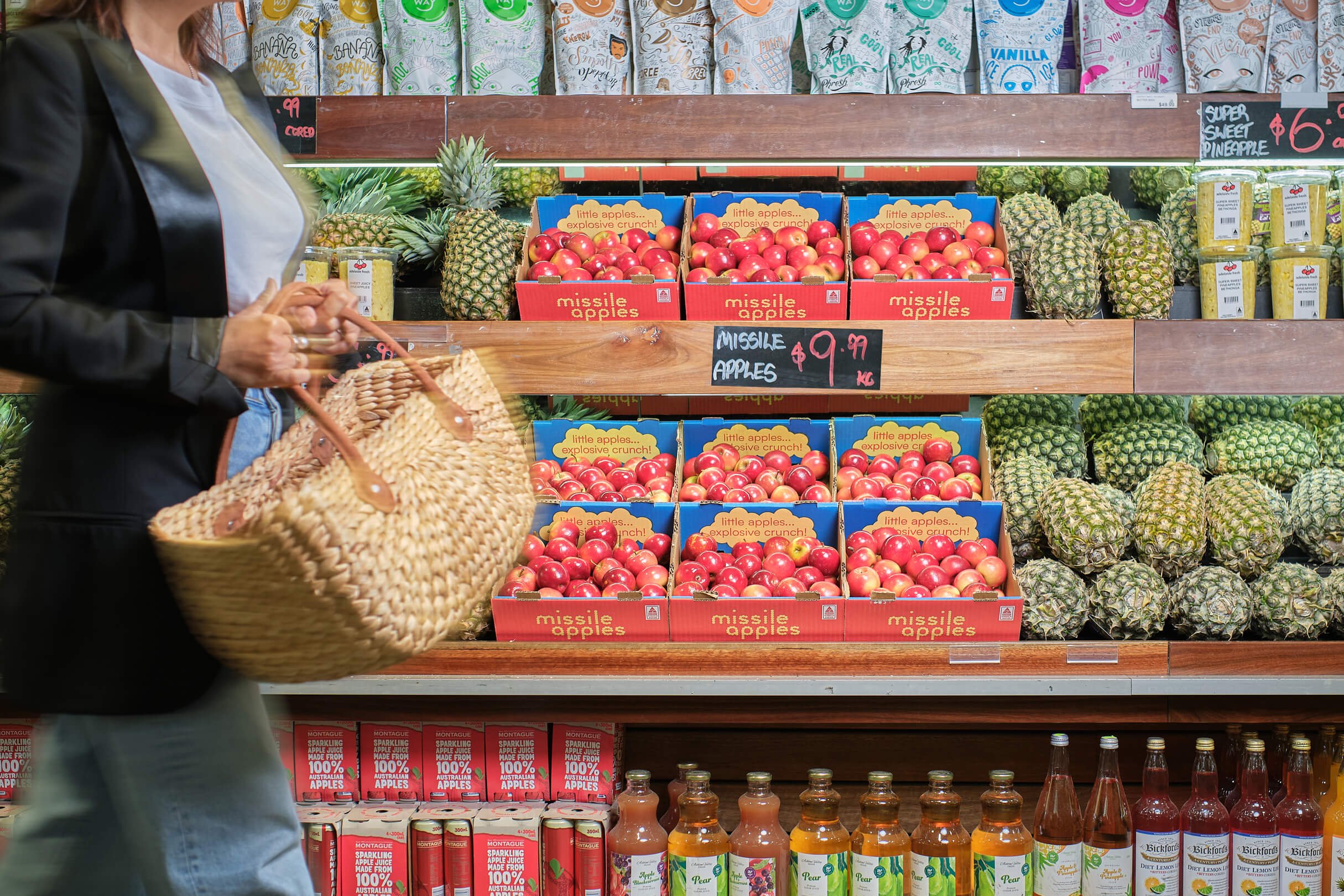
National distribution achieved, consistent sell-outs before season end, and pricing at over 100% above competing varieties

CASE STUDY
Built through a clear three-stage approach
Clarity → Visibility → Consistency
THE CHALLENGE
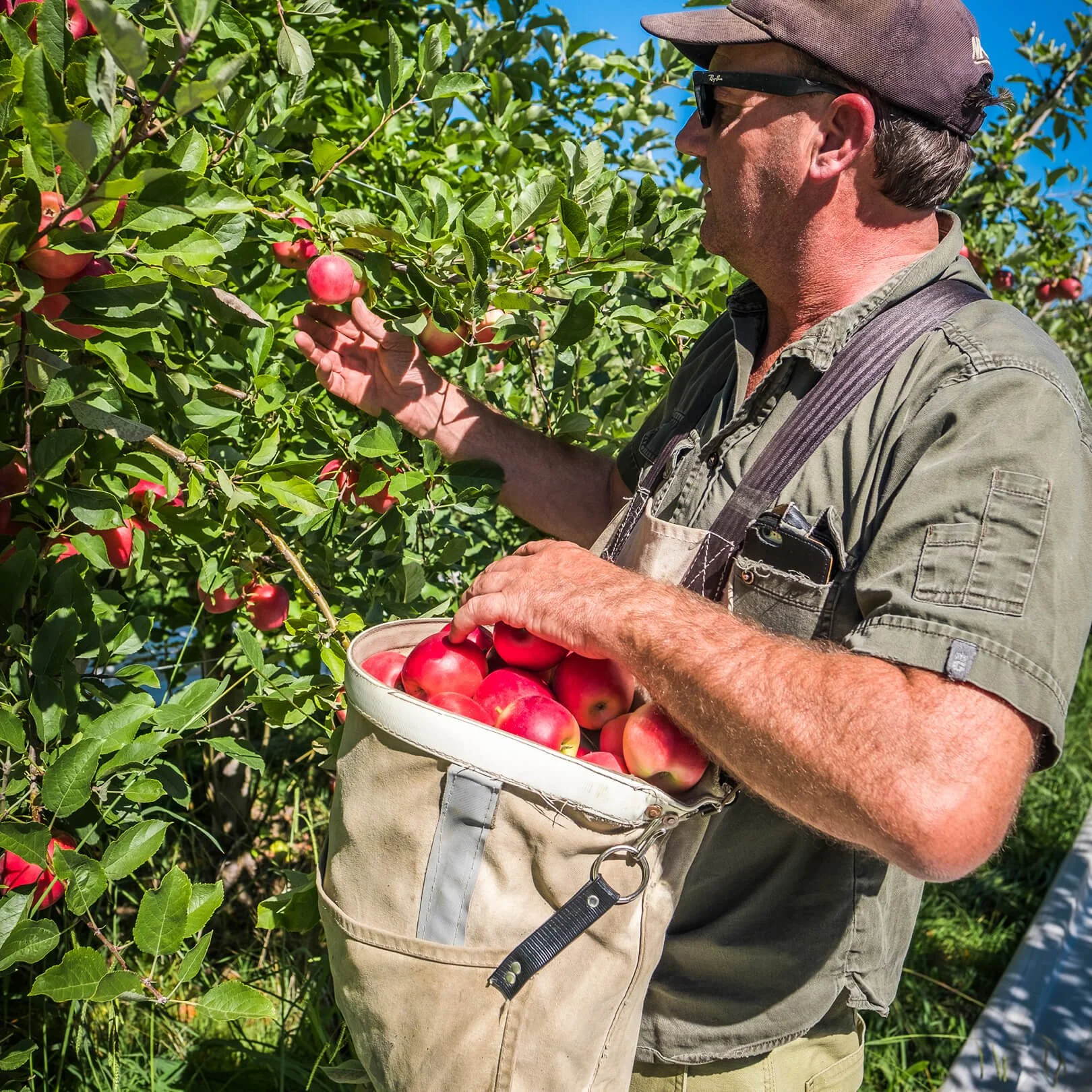
Lenswood Apples is known for producing premium fruit, grown by a collective of Adelaide Hills growers with a strong reputation for quality.
A newly introduced apple variety quickly proved its appeal. Once consumers tried it, feedback on taste and snacking convenience was consistently positive.
However, the route to market was the problem. The apple had initially been sold pre-packed under a different name, using packaging that conflicted with major retailers’ sustainability expectations. The result was swift rejection by large distribution channels.
The alternative — selling loose, per kilogram — introduced a new risk. The fruit was significantly smaller than standard apples and carried a materially higher price point. Without a clear way to communicate value, the variety risked being overlooked or misunderstood at shelf, threatening the commercial viability of the crop.
THE INSIGHT
The obvious move was to lightly update the existing look and lean on sampling to get more people to try the apple. But that wouldn’t have worked.
First, licensing rules meant the apple couldn’t be sold loose under its original name. Second, small changes wouldn’t solve the real problem: in loose fruit, most options look the same, so shoppers assume they’re the same.
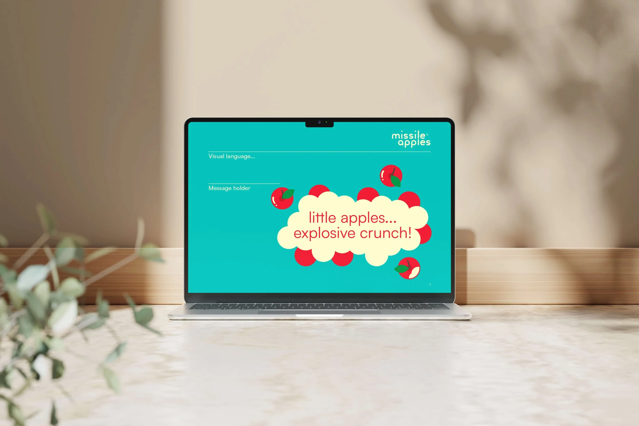
What we needed wasn’t more awareness — it was a clearer reason to choose it. The apple needed a new name and presence that could hold its value in a loose retail environment, where packaging is minimal and difference is hard to see.


OUR APPROACH
We started where the decision happens: in front of the loose fruit display. Then we built everything needed to make the choice feel easy and justified.
Key actions included:
Creating a separate brand so the apple could be sold loose without legacy restrictions
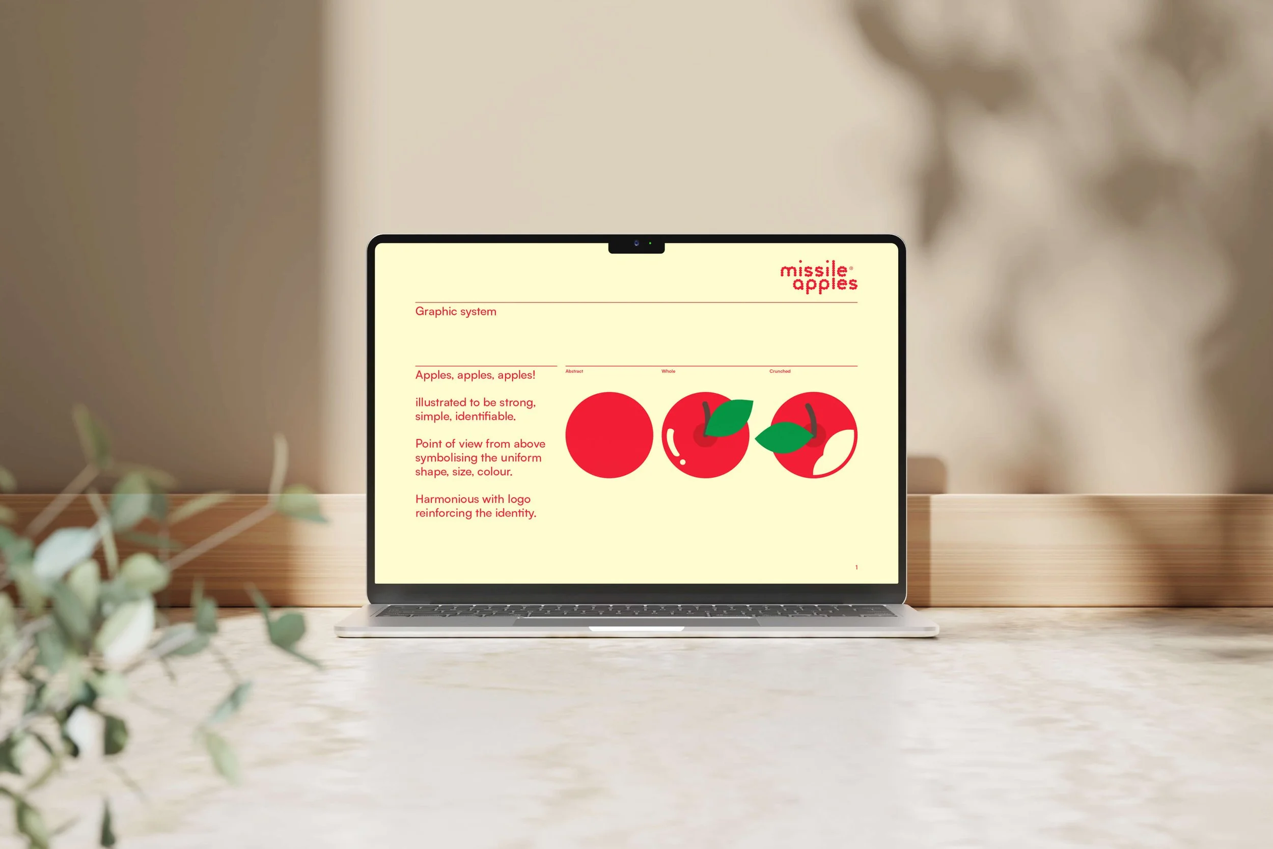
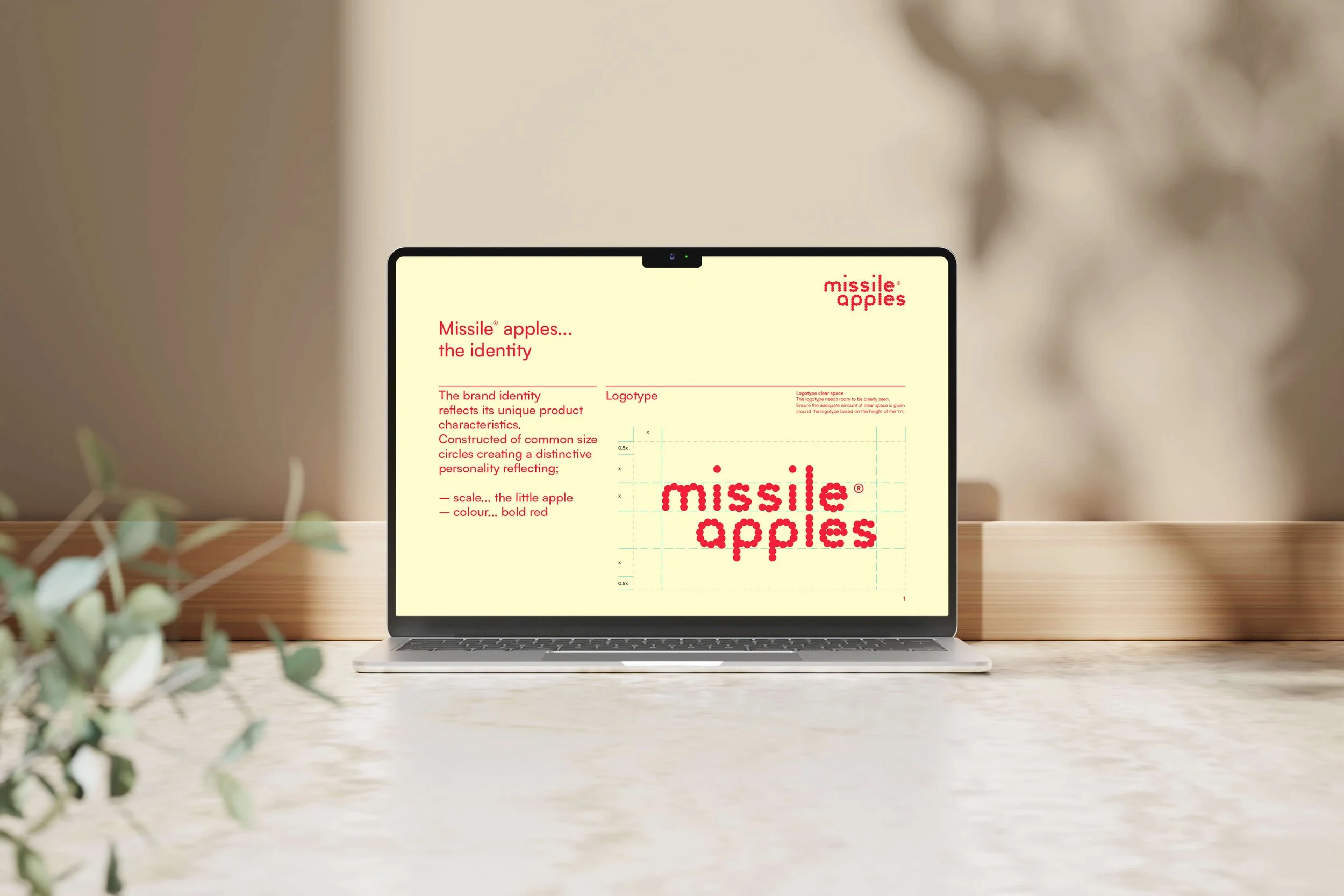
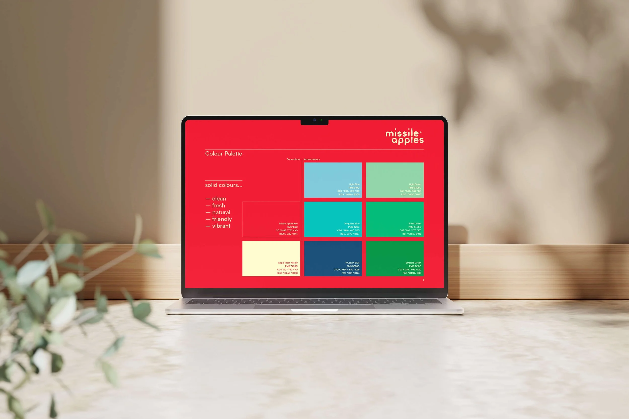
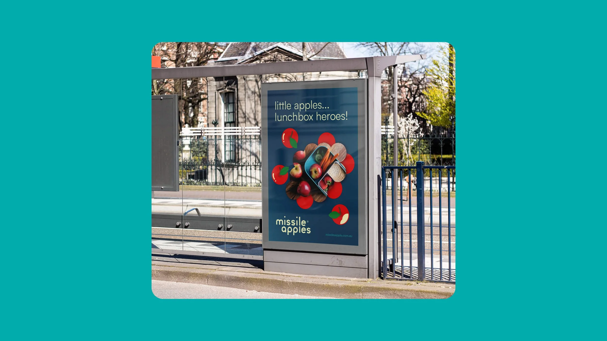
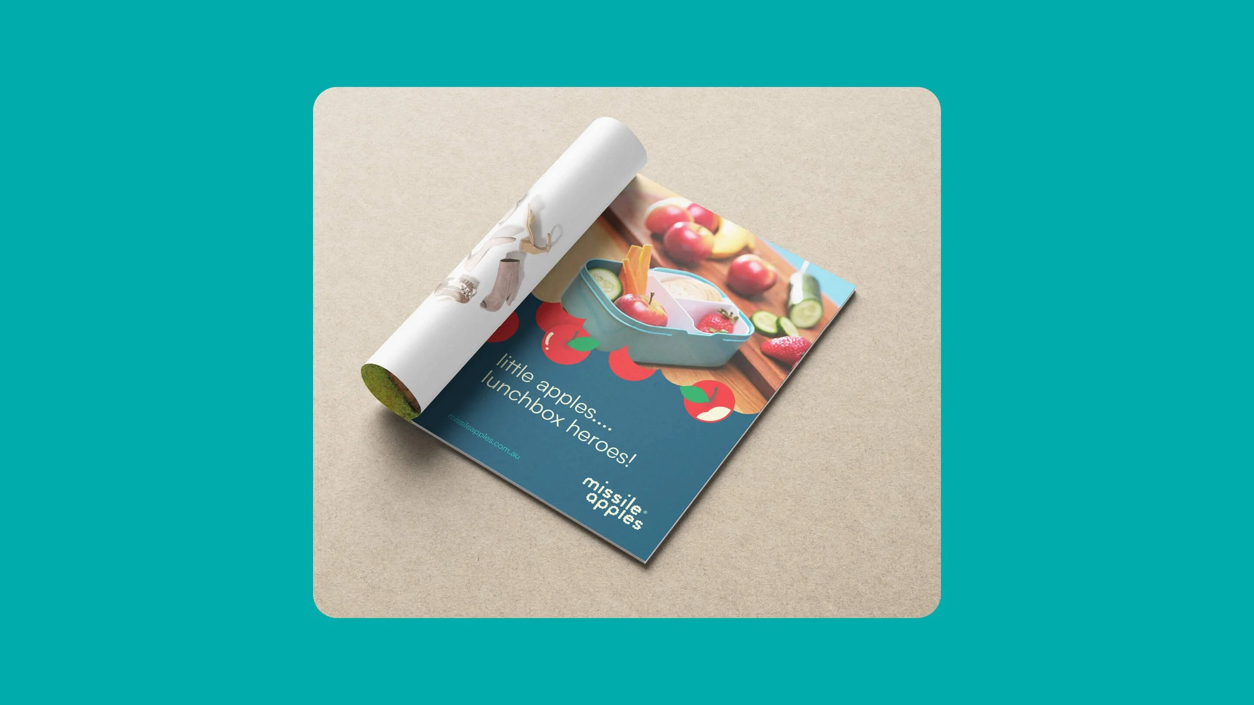
Choosing a name and simple signals that made it feel like a premium snacking apple, not a standard cooking apple
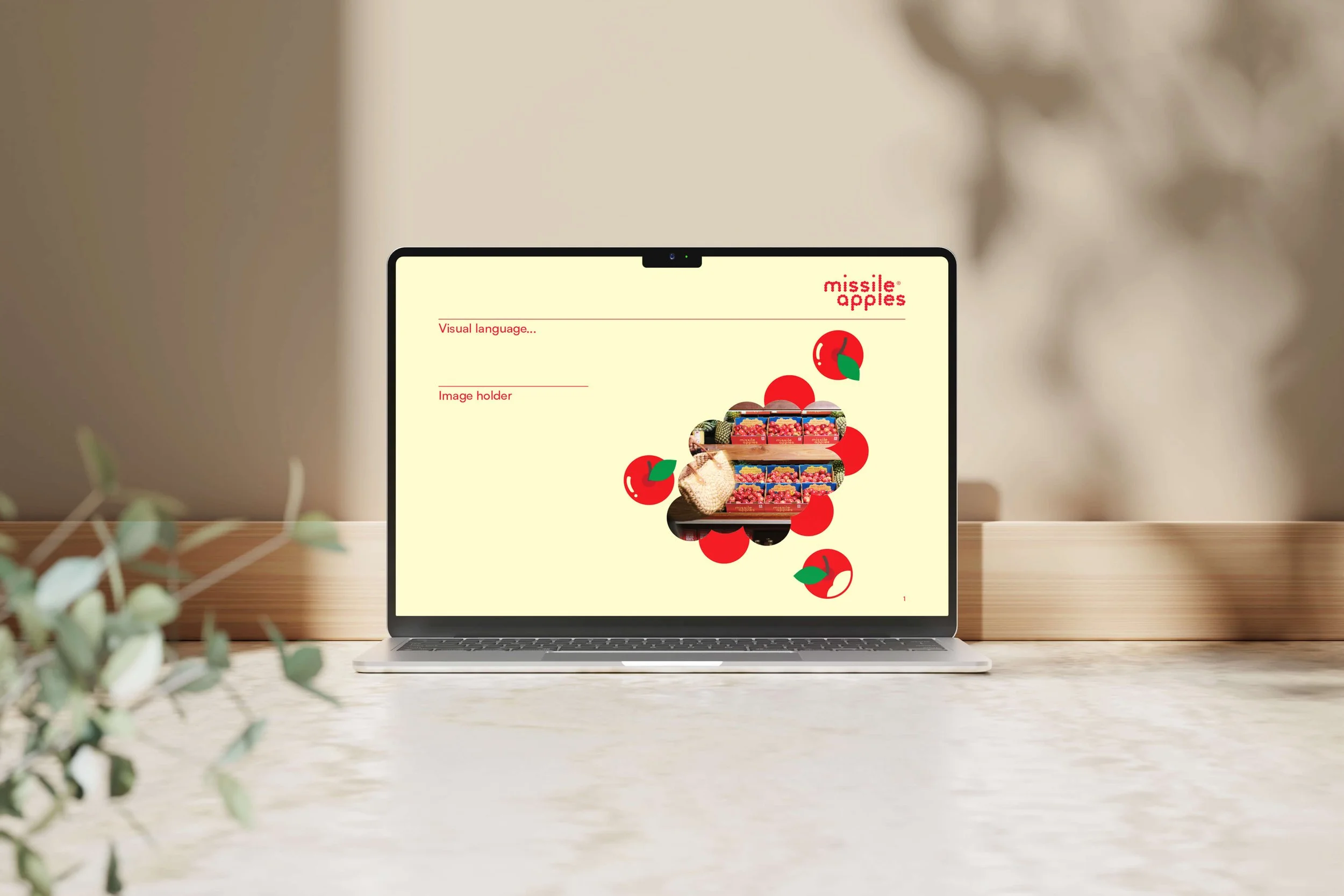
Making sure the packaging worked in loose retail — where the fruit is handled, moved, and often sold without any wrapper
Using bold outer boxes so the brand stayed visible even when individual apples were loose in the display
Aligning price, story, and presentation so the premium per-kilogram price made sense at a glance.
THE RESULT
The REBRAND unlocked national distribution across independent fruit retailers and supermarkets. Missile Apples consistently sold out across all states before the end of each season — despite commanding a significantly higher price than comparable apples.
Externally, the product achieved:
Strong retailer uptake and repeat purchasing
Clear differentiation in loose produce environments
Pricing at over 100% above comparable apples, per kilogram
Internally, the outcome was just as important:
Restored grower confidence and commercial certainty
Alignment across the cooperative around pricing and positioning
A defensible market position that protected long-term investment in the crop
WHY IT WORKED
The result came from treating the product as a business decision first. Clear separation, confident positioning, and channel-specific thinking reduced risk and helped customers understand the value at the moment of purchase.
This same approach works wherever a premium product is hidden inside a commodity category.
IS THIS FOR YOU?
This case study is for:
Premium food brands under margin or distribution pressure
Producer-led businesses needing to justify higher pricing
Teams willing to challenge category norms with clear commercial intent
Organisations prepared to back a clear commercial reset
It’s not for commodity-led or price-driven producers, brands unwilling to differentiate or reposition, or businesses seeking cosmetic design changes without strategic intent.