
REBUILD
A strategic packaging REBUILD that enabled a confident spirits portfolio expansion.


CASE STUDY
Client / Category
LOBO — Craft cider and spirits
Challenge
Expanding into a crowded gin category without weakening existing brand equity
Solution
REBUILD — Portfolio-led packaging system
Outcome
Improved distributor confidence, expanded retail distribution, and continued year-on-year sales growth
Built through a clear three-stage approach
Clarity → Visibility → Consistency
THE CHALLENGE
The business had already built a strong reputation in cider and had proven its credibility in spirits with the successful launch of LOBO Apple Brandy. Product quality was not in question, and early trade feedback was positive.
However, the planned introduction of gin marked the first real expansion into a highly competitive spirits category. Gin shelves were crowded, expectations were high, and credibility could not be assumed.
The risk was clear: a misstep would undermine distributor confidence and fragment a brand that was just beginning to establish itself in spirits.
Crucially, existing brand equity had to be protected. This wasn’t an opportunity for novelty or experimentation — it was a structural growth decision that needed to hold up long term.
THE INSIGHT
A typical response would have been to copy category visual trends to signal credibility — borrowing familiar gin cues to “fit in” quickly.
That approach would have underperformed. Trend-led execution would fragment the portfolio and signal a lack of confidence in the brand’s own equity, making future extensions harder rather than easier.
What actually needed fixing was structure. The spirits portfolio required a clear, repeatable way of organising the spirits range where each product could express its own story while remaining unmistakably part of a coherent whole.
OUR APPROACH
The work was guided by a simple principle: credibility through consistency - with clear structure before decoration.
Key decisions included:
Clarifying how gin should sit alongside Apple Brandy within the spirits portfolio
Defining distinct product roles while keeping the range connected
Expanding the LOBO story through product-specific narratives rather than category clichés
Putting a consistent structure in place to support future spirits releases
Deliberate restraint was critical. We did not chase craft gin trends, and we did not redesign the brand identity. The focus was on strengthening what already existed and building a system that could scale.
THE RESULT
Externally, the newly designed Gin range immediately improved distributor conversations. The clarity and shelf presence of the portfolio supported stronger trade confidence, leading to uptake into chain retail distribution and new on premise accounts. The spirits range now presents as a cohesive, ultra-premium offering rather than a collection of one-offs.
Internally, the team gained confidence presenting the spirits portfolio, with a clear narrative for how each product fits and why it exists.
The results were both qualitative and quantitative, with continued year-on-year sales growth following the expansion. Released in 2018 the product design has remained unchanged in market place. Positive distributor feedback and consistent market performance reinforced that the structure was working as intended.
WHY IT WORKED
The outcome was driven by protecting brand equity while expanding the range, rather than masking risk with trend adoption.
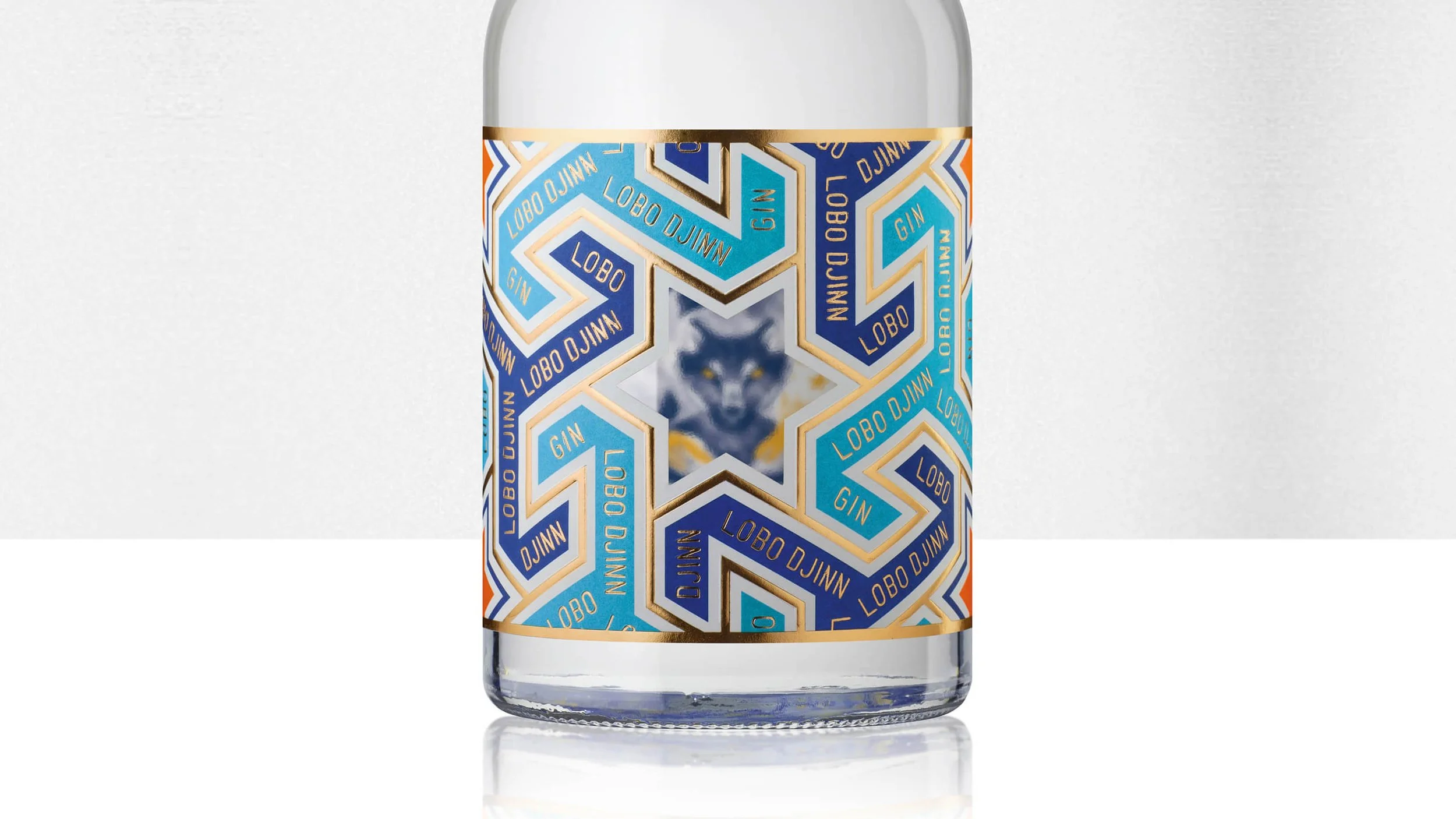
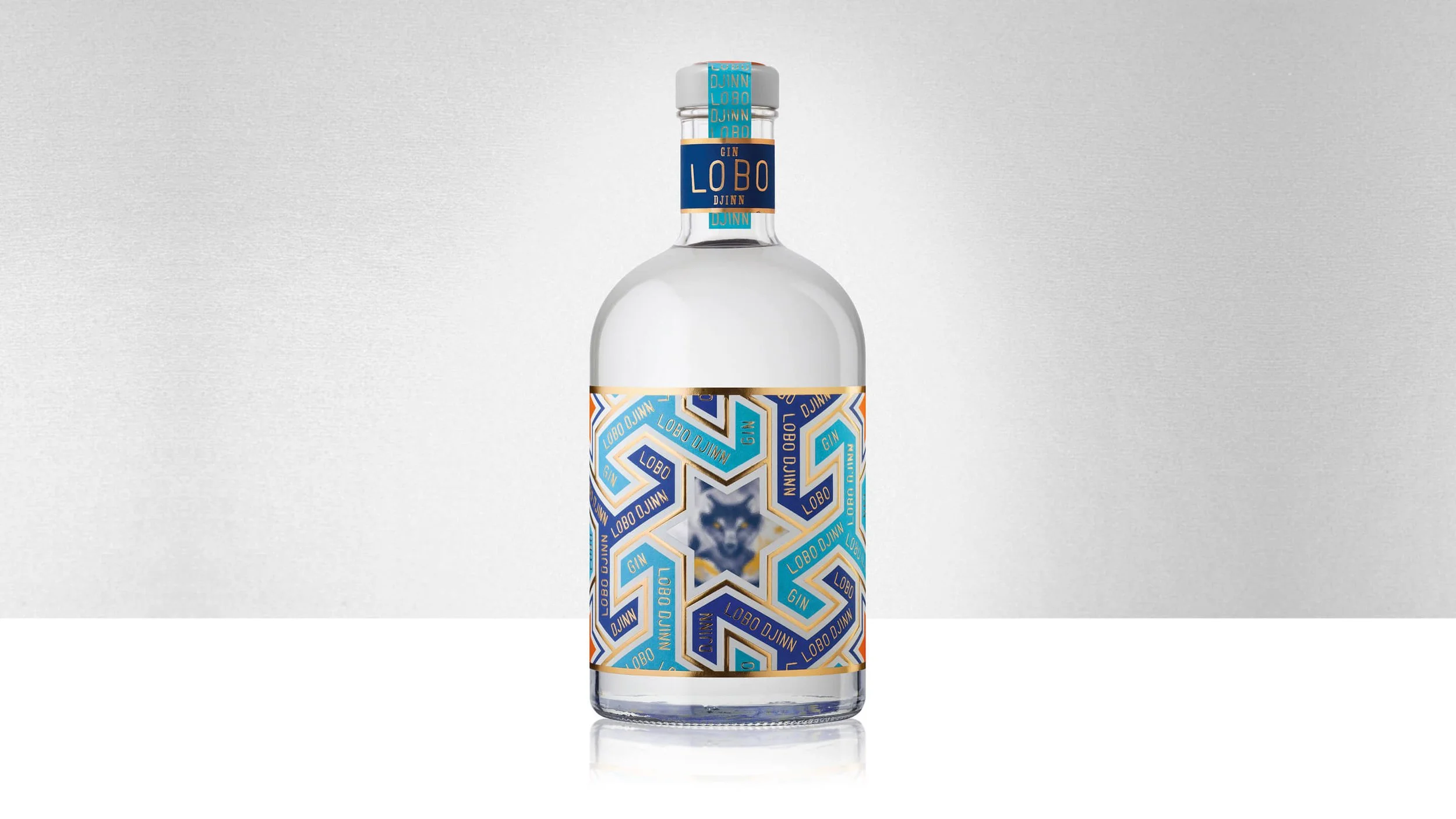
Each product — including this Orchard Gin, built around quince grown in the orchard and expressed through the LOBO Djinn narrative — was allowed its own personality within a disciplined system.
This reflects Influx’s belief that growth requires structure before expression. Credibility comes from consistency, and packaging must function as a commercial tool, not a creative exercise. Long-term thinking reduced launch risk and created confidence on shelf and in trade.
IS THIS FOR YOU?
You’re an established producer expanding into new categories
You’re a business owner preparing for portfolio growth
You’re a spirits producer entering a crowded premium segment
You’re willing to invest in strategic clarity before design
You’re serious about long-term growth, not quick wins
This is not for businesses chasing trends to stand out, execution-only or “make it look cool” briefs.
AWARDS
International Packaging Award – Communication Arts (USA) 59th Design Annual, 2018