
REBUILD
A strategic packaging REBUILD for a category expansion, without risking brand equity.

CASE STUDY
Client / Category
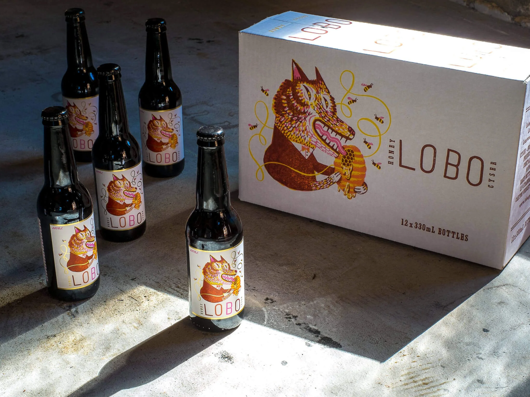
LOBO — Craft Cider and Spirits
Challenge
Introducing a new product category without fragmenting an established range
Solution
REBUILD — portfolio-led packaging system
Outcome
Confident expansion into Honey Mead, without disrupting shelf clarity
Built through a clear three-stage approach
Clarity → Visibility → Consistency
THE CHALLENGE
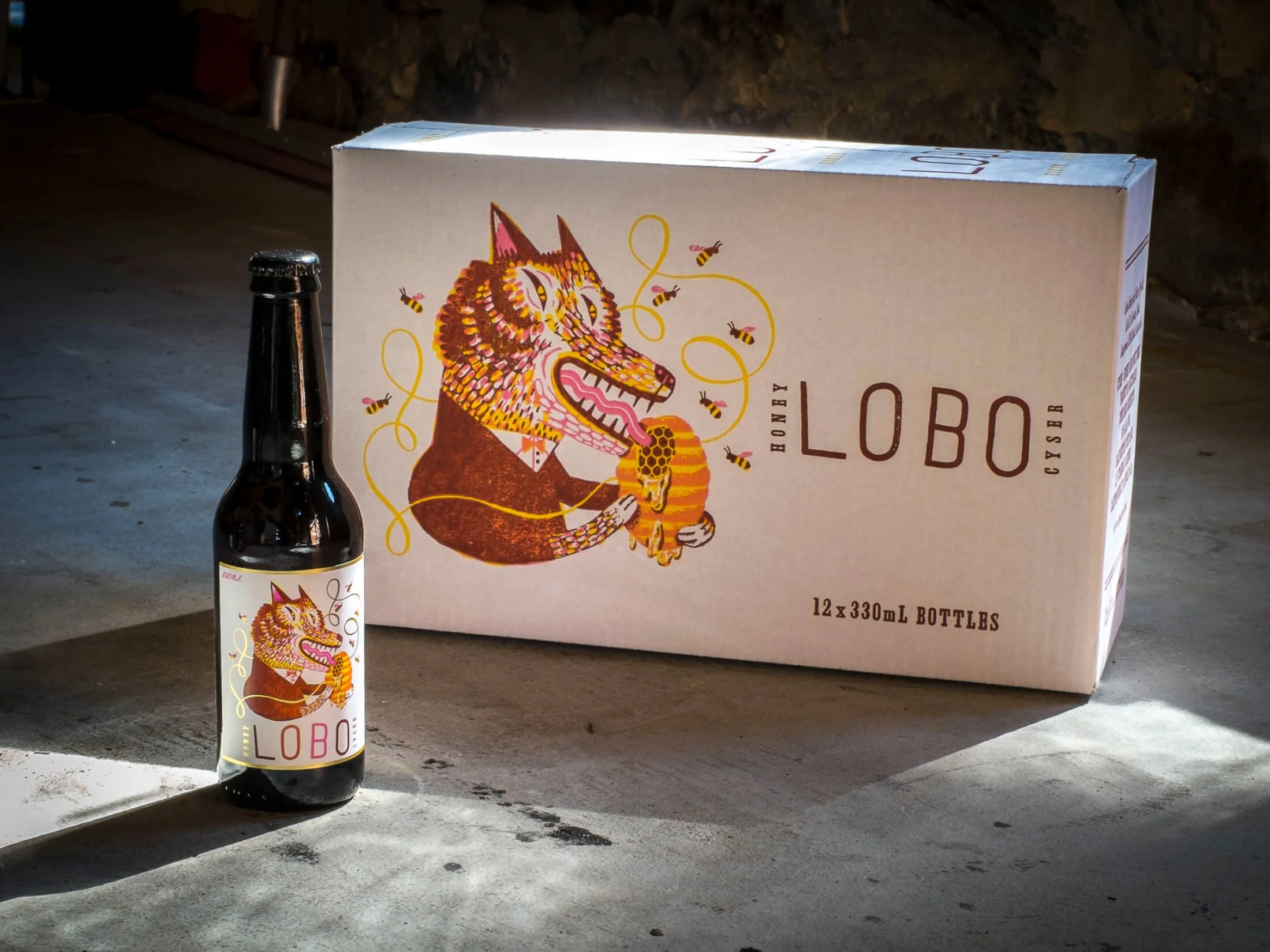
LOBO had built a loyal following and strong credibility through its craft cider range. The brand was well recognised, particularly across apple and pear cider, and had already navigated one successful portfolio expansion.
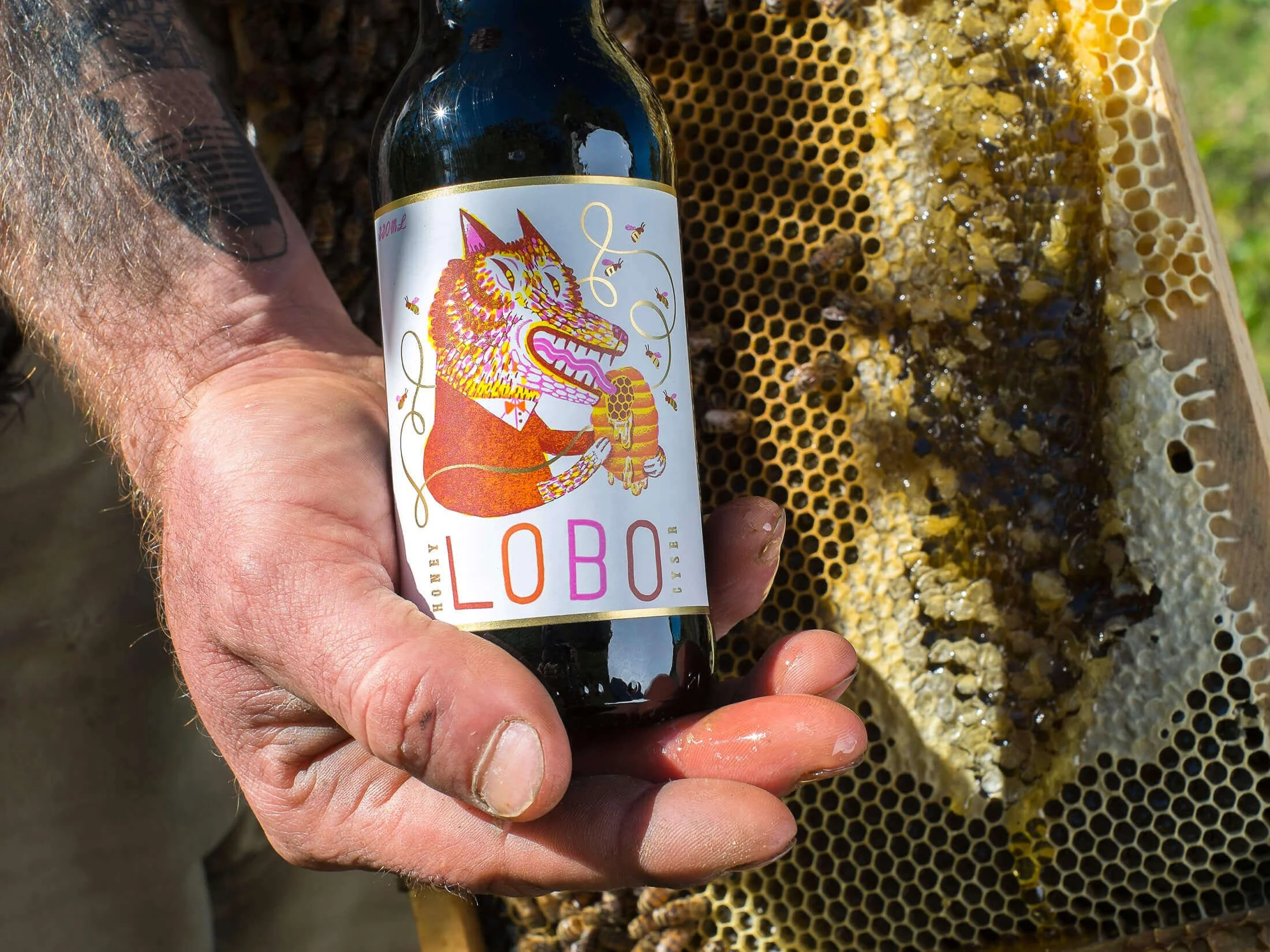
The challenge emerged when introducing Honey Mead as a new product category. Mead carried very different category expectations and visual cues, which risked sitting awkwardly alongside cider. Without a clear structure, the new product could easily read as a separate experiment rather than part of a coherent range.
This mattered commercially because the Honey Mead needed to launch with confidence, clarity, and longevity — without reopening brand decisions or diluting existing cider recognition. A full rebrand was not viable, and protecting established brand equity was critical.
THE INSIGHT
A typical response would have been to lean into traditional Mead cues — old-world, medieval, or heritage-led styling — to signal category authenticity.
That approach would have weakened the existing packaging system and fragmented the range, making the brand harder to recognise and manage as it continued to grow.
The real issue wasn’t how Mead should look in isolation. It was how portfolio expansion could follow the same decision logic established in earlier range growth, ensuring new categories strengthened the whole brand rather than pulling it apart.
OUR APPROACH
The work was guided by one principle - portfolio clarity over category clichés.
Key decisions included:
Defining the role of Honey Mead within the existing LOBO range
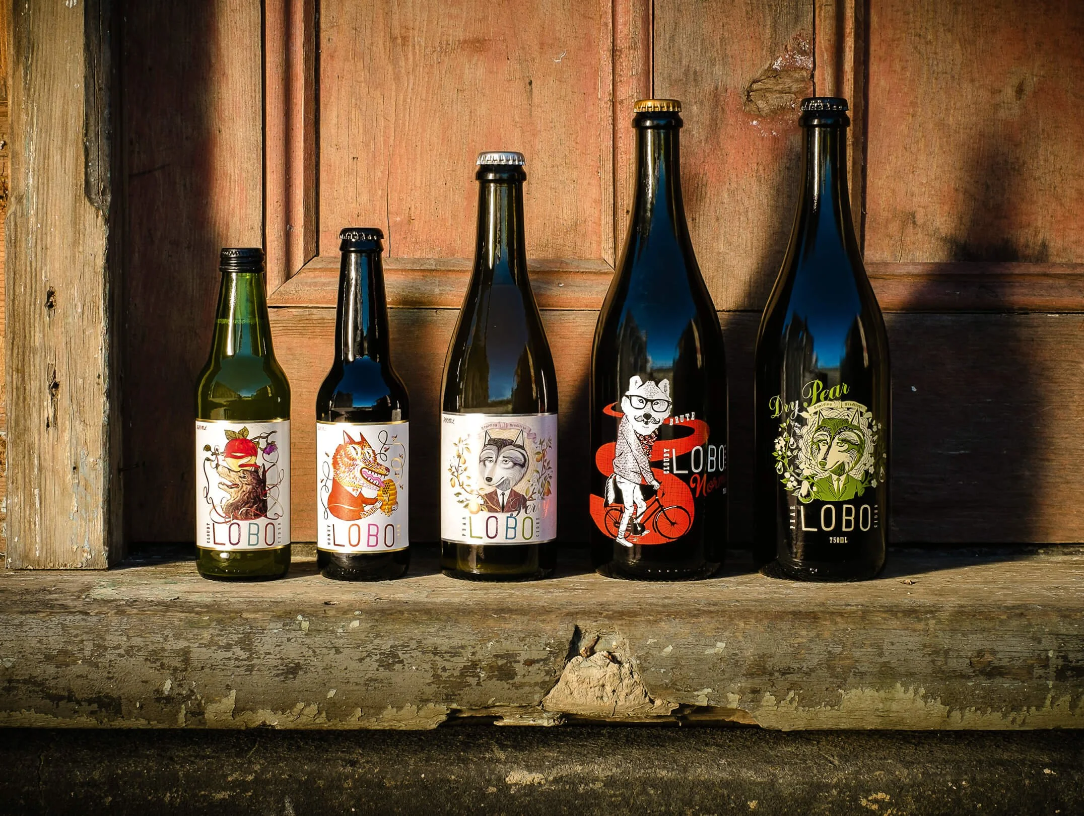
Ensuring cider, perry, and mead worked together as a coherent range
Extending the existing packaging system rather than creating a new one
Testing shelf clarity across the full lineup to ensure coherence at a glance
What we deliberately did not do was create a separate heritage or medieval aesthetic for Mead. While the product has ancient roots, treating it as a stylistic outlier would have introduced confusion and undermined the system.
Instead, character and storytelling were expressed within the existing structure, reinforcing recognition while allowing the product to feel distinctive.
THE RESULT
Externally, the Honey Mead was clearly understood as part of the LOBO range rather than a standalone experiment. It entered a new category without disrupting shelf clarity or brand recognition.
Internally, the team gained confidence introducing a new product type without reopening fundamental brand decisions. The established system held, making the expansion feel deliberate rather than risky.
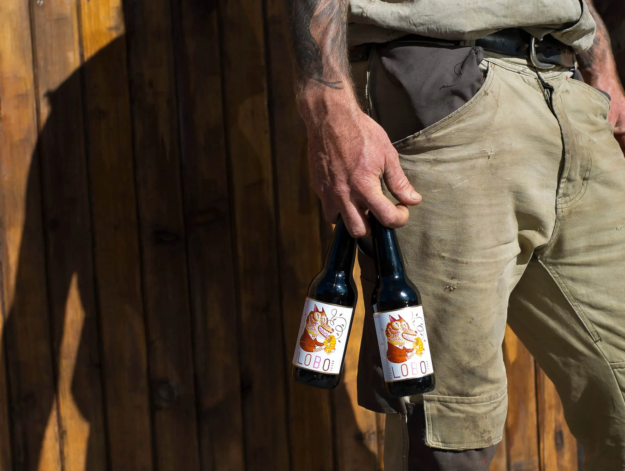
Results were both qualitative and quantitative. The product has maintained continued shelf presence since launch, without the need for subsequent redesign — a strong signal that the structure was doing its job.
WHY IT WORKED
The outcome was driven by extending a proven packaging system instead of introducing a new visual language.
This reinforced a core belief: growth is best supported by structure, not novelty.
For established producers, this approach is repeatable wherever category expansion could risk fragmenting an existing range.
IS THIS FOR YOU?
You’re an established producer expanding into adjacent categories
You’re an owner-led brand needing structure before growth
You’re seeking clarity without a full rebrand
You’re willing to follow an existing brand system as you grow
This is not for trend-led brands, execution-only briefs, or early-stage start-ups experimenting with identity.
AWARDS
International Packaging Award – Communication Arts (USA) 55th Design Annual, 2014