
REBUILD
A strategic REBUILD to support a craft brand’s move into ultra-premium spirits.

CASE STUDY
Client / Category
LOBO — Craft cider and spirits
Challenge
Introducing an ultra-premium spirits category into a cider-led brand without losing credibility or confusing the core audience
Solution
REBUILD — portfolio-led packaging system
Outcome
A premium brand presence in the spirits category, with immediate credibility at launch.
Built through a clear three-stage approach
Clarity → Visibility → Consistency
THE CHALLENGE
LOBO had built a strong reputation as a craft cider producer, with a loyal following and clear brand recognition rooted in provenance, quality, and authenticity. The cider range performed well and had earned trust through a distinctive visual identity and storytelling approach.
What wasn’t keeping pace was the brand’s ability to stretch beyond cider. Spirits were never part of the original brand intent, yet the business was ready to introduce an ultra-premium apple brandy at a price point more than ten times higher than its core cider range.
This mattered commercially because the spirits launch needed immediate credibility. At over $100 per bottle, the product had to signal craftsmanship, seriousness, and quality from the first glance. The constraint was significant: LOBO was known only for cider, and any mis-step risked undermining both the new spirits category and the equity already built with its existing audience.
THE INSIGHT
The obvious solution would have been to replicate the existing cider branding and layer on generic premium cues to signal a move into spirits.
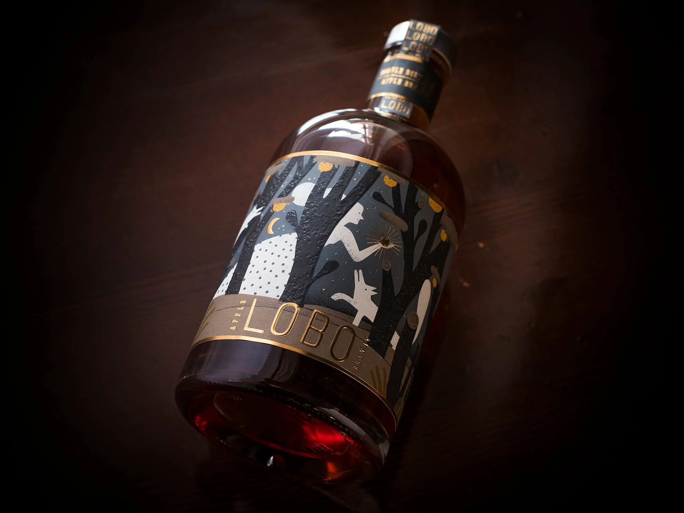
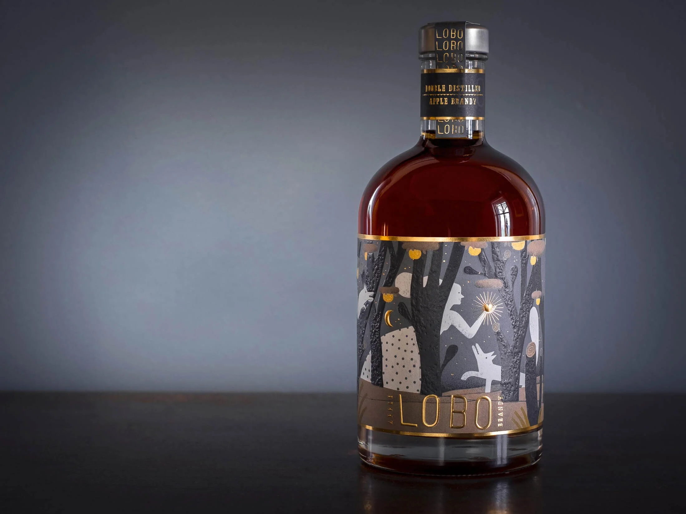
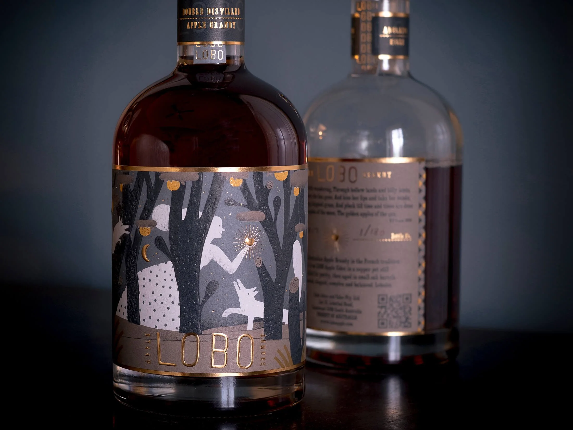
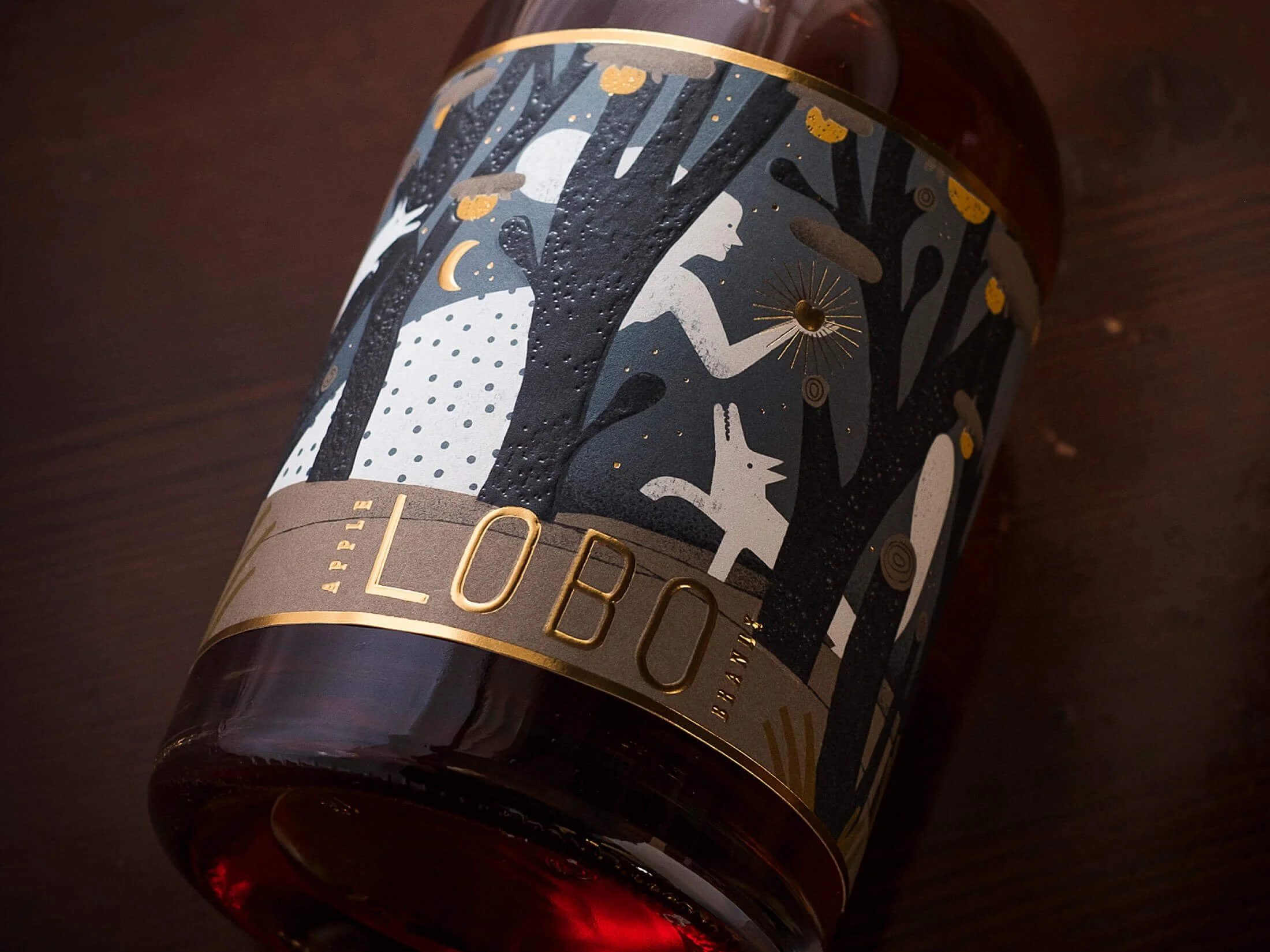
That approach would have underperformed. LOBO’s equity was not built on uniformity or decoration, but on individuality and narrative depth. Each product featured a different wolf illustration, created by a different artist, with the character reflecting the nature of the drink itself. Simply “upscaling” the look would have disconnected the spirits from the brand’s true strength.
What actually needed fixing was brand permission. LOBO required a clear, structured way to enter a premium spirits category while signalling craftsmanship at a higher price tier — without breaking the logic or personality that made the brand trusted in the first place.
OUR APPROACH
The work was guided by one principle: clarity before embellishment.
Rather than decorating the existing identity, the focus was on extending the system with intent and meaning.
Key decisions included:
Defining how the LOBO brand could credibly stretch from cider into spirits without changing its foundations
Clarifying why the product deserved to exist at a higher price point
Anchoring the spirits range in provenance, process, and craft, not generic luxury signals
Collaborating with illustrator Mar Hernández to create a new wolf character that embodied the spirit’s character and ambition
Reinforcing ideas of pursuit, patience, and craftsmanship in a way that felt credible for spirits
Deliberately not done:
No logo redesign
No trend-led premium cues
No generic luxury tropes
No separation into a standalone spirits sub-brand
The result was a portfolio-led packaging system that extended LOBO’s visual language with confidence and restraint.
THE RESULT
Externally, the product launched with immediate credibility. Distributor and customer response was strong, and the packaging received significant recognition:
Communication Arts Packaging Design Award (USA)
National AGDA packaging design award (Australia)
More importantly, the design proved its longevity. Released in 2017, the packaging remains unchanged and still on shelf in 2026 — a rare outcome in the spirits category, and a clear signal that the work was built to last rather than chase trends.
Internally, the project gave the business confidence to launch into spirits, and clarity about how future products could be introduced without diluting the brand. It created alignment across an expanding portfolio of cider and spirits, reducing uncertainty and rework.
The results combined qualitative and quantitative validation: award recognition, sustained market presence, and continued sales over more than a decade.
WHY IT WORKED
The outcome was driven by a system-led extension of the brand, not surface-level styling. By maintaining consistent structure while allowing narrative and illustration to evolve, the work built trust at a higher price tier without abandoning existing equity.
This demonstrates Influx’s approach: structure before decoration, long-term thinking over short-term impact, and getting it right first to avoid constant revision.
The method is repeatable for established producers expanding into premium categories where credibility, restraint, and brand permission matter more than novelty.
IS THIS FOR YOU?
You’re an established beverage producer expanding into a new or higher-value category
You need packaging to signal quality and craftsmanship immediately
You want to protect existing brand equity while creating room to grow
You’re willing to invest in outcomes, not quick fixes
You value structure, clarity, and long-term thinking
This is not for trend-led brands, execution-only briefs, or early-stage start-ups looking for surface-level change.
AWARDS
International Packaging Award – Communication Arts (USA) 58th Design Annual, 2018
National Packaging Award – AGDA (Australian Graphic Design Association) Awards, 2018