
REFRESH
A strategic packaging REFRESH that restored price confidence - without sacrificing sales.

CASE STUDY
Client / Category
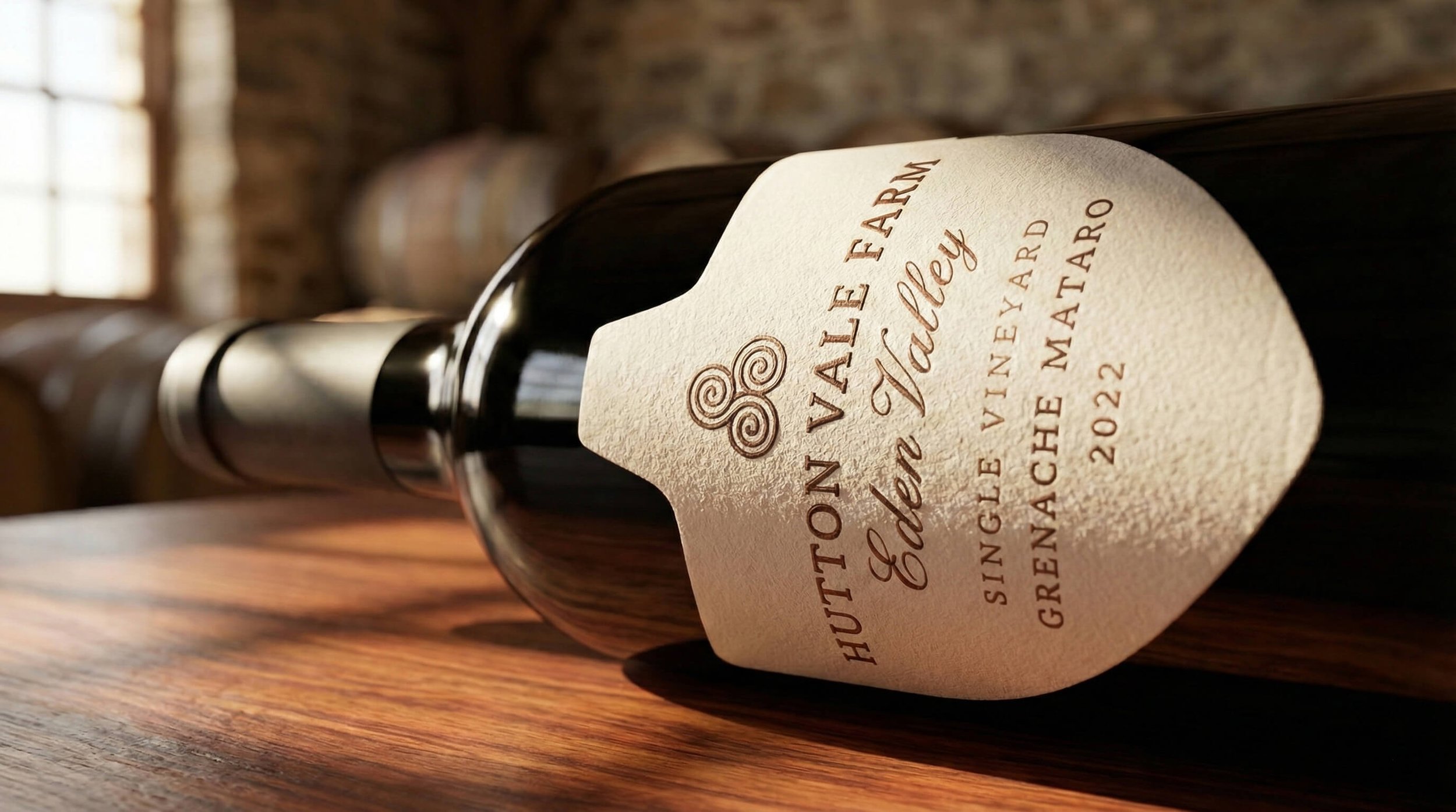
Hutton Vale Farm — Family Owned Winery
Challenge
The quality of the wine wasn’t being reflected in how it was perceived on shelf.
Solution
REFRESH – strategic packaging redesign
Outcome
Increased pricing confidence at a premium price point, with sales holding steady and margin improving.
Built through a clear three-stage approach
Clarity → Visibility → Consistency
THE CHALLENGE
This was a capable, family-owned winery producing high-quality wine with a proven product in market. The winemaking was strong, and the business had clear growth ambitions.
What wasn’t keeping pace was price signalling. Competitors using the same fruit and producing comparable wine were successfully selling at higher retail prices. Despite similar quality, this brand consistently undersold itself.
This mattered commercially because growth was stalling. The business knew it could do better but lacked confidence that the existing label justified a higher price — creating a gap between product quality and market perception.
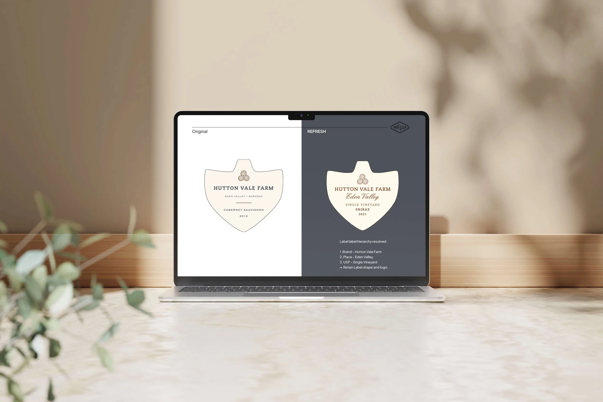
The issue wasn’t the brand itself, it was how confidently the packaging was signalling value at shelf. That made a full REBRAND unnecessary and a targeted RFRESH the right move.
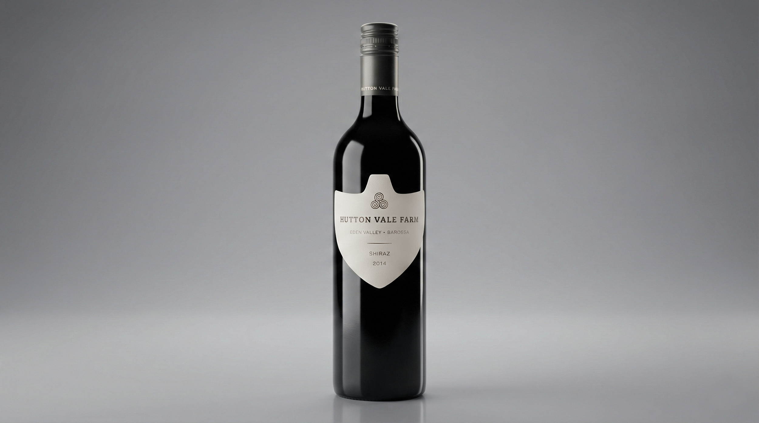
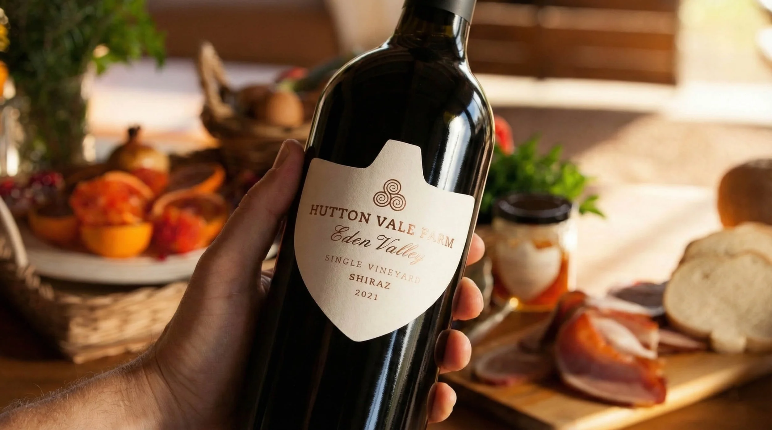
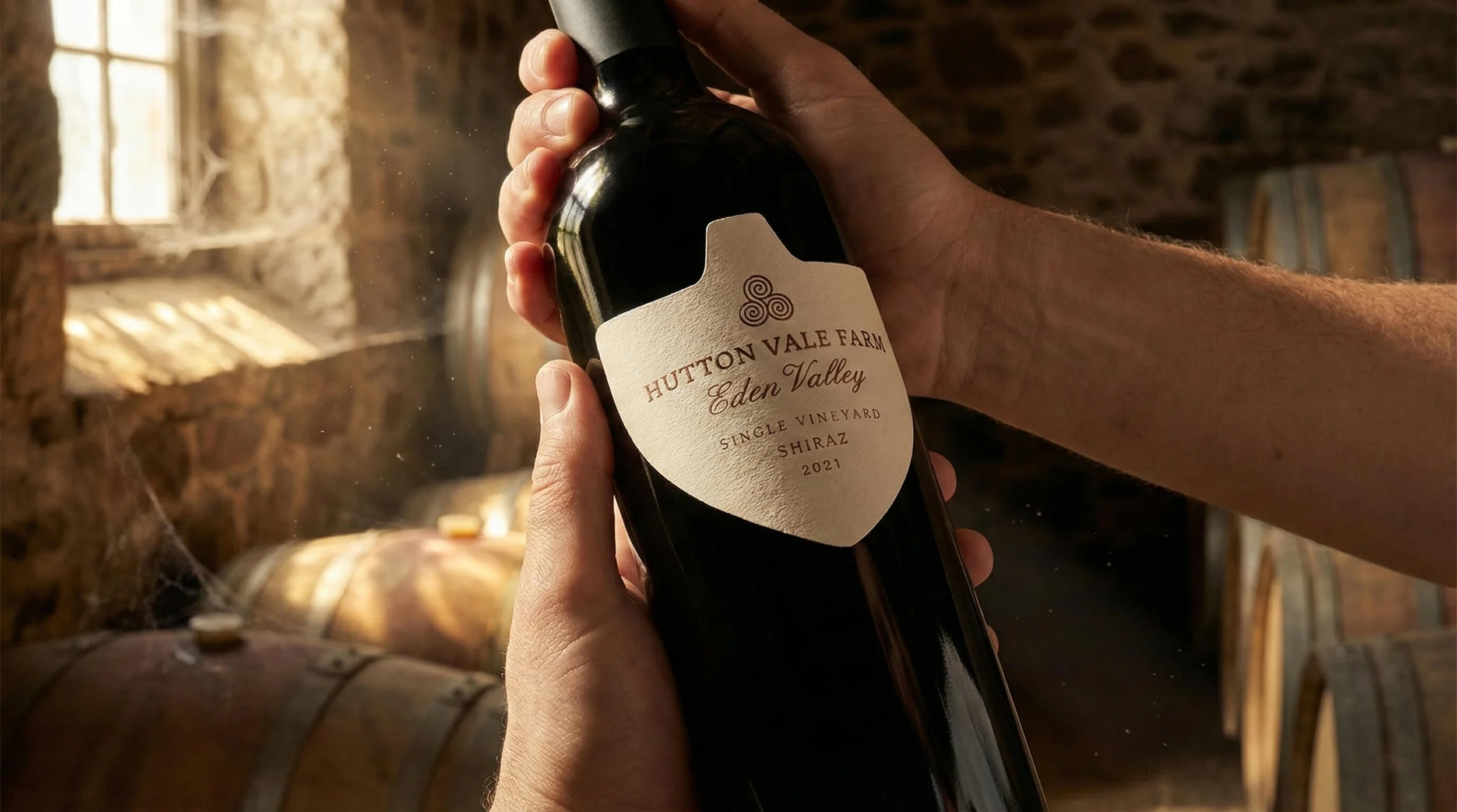
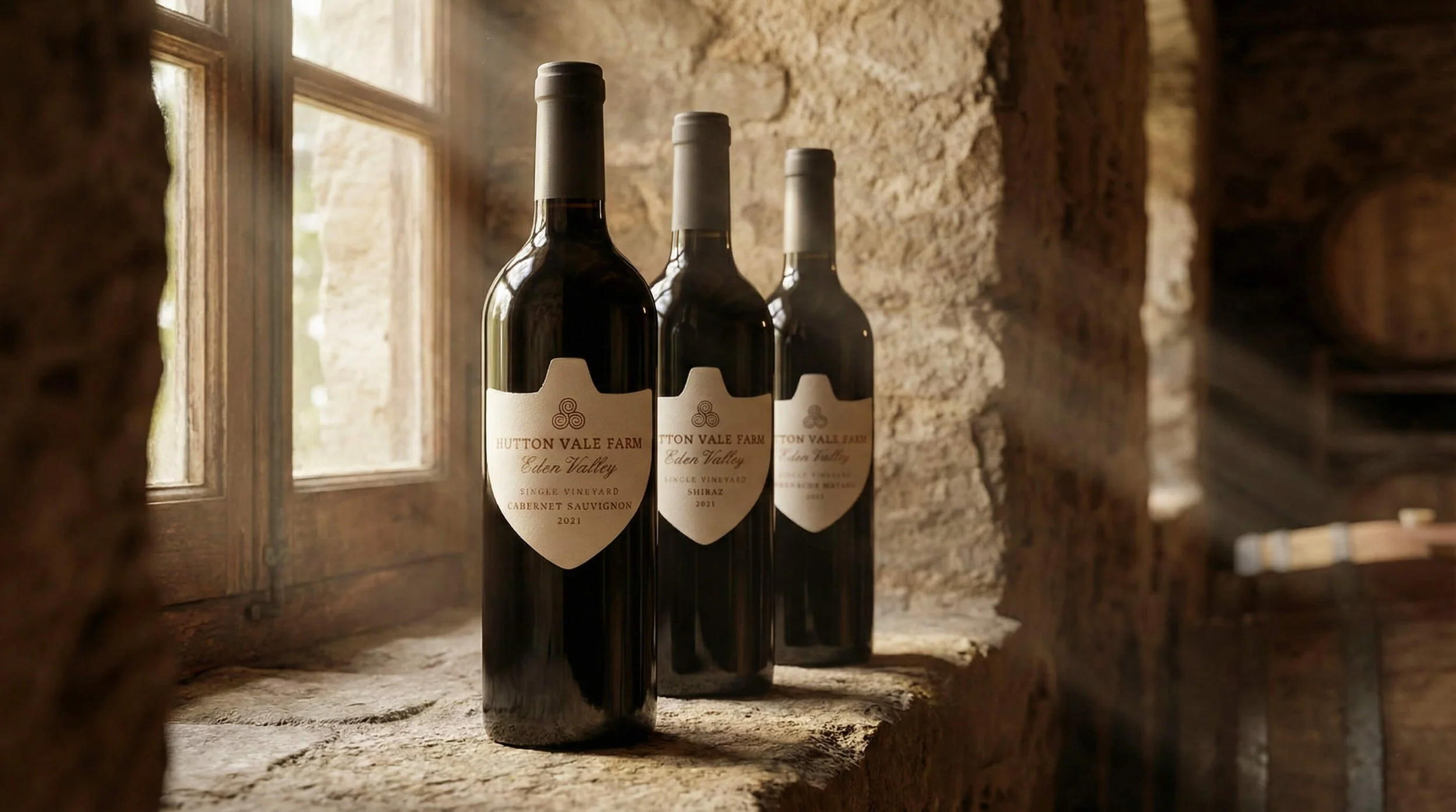
Before
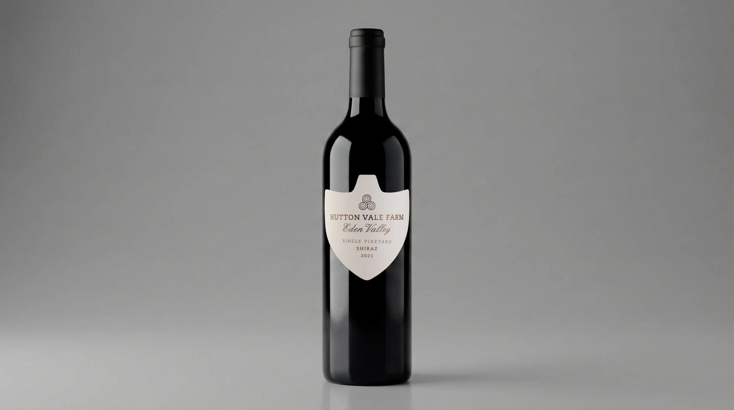
After
OUR APPROACH
The work was guided by one principle: premium signalling alignment through clarity.
Rather than redesigning everything, the focus was on refining what already worked.
Key decisions included:
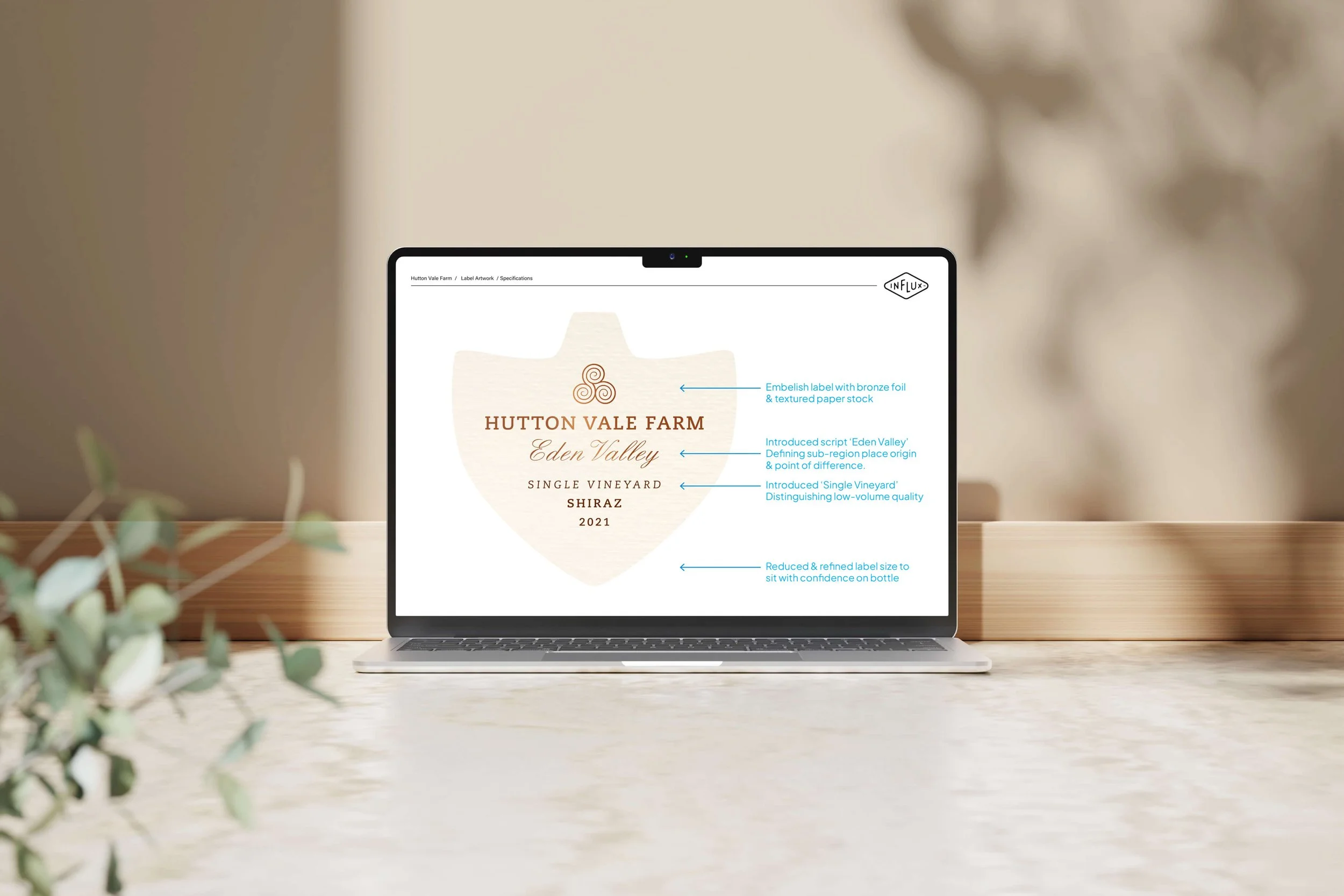
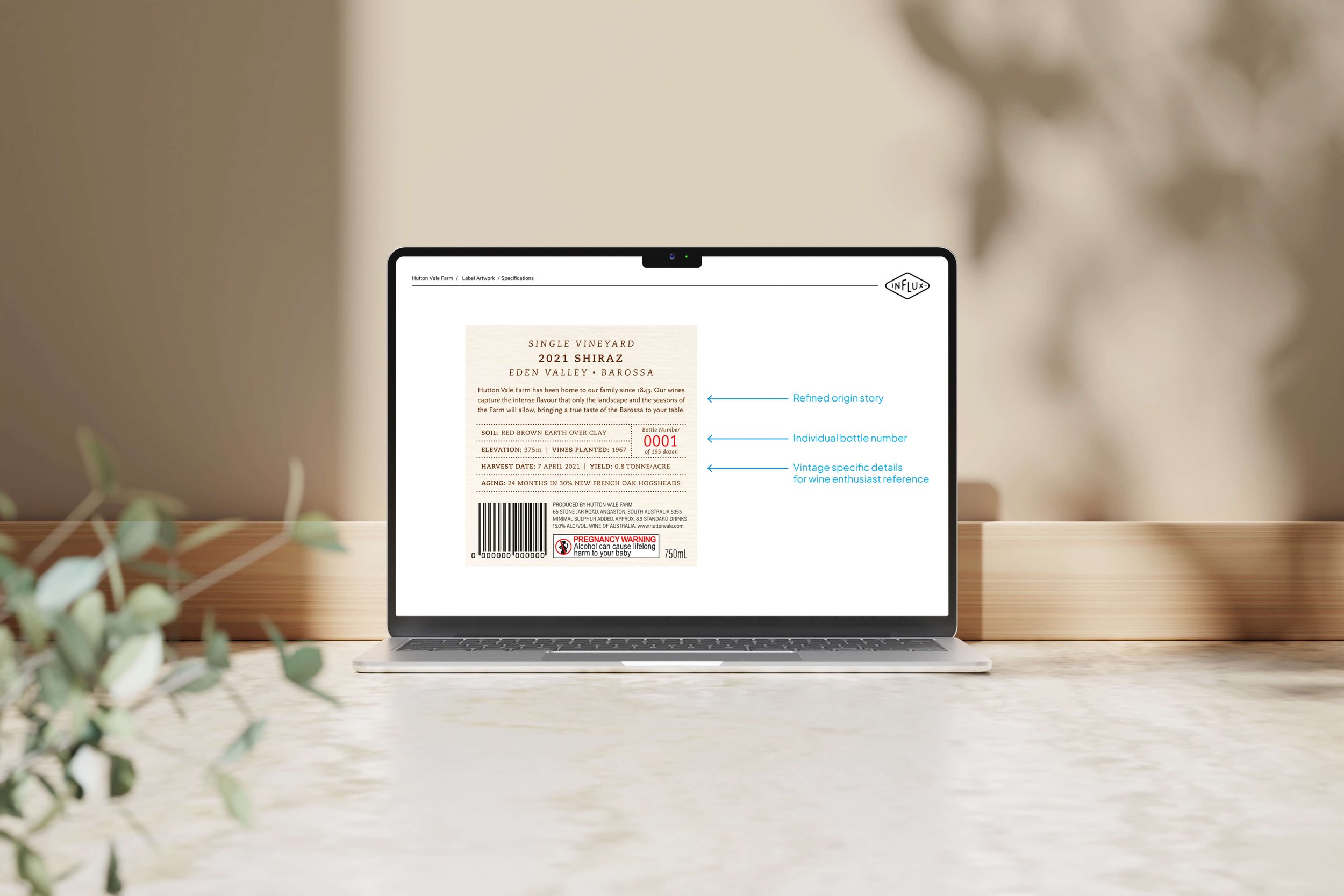
Refining label size, placement, and the signals that influence perceived value
Clarifying messaging to better communicate quality and justify price for the intended audience
Adjusting closure choice to cork to reinforce premium cues
Providing packaging options through visual mockups to support confident decisions
Deliberately, no rebrand was undertaken. The logo and label shape were already strong and recognisable. The task was to improve clarity and authority — not introduce unnecessary change.
THE RESULT
The winery gained confidence to price in line with quality.
Externally, the business increased RRP per bottle by 36%, while sales remained steady. This translated to a 30% increase to the bottom line, proving the market accepted the higher price point.
Internally, decision-making became simpler. The team aligned around the packaging, pricing conversations became easier, and customer feedback was consistently positive.
The results were both qualitative and quantitative — without relying on hype or overstatement.
WHY IT WORKED
By focusing on strategic packaging redesign, the work addressed the real commercial issue: perception. Improving how information was prioritised, communicated, and valued closed the gap between product quality and how the wine was ultimately perceived.
This clarity-first approach meant only the changes that mattered were made — creating outcomes that are repeatable for other established producers facing similar pricing pressure.
“The packaging feedback has been very positive, as expected. We are extremely happy with the outcome!”
IS THIS FOR YOU?
You’re experiencing flat or declining sales despite strong product quality
You know your product could command more, but lack pricing confidence
You want clarity and restraint, not a full rebrand
You’re open to strategic guidance and measured change
This is not for businesses looking for quick fixes, cosmetic design changes, or the cheapest label solution.