REBUILD
A REBUILD used to introduce an icon tier with confidence.

CASE STUDY
Client / Category
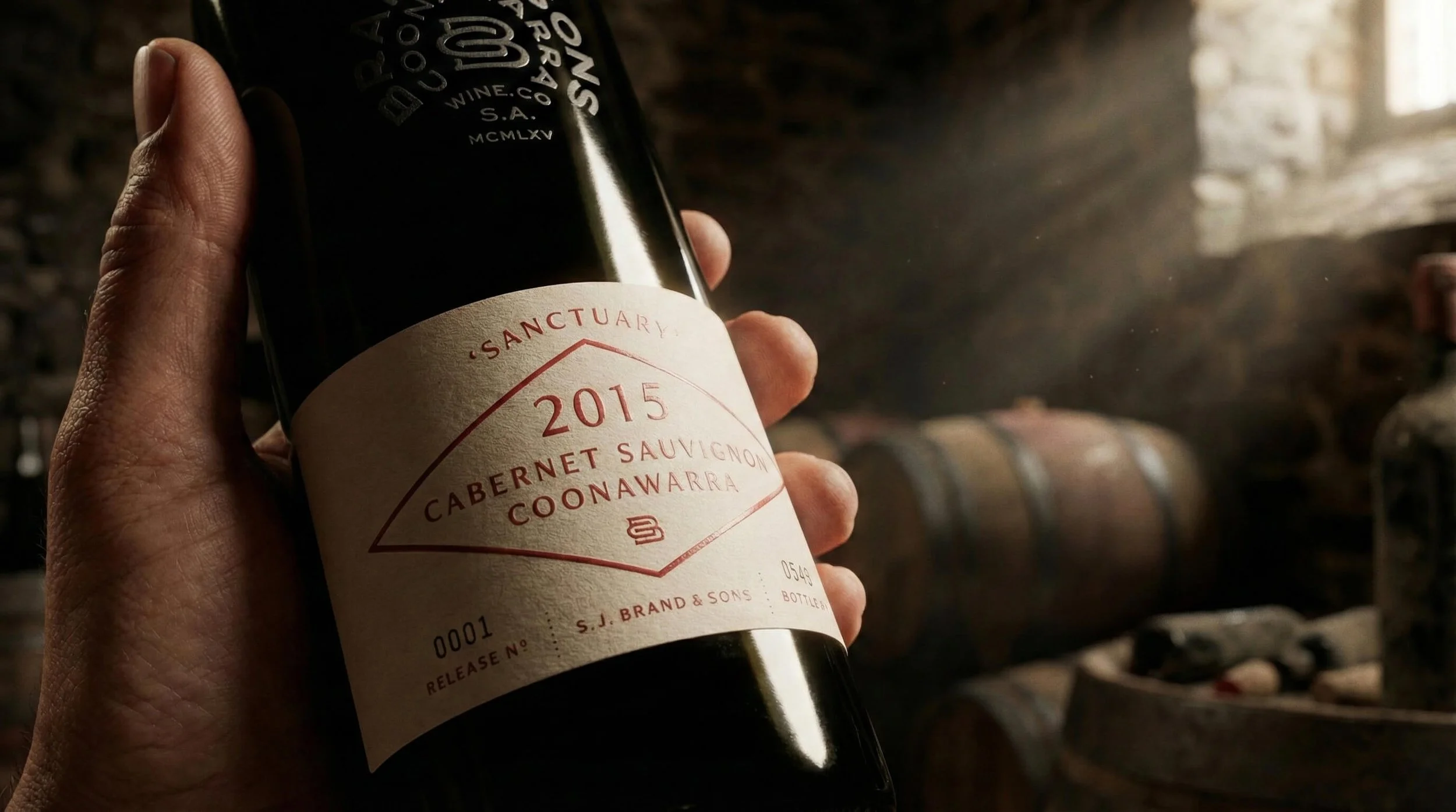
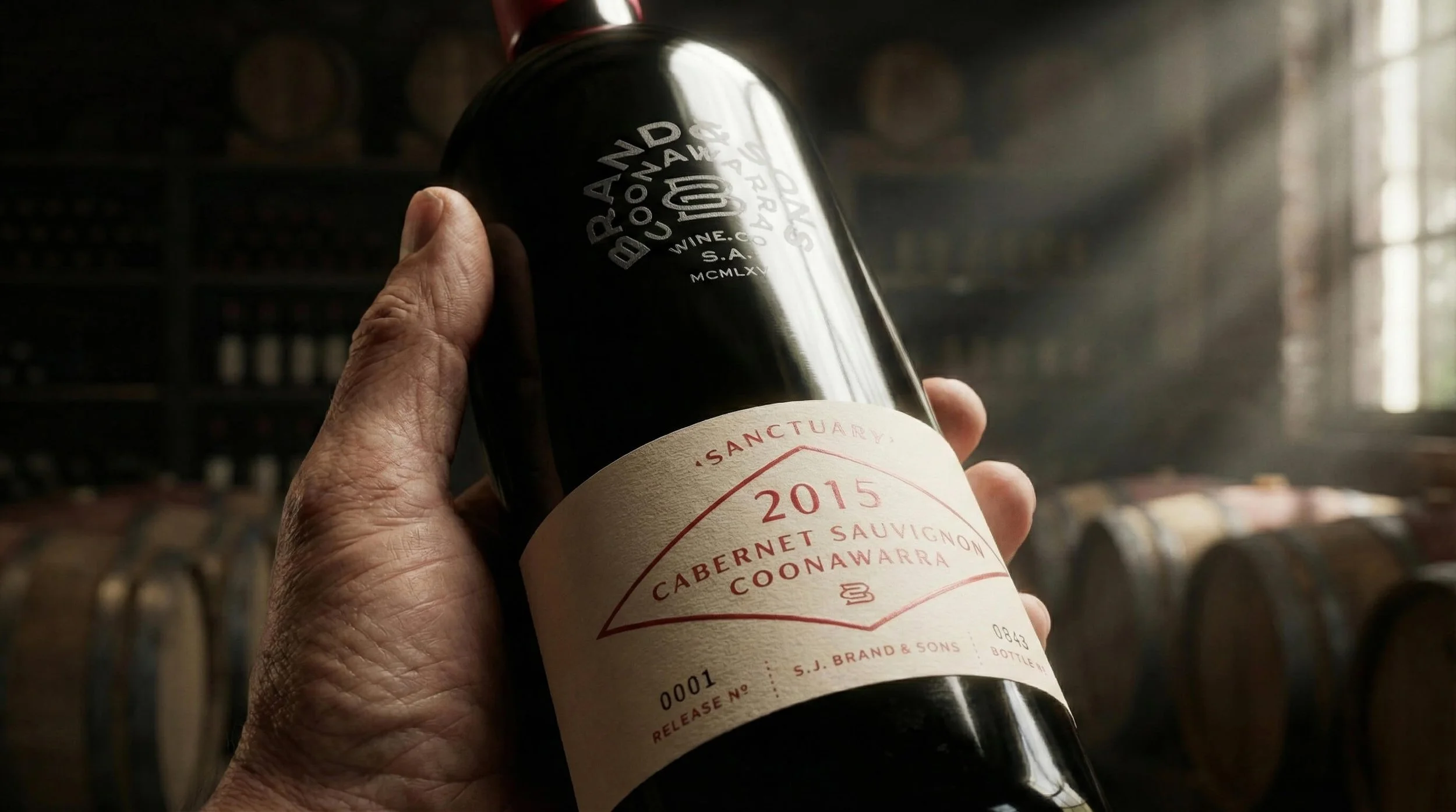
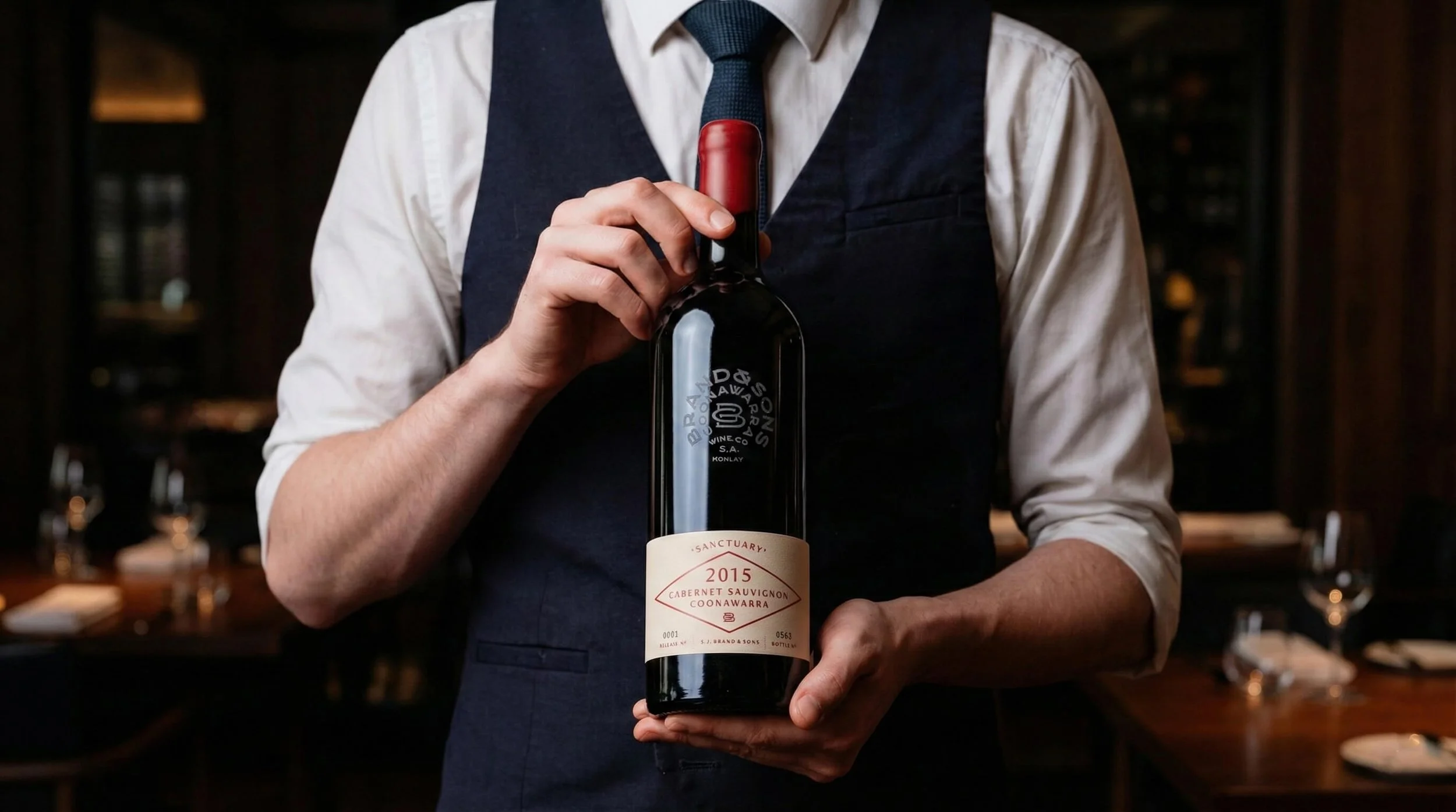
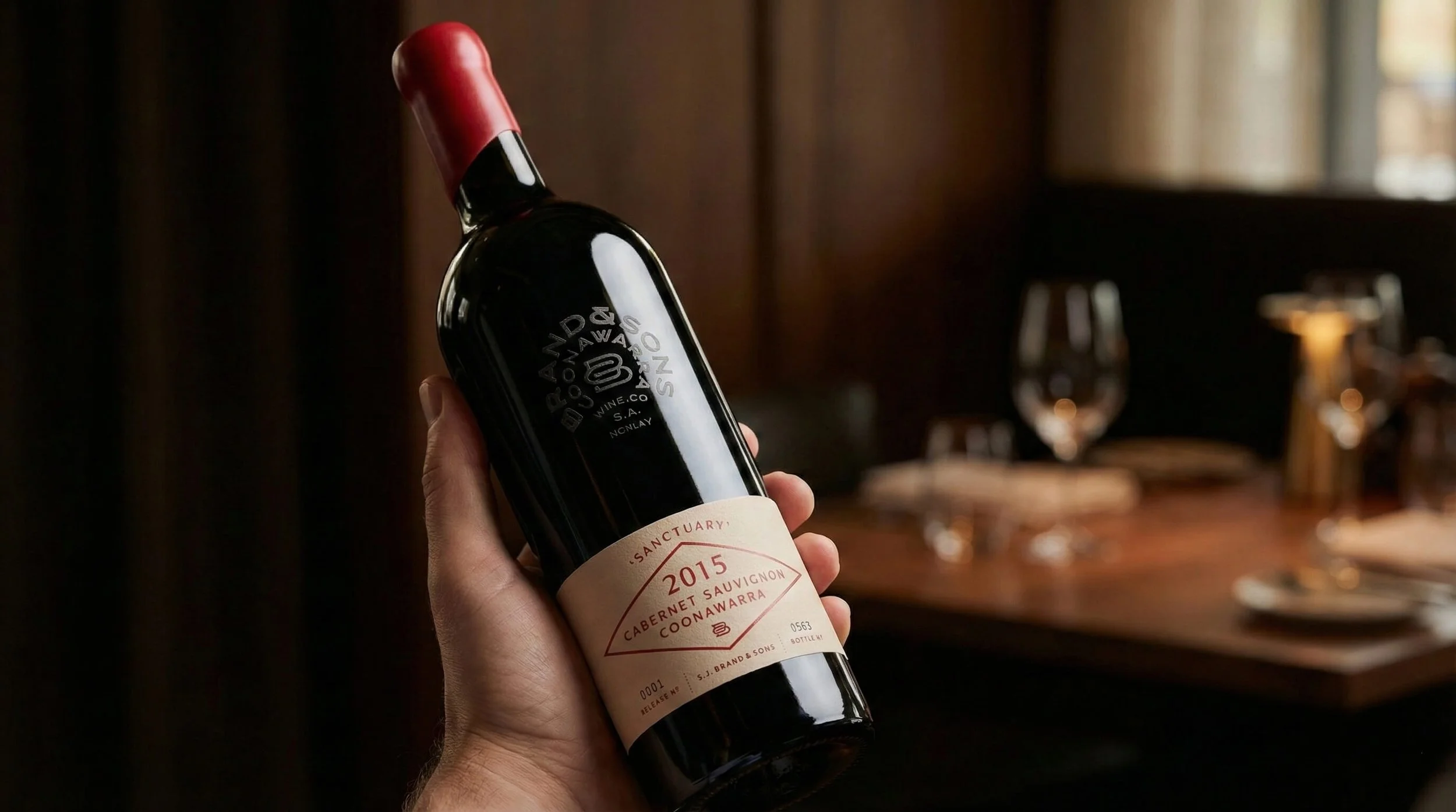
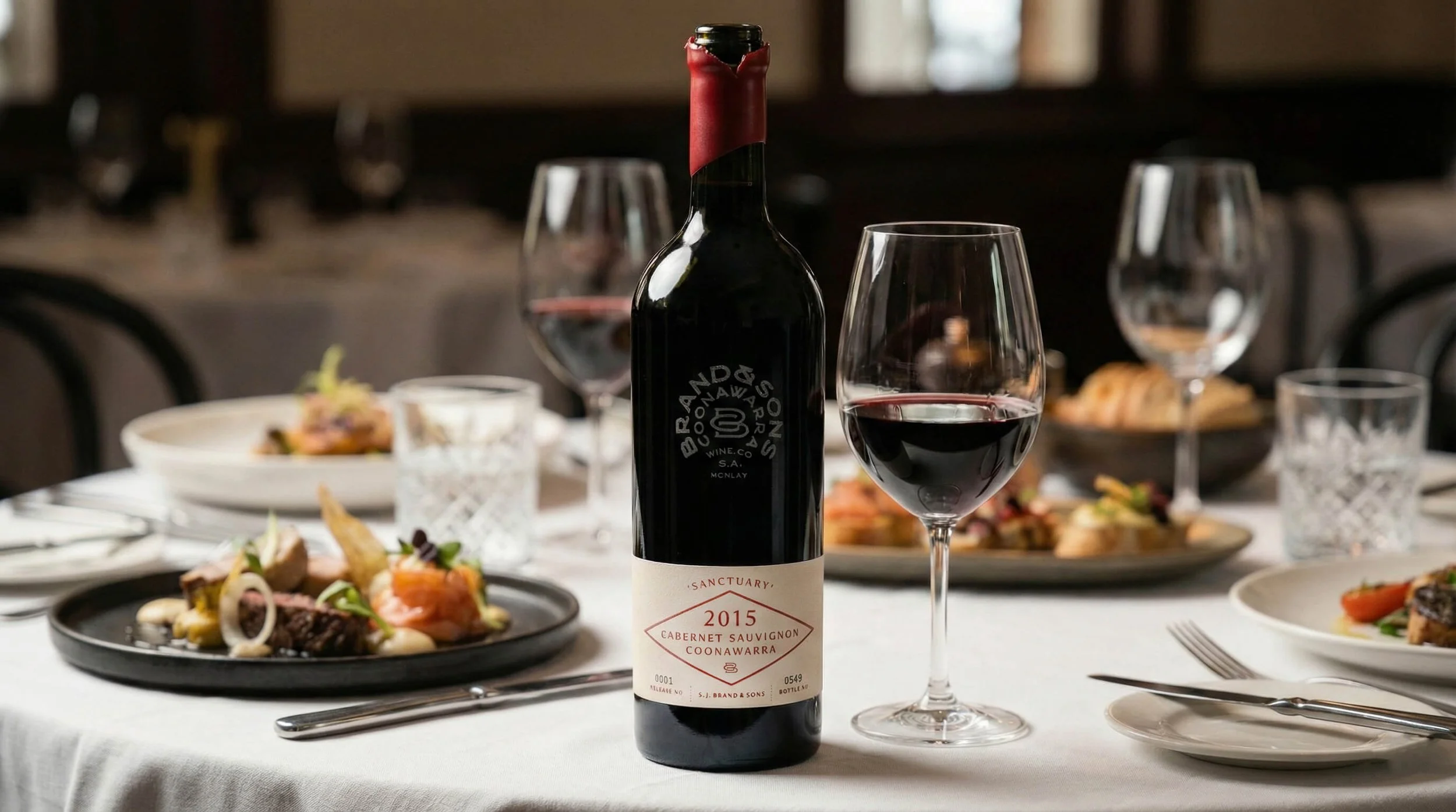
Brand and Sons — Premium winery
Challenge
Introducing an ultra-premium icon wine without weakening the existing range
Solution
REBUILD — a clear structure for introducing an icon wine
Outcome
A clear, credible icon release, grounded in place and family heritage.
Built through a clear three-stage approach
Clarity → Visibility → Consistency
THE CHALLENGE
The winery already held a strong reputation for quality regional wines, with a loyal customer base and consistent performance across its core range. However, the existing range wasn’t set up to support an ultra-premium wine. Introducing a single-vineyard Icon wine range from Coonawarra raised a specific risk: without clear hierarchy and separation, the new tier could confuse buyers or undermine established products.
This mattered commercially because the opportunity to claim icon status in Coonawarra depends on credibility, not volume. The constraint was precision. The icon wines needed to feel elevated while remaining clearly connected to the parent brand and its family heritage.
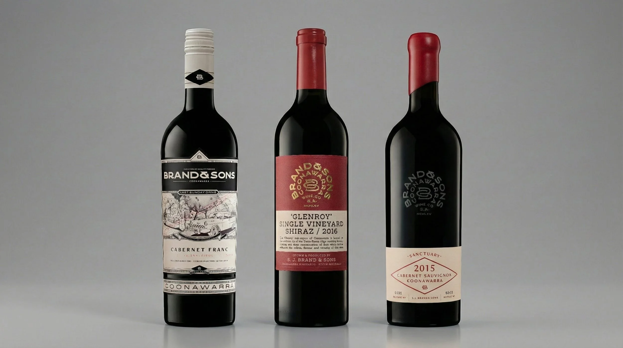
Icon
Premium
Super Premium
THE INSIGHT
A common response would have been to add more obvious luxury touches to signal price - foils, heavier stocks, and decorative finishes. That approach often looks impressive, but it doesn’t create real authority.
What was missing wasn’t polish — it was a clear way to show why this wine sat above the rest.
The business needed a simple, confident way to introduce an icon wine that felt earned, not dressed up. One that clearly signalled its place in the range, while staying connected to family, region, and reputation.
OUR APPROACH
Guiding principle: Create an icon wine that feels earned, not exaggerated.
What we did:
Clearly defined how the icon wine sits alongside the existing range
Locked the role of the icon wine before any creative work began
Let place, provenance, and family history do the talking — not surface decoration
What we deliberately avoided:
Creating a separate luxury sub-brand
Disrupting recognition of the existing range
Adding decorative elements that competed with heritage or place
THE RESULT
Externally, the icon release launched with immediate credibility. Its role was clear, and its value was easy to understand.
Internally, the team had confidence in how the icon wine should be presented and protected. With one clear signal in market, no redesign or repositioning was needed.
The structure held — and continues to hold.
WHY IT WORKED
The range was easy to understand at a glance. Buyers didn’t need explanation — the icon wine made sense immediately.
Credibility came from clarity, not decoration. This makes the approach repeatable for producers with strong heritage who want to introduce an icon wine without breaking what already works.
IS THIS FOR YOU?
You’re an established producer protecting long-term brand equity
You’re a winery introducing an icon or flagship tier within an existing portfolio
You’re committed to protecting heritage while evolving the portfolio
You’re a decision-maker who value clarity before execution
This is not for start-ups or early-stage brands, producers chasing luxury cues without substance, or businesses comfortable diluting brand meaning for short-term impact.