
REBRAND
Strategic REBRAND that brought clarity and confidence to a zero-alcohol spirits range.

CASE STUDY
Client / Category
Artisan Distillers — Zero-alcohol spirits distiller
Challenge
A growing range that lacked clarity at shelf, limiting trade confidence and slowing range uptake
Solution
REBRAND — full brand and packaging transformation
Outcome
Improved distributor confidence and stronger retail uptake
Built through a clear three-stage approach
Clarity → Visibility → Consistency
THE CHALLENGE
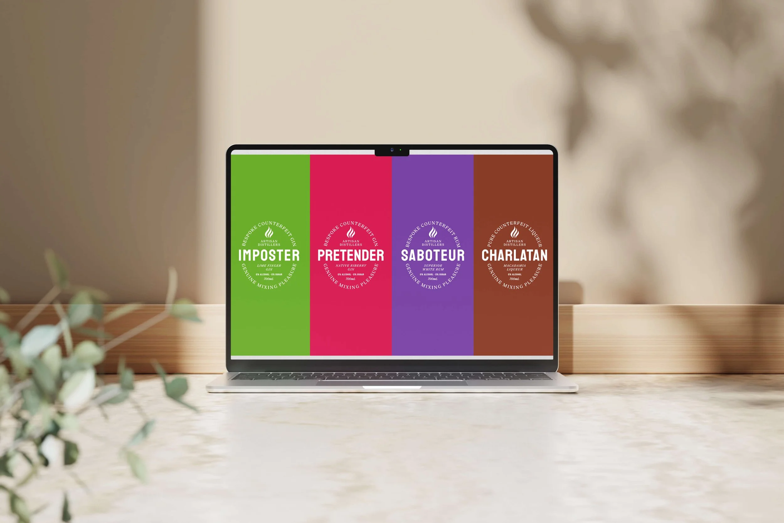
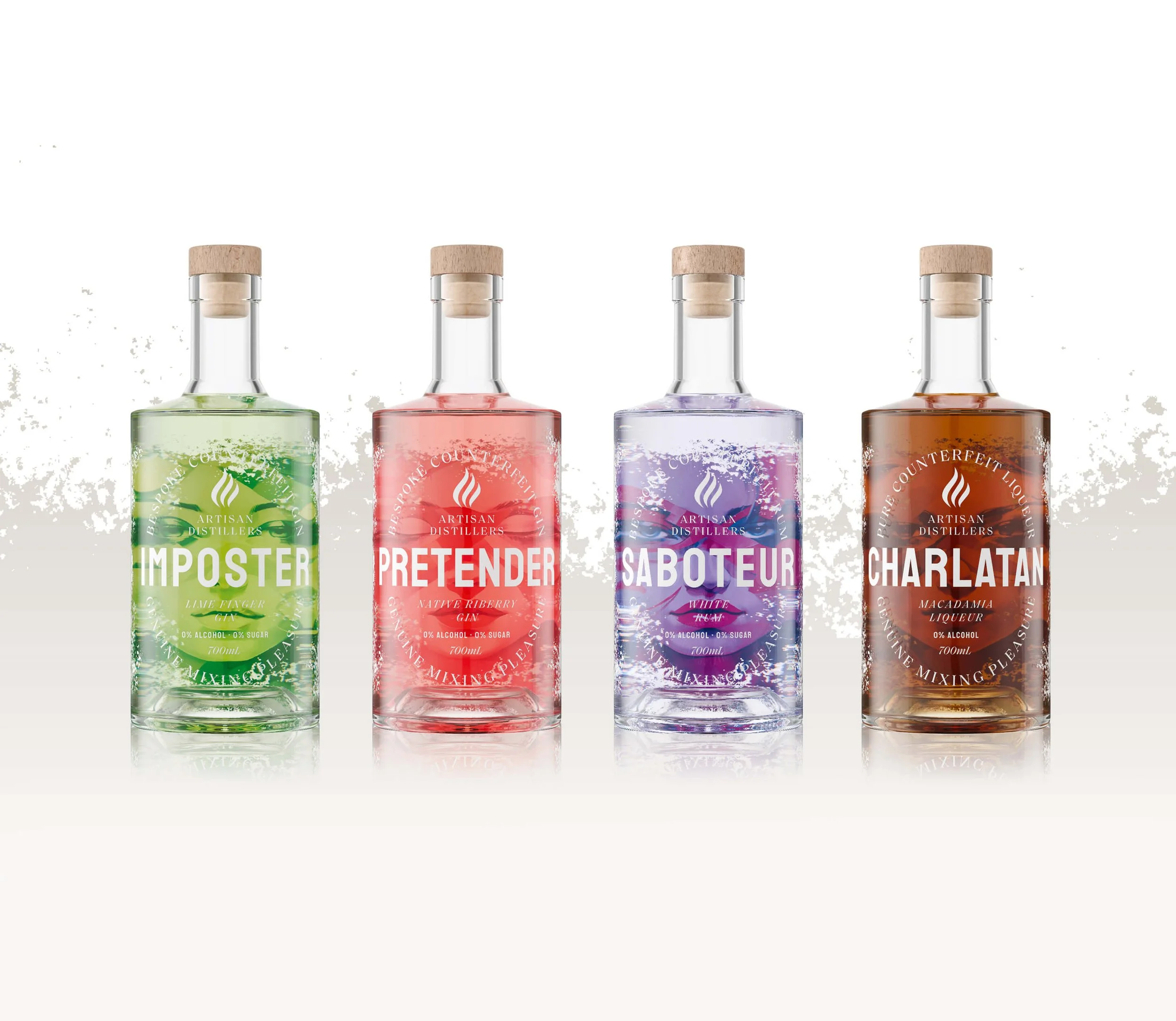
Interest in zero-alcohol spirits was growing, and the product itself was performing well in tastings and early conversations. However, the brand’s packaging hadn’t kept pace with the category’s maturation. At shelf, the range was hard to understand, with multiple SKUs competing rather than working together.
This created hesitation for distributors and retailers, who struggled to quickly grasp the brand’s role, quality cues, and target audience. In a fast-crowding category, unclear presentation became a commercial risk — limiting range uptake and slowing broader distribution momentum.

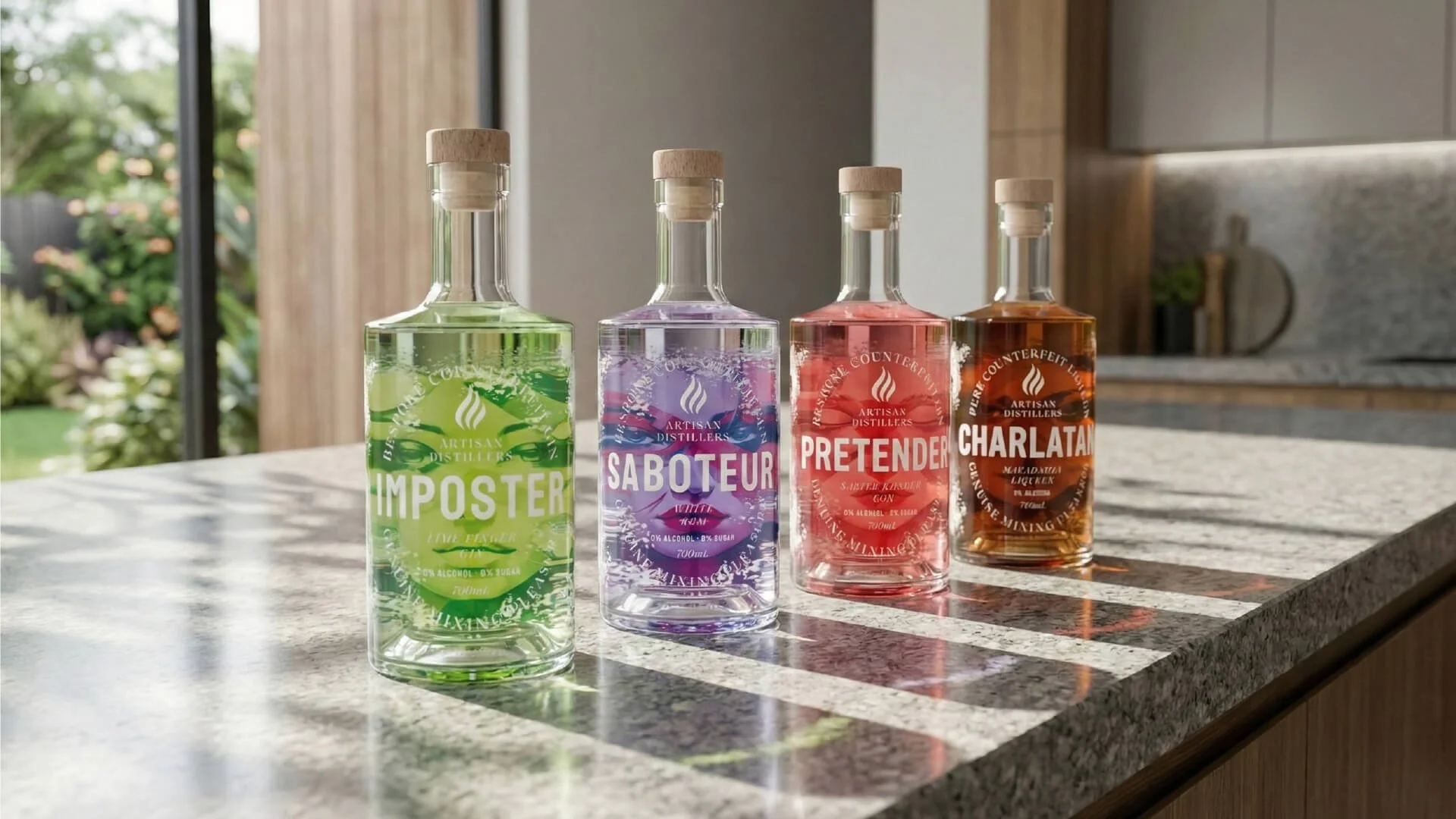
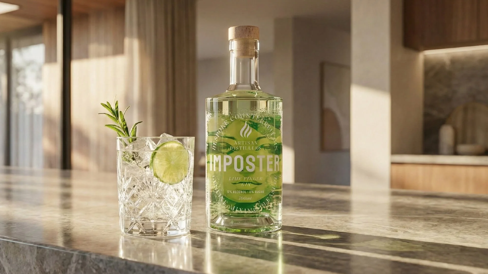
Before
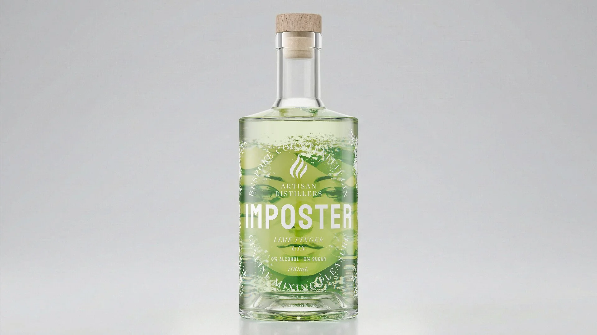
After
THE INSIGHT
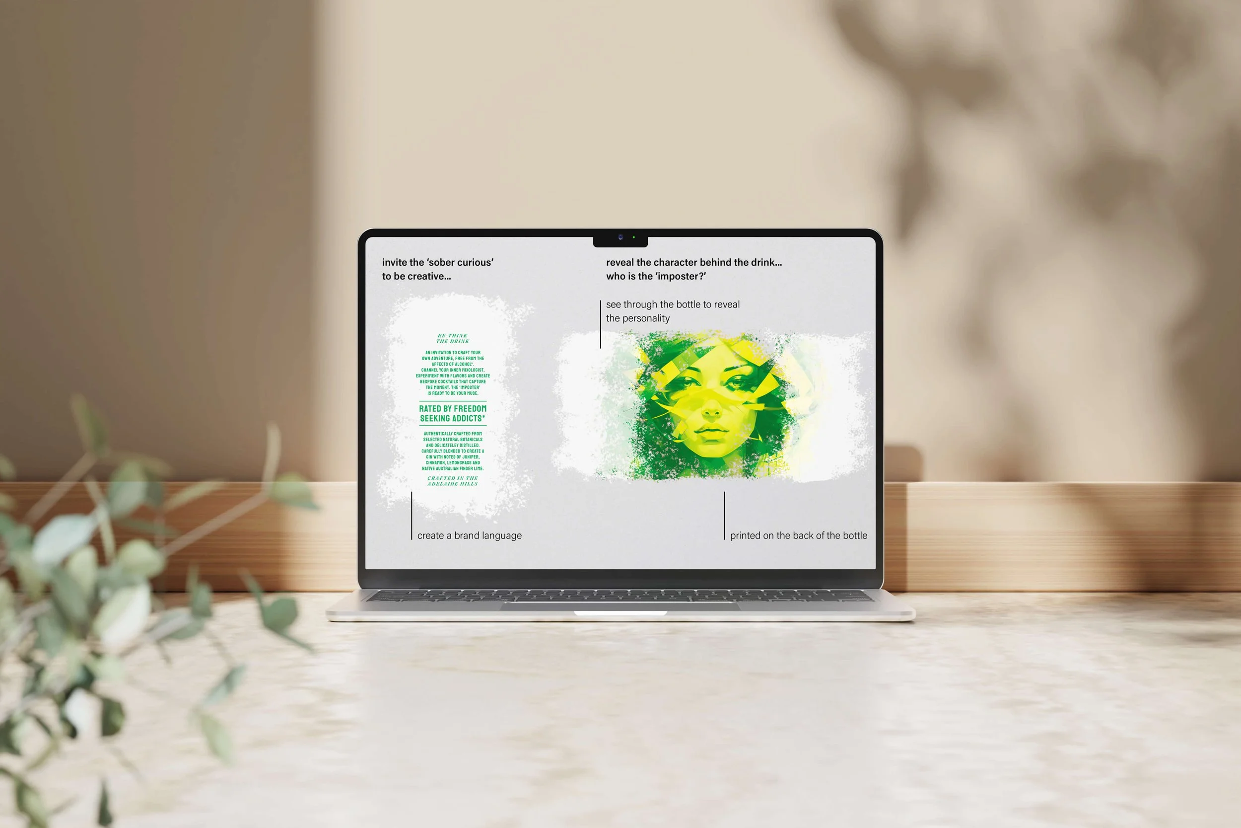
A typical response would have been to make each product louder or more visually distinctive to stand out. In an emerging category, that approach often increases confusion rather than confidence.
What was actually missing was clear category signalling at a brand level. The problem wasn’t individual labels — it was the absence of a unified system that clearly positioned the brand as a credible, premium zero-alcohol spirits range that trade could understand and sell with confidence.
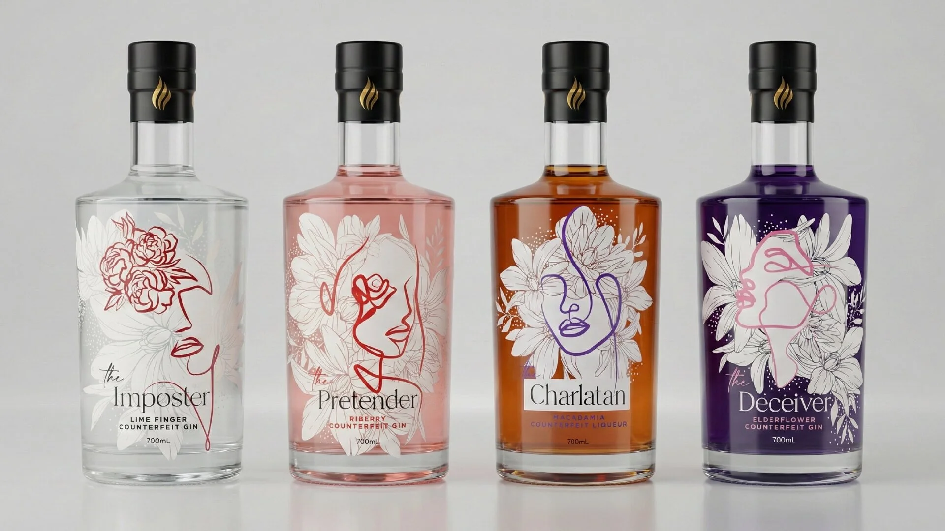
Before
OUR APPROACH
The work was guided by a simple principle: alignment over novelty.
Key decisions included:
Clarifying the brand’s role within the zero-alcohol spirits category
Defining the signals that justify premium pricing in the target market
Rebuilding the packaging system so the range read clearly as one brand
Ensuring the range communicates clearly and consistently across all SKUs
Design decisions were made from the perspective of the complete business — not just individual labels. Packaging and brand touch points were considered to ensure the brand held together wherever it appeared.


THE RESULT
Externally, distributor conversations became easier and more productive. The range was clearer at shelf, making it simpler for trade partners to understand how the products fit together and where they belonged. This led to increased uptake and stronger retail presence nationally.
Internally, the client reported greater pride and confidence when presenting the brand. With a clear system in place, decisions became faster and less reactive. The result was a mix of qualitative and quantitative gains, supported by positive distributor feedback and increased sales into retail outlets.
After
WHY IT WORKED
By prioritising category clarity over visual noise, the brand moved from being part of the confusion to setting a clear reference point in an emerging space. The REBRAND addressed how the brand was understood, not just how it looked, making the outcome repeatable for other categories where uncertainty limits sales.
IS THIS FOR YOU?
You’re an established beverage brand entering an emerging or misunderstood category
Your business has multiple SKUs that don’t yet work together at shelf
Your leadership team that wants trade confidence, not just better visuals
This is not for brands chasing novelty, trends, or execution-only design without strategic clarity