Nightfall Wines Luxury Wine Branding and Packaging Design, Coonawarra
CASE STUDY
In luxury venues, wine doesn't compete with other wine. It competes with everything else.
Client
Nightfall Wines
Category
Wine
Region
Coonawarra,
South Australia
Deliverables
Brand Identity
Visual identity
Packaging design
Awards
Communication Arts Design Annual (USA), Winner, 2022
AGDA (Australian Graphic Design Association), Packaging Design, Finalist, 2021
AADC, Packaging Design, Finalist, 2021
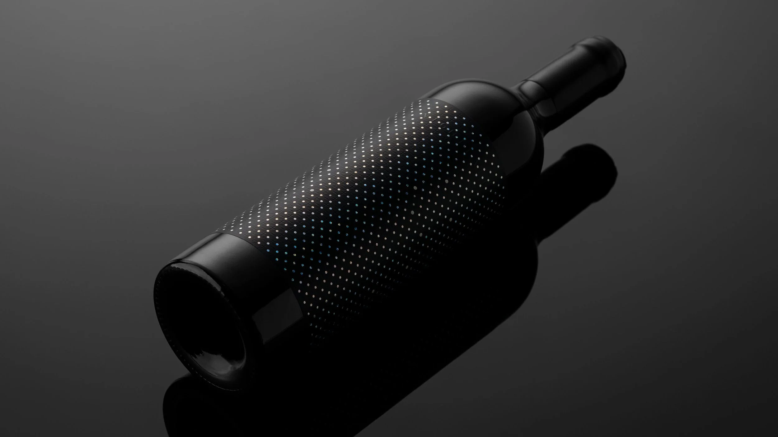
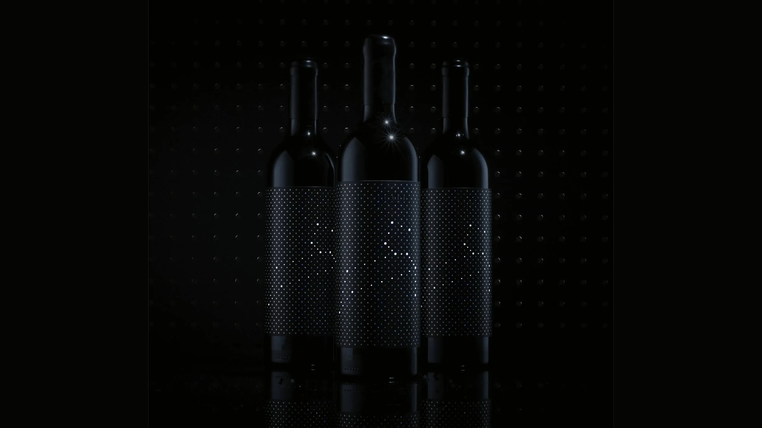
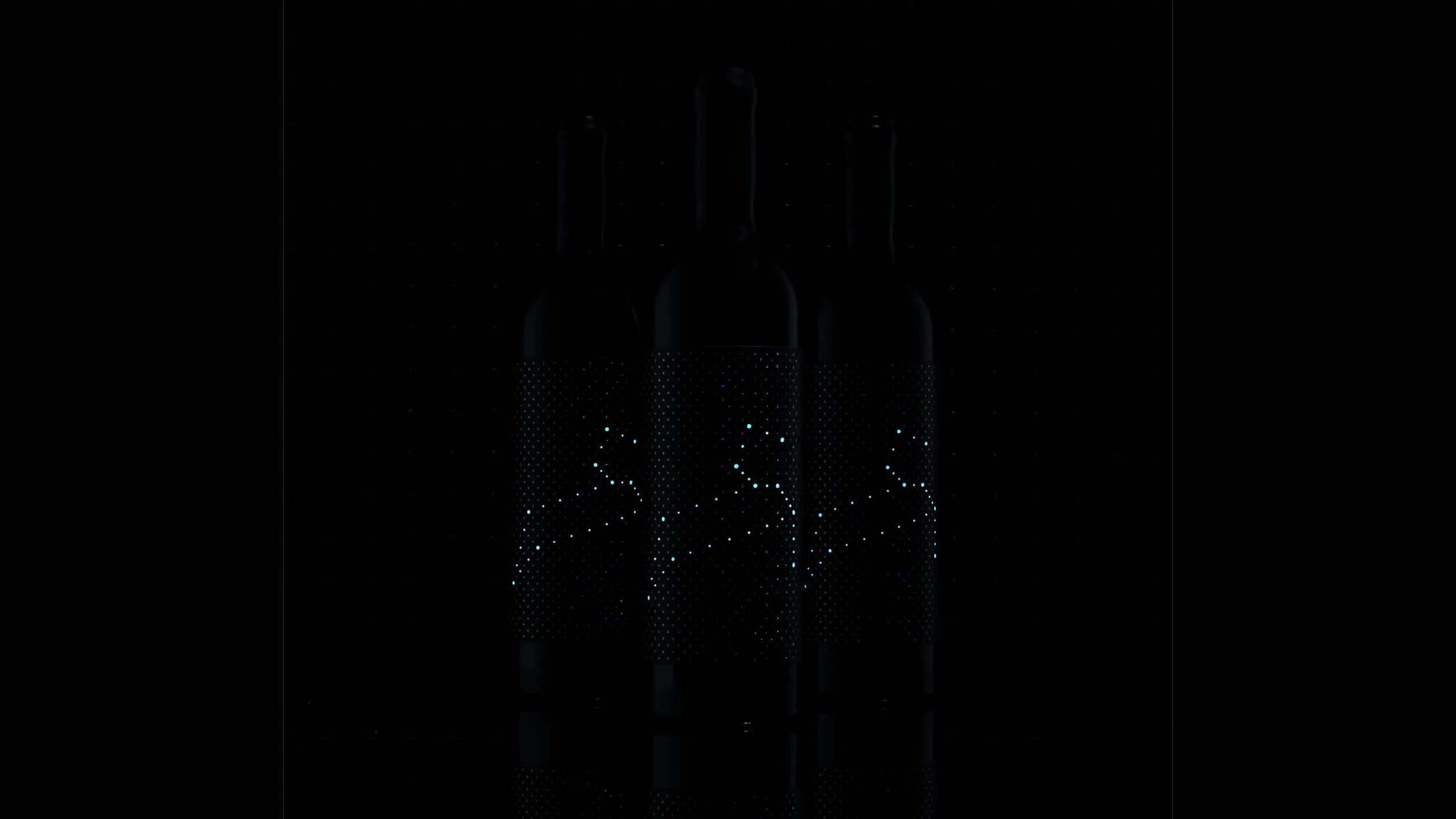
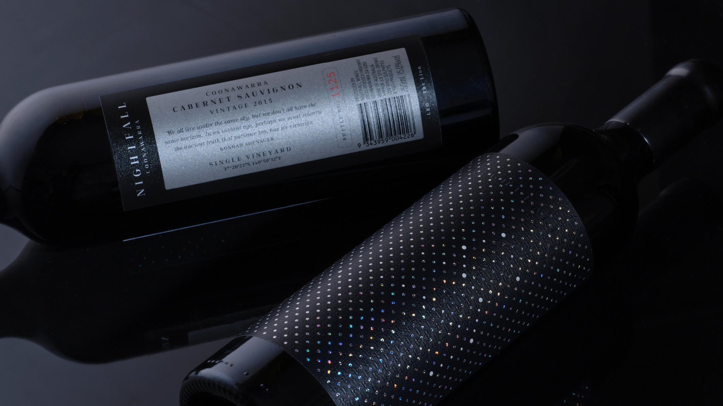
Luxury Wine Branding - Nightfall Wines, Coonawarra, South Australia.
Nightfall Wines had exceptional quality and real interest from export distributors. The opportunity was clear, and the window was narrow.
The parent brand, while credible domestically, wasn't built for where these wines were being positioned: nightclubs, fine dining, high-value gifting, luxury retail. In those environments, traditional wine cues would have been easy to overlook.
PROBLEM
The Brief: Build a Standalone Brand for Export and Luxury Channels.
DECISION
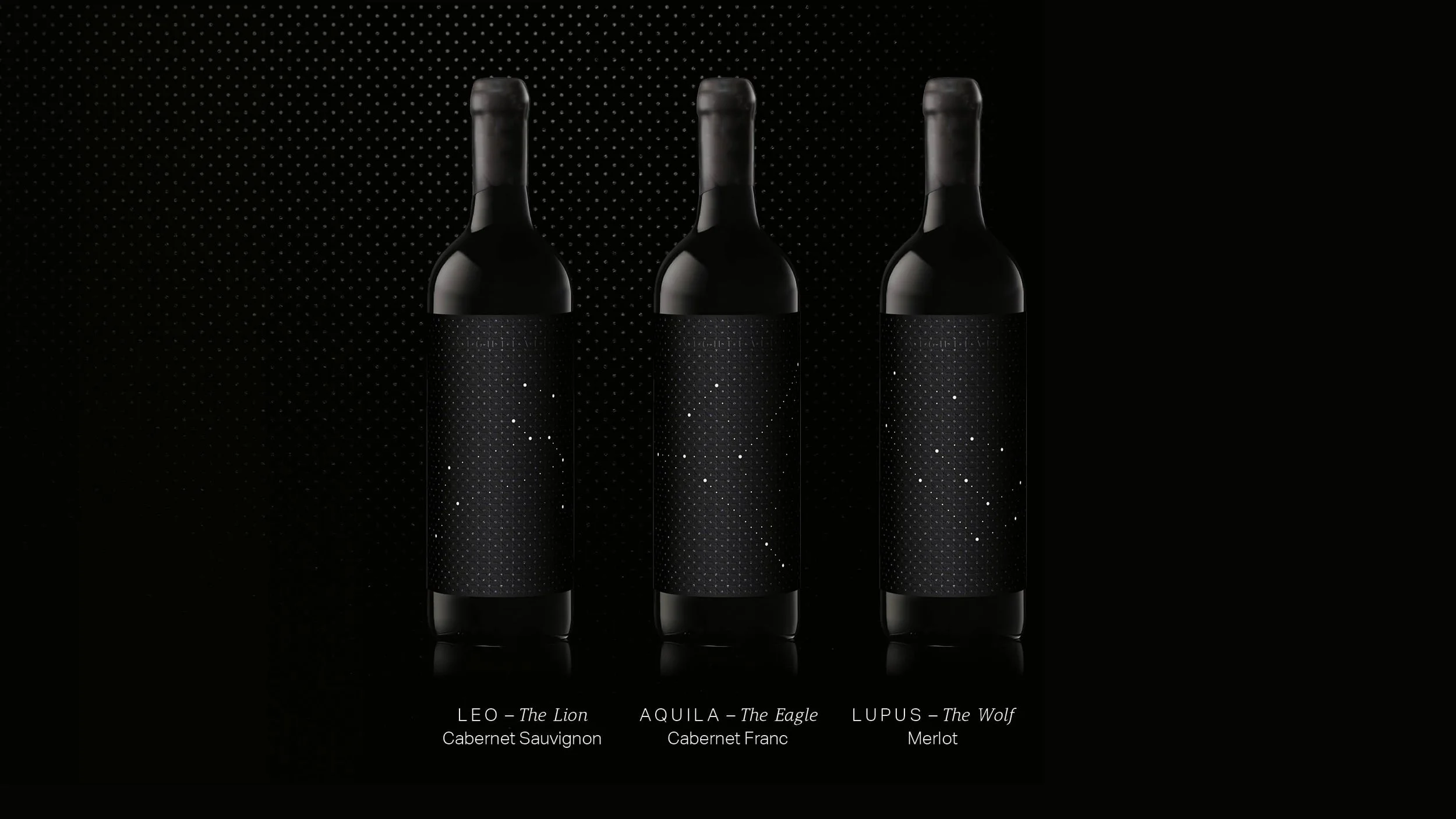
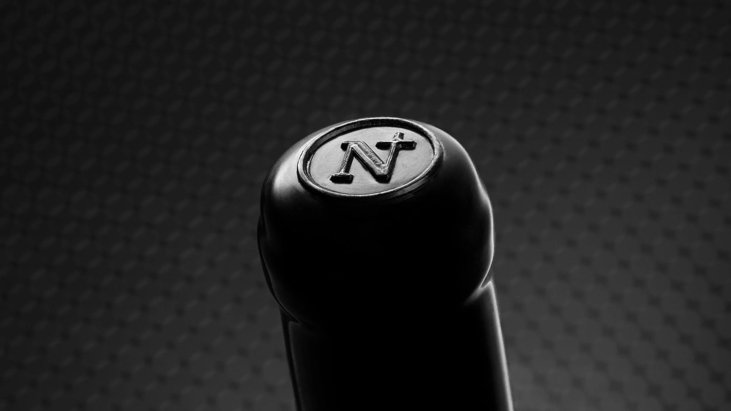
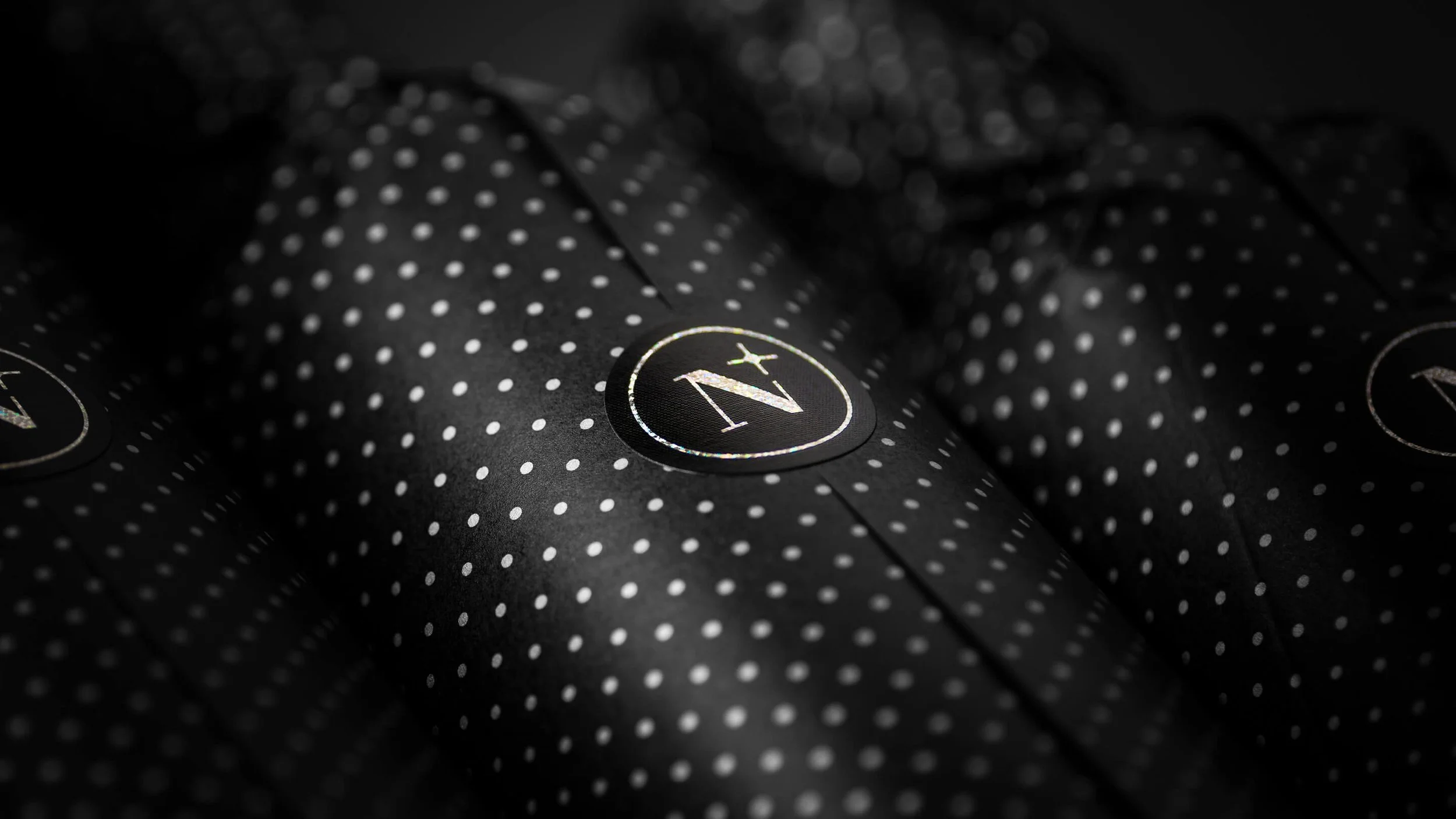
No Prominent Logo, No Varietal-Led Label - Built for Its Context.
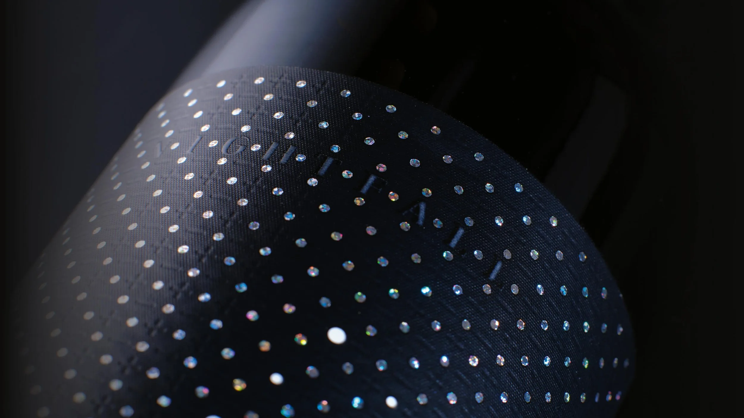
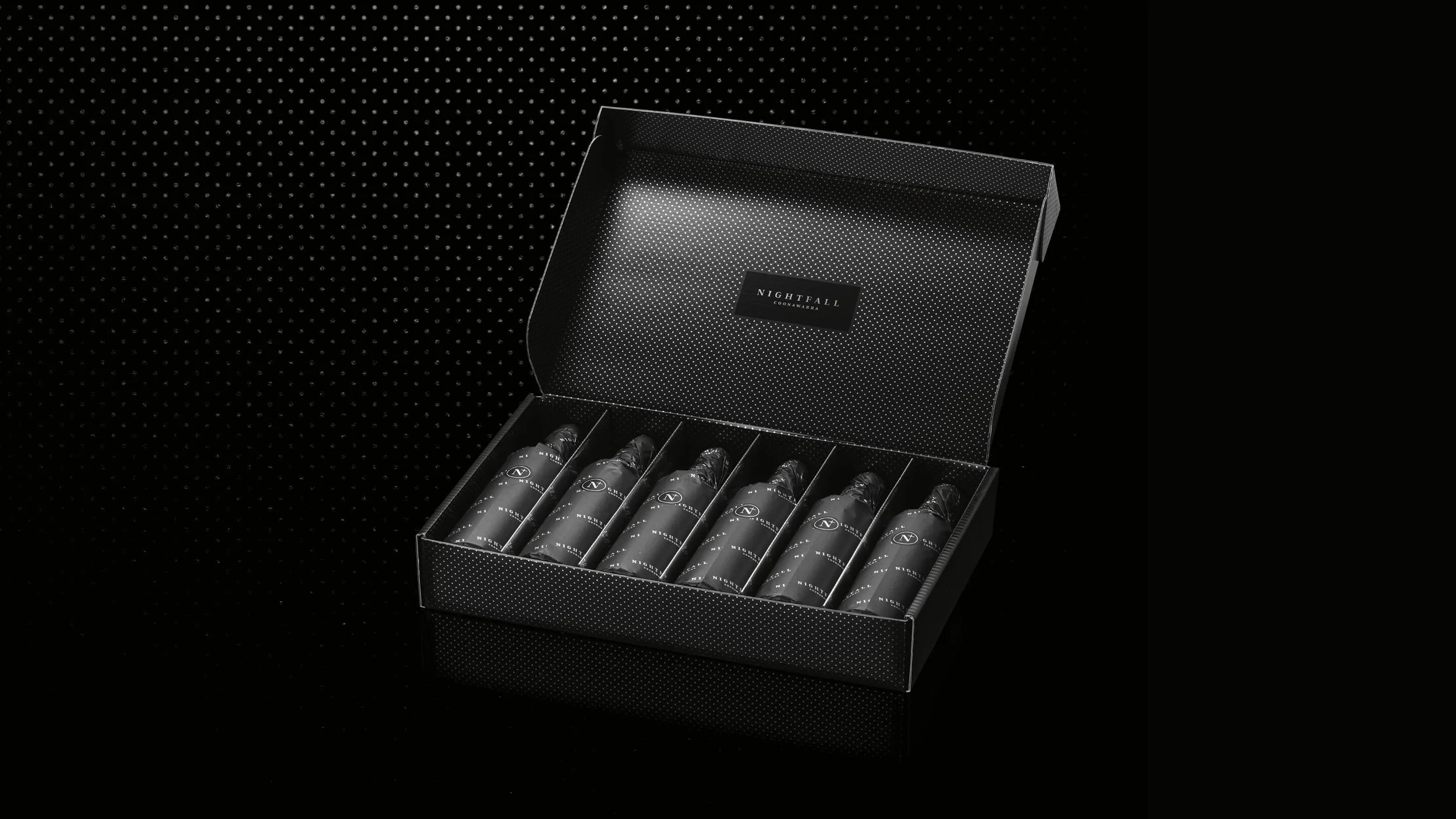
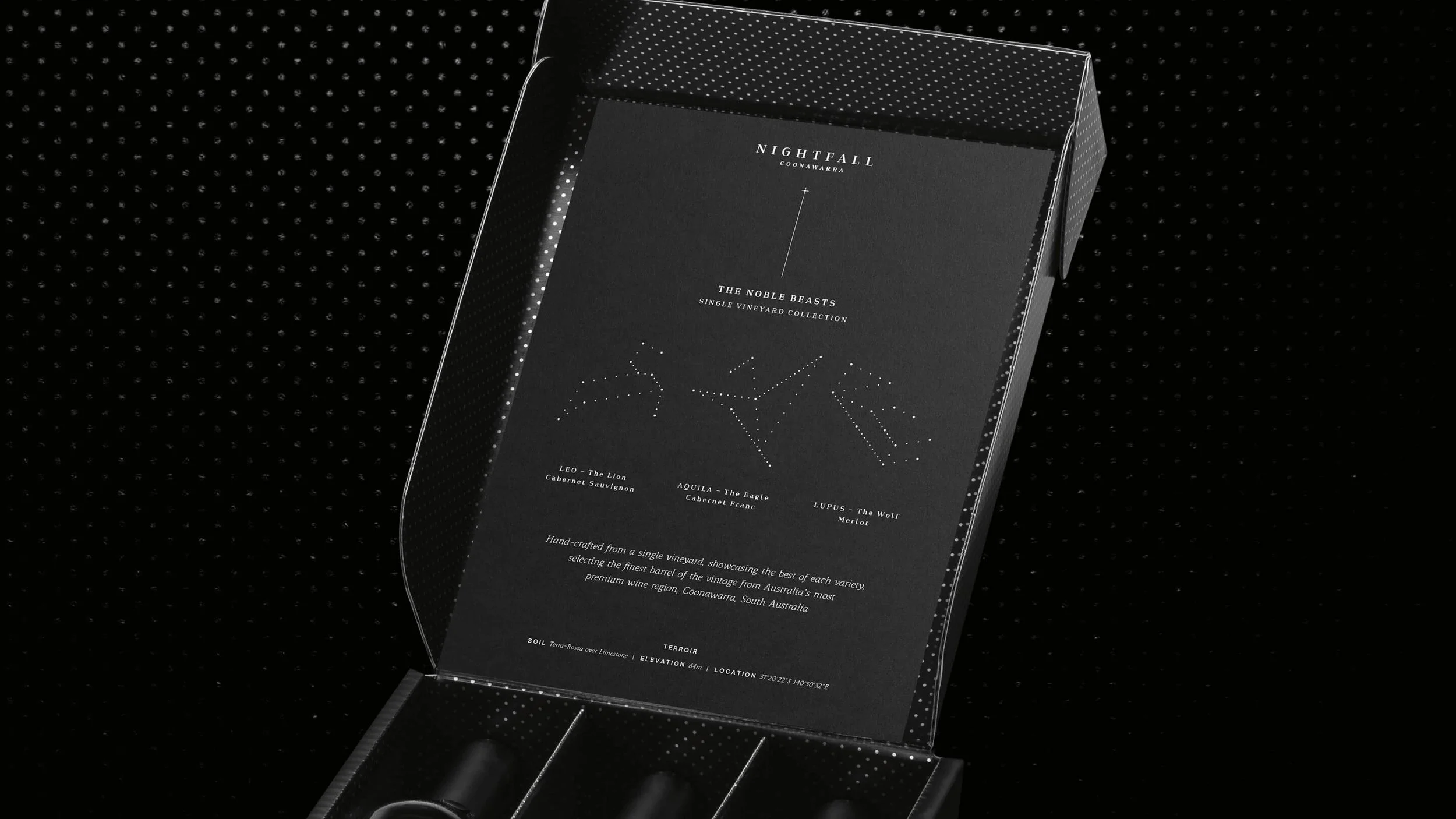
Subtle constellation patterns were embedded into the label surface, revealing themselves as light moved across the bottle, quiet at first glance, increasingly distinctive on closer inspection. A brand built to reward the environments it was designed to enter.
OUTCOME
Immediate Export Distributor Response, Premium Channels Unlocked
Ready to move your project forward?
Let's find out if we're a good fit.
Book a 30-minute clarity call no pitch, no pressure.