LOBO Djinn Gin Spirits Packaging Design, Adelaide Hills
CASE STUDY
The gin category is full of brands that look like gin brands. That's not a compliment.
Client
LOBO Cider & Spirits
Category
Spirits
Region
Adelaide Hills,
South Australia
Deliverables
Visual identity
Packaging design
Awards
Communication Arts Design Annual (USA), Winner, 2018
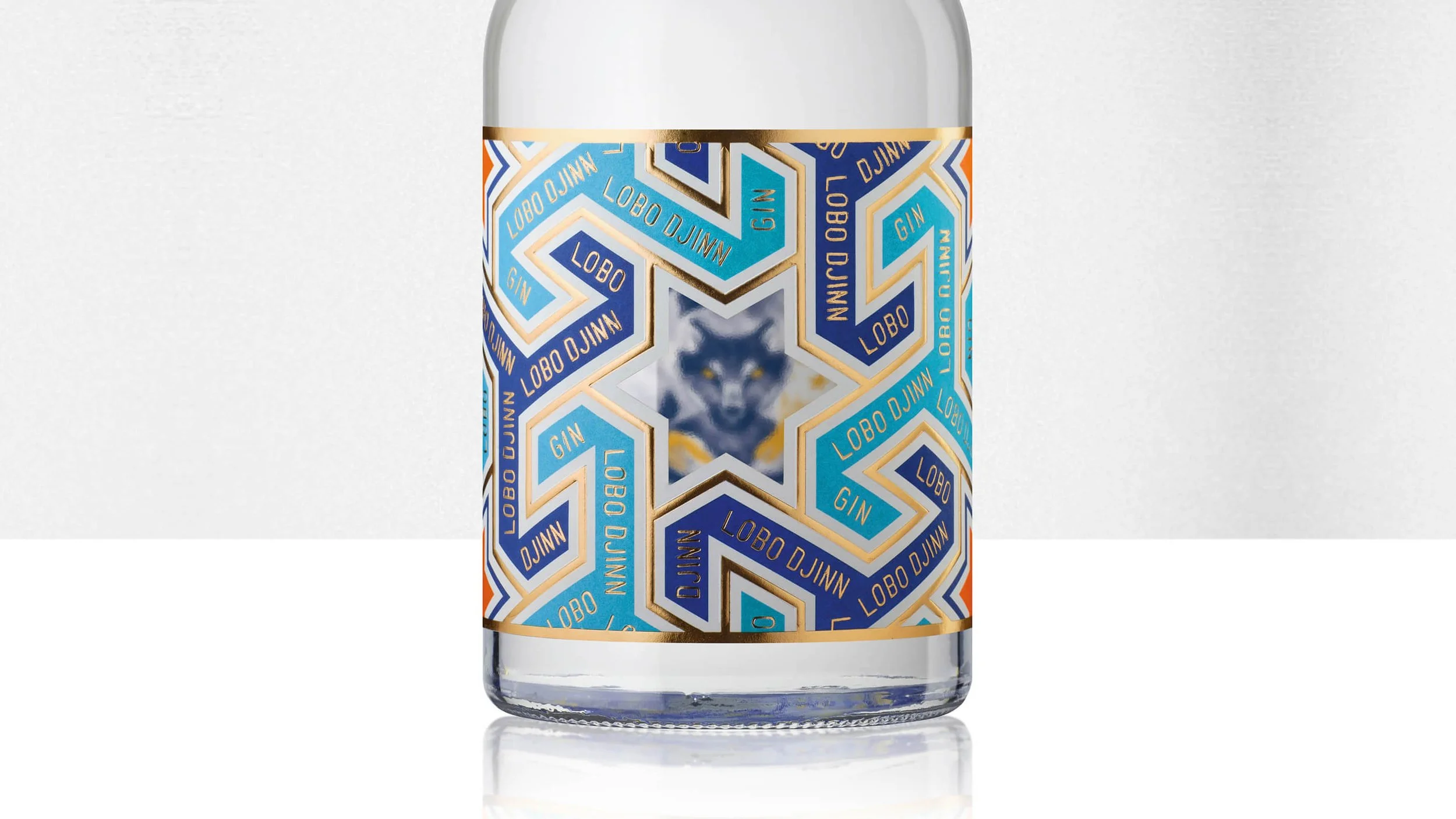
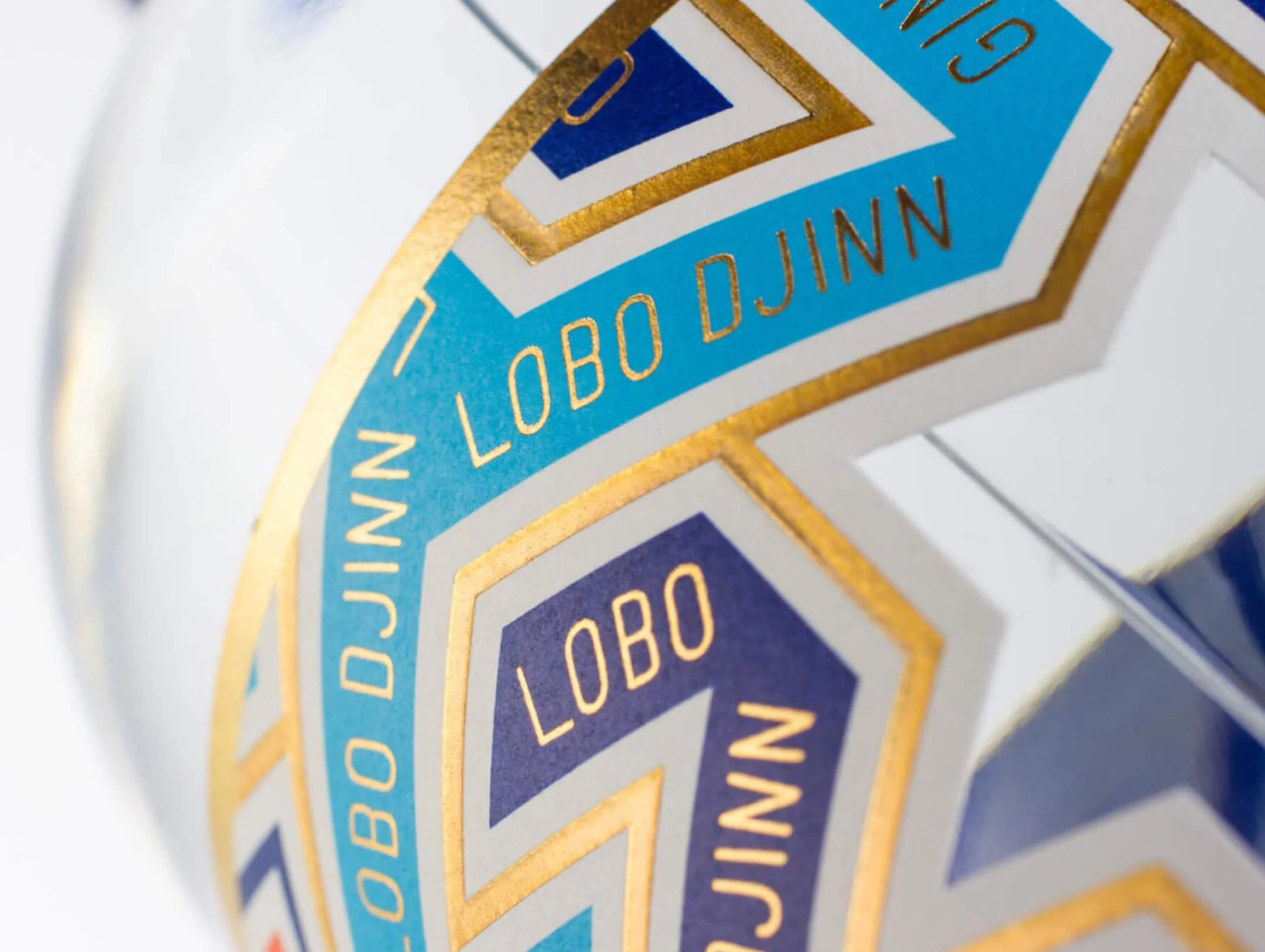
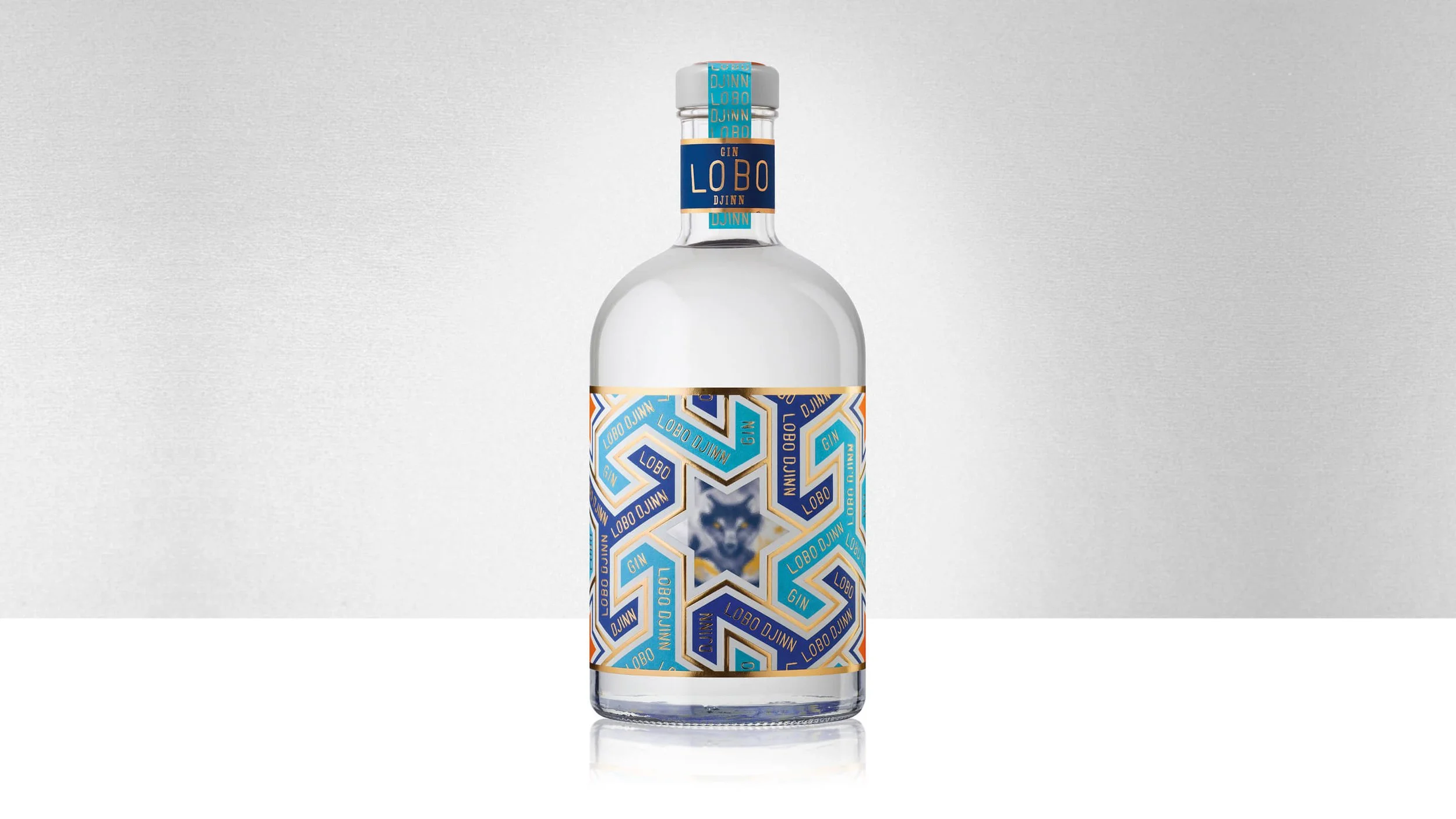
Gin Branding - LOBO Cider & Spirits, Adelaide Hills, South Australia.
LOBO had proven its spirits credibility with the successful launch of Apple Brandy. Gin was the next step, and the category was crowded.
Copying familiar gin cues to fit in quickly would have undermined the brand's distinctiveness and made future portfolio extensions harder, not easier.
PROBLEM
The Brief: Enter a Crowded Gin Category Without Looking Like Every Other Gin.
DECISION
Build a Structure the Whole Spirits Portfolio Could Grow Within.
Each product in the LOBO spirits range carries its own character and narrative. ‘Djinn’ Gin is built around quince grown in the orchard, expressed through the LOBO Djinn story. The structure remained consistent with clear product roles, coherent range logic, no trend-chasing.
OUTCOME
Chain Retail Uptake, New On-Premise Accounts, Year-on-Year Sales Growth.
The packaging design has remained unchanged since 2018.
Ready to move your project forward?
Let's find out if we're a good fit.
Book a 30-minute clarity call no pitch, no pressure.