LOBO Honey Mead — Craft Beverage Packaging Design, Adelaide Hills
CASE STUDY
A new product shouldn't look like a new brand.
Client
LOBO Cider & Spirits
Category
Honey Mead
Region
Adelaide Hills,
South Australia
Deliverables
Visual identity
Packaging design
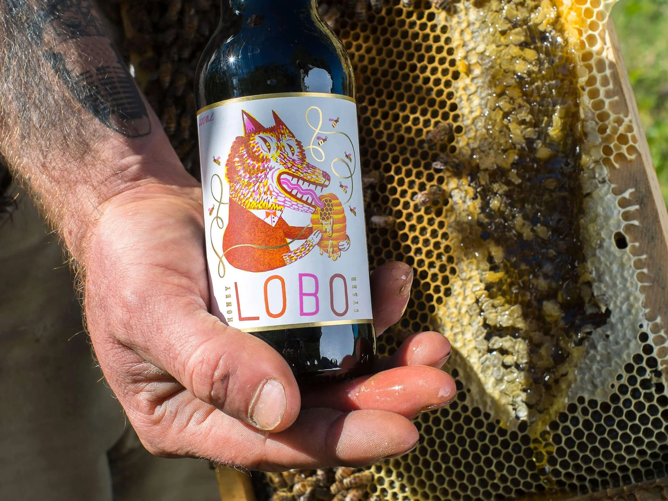
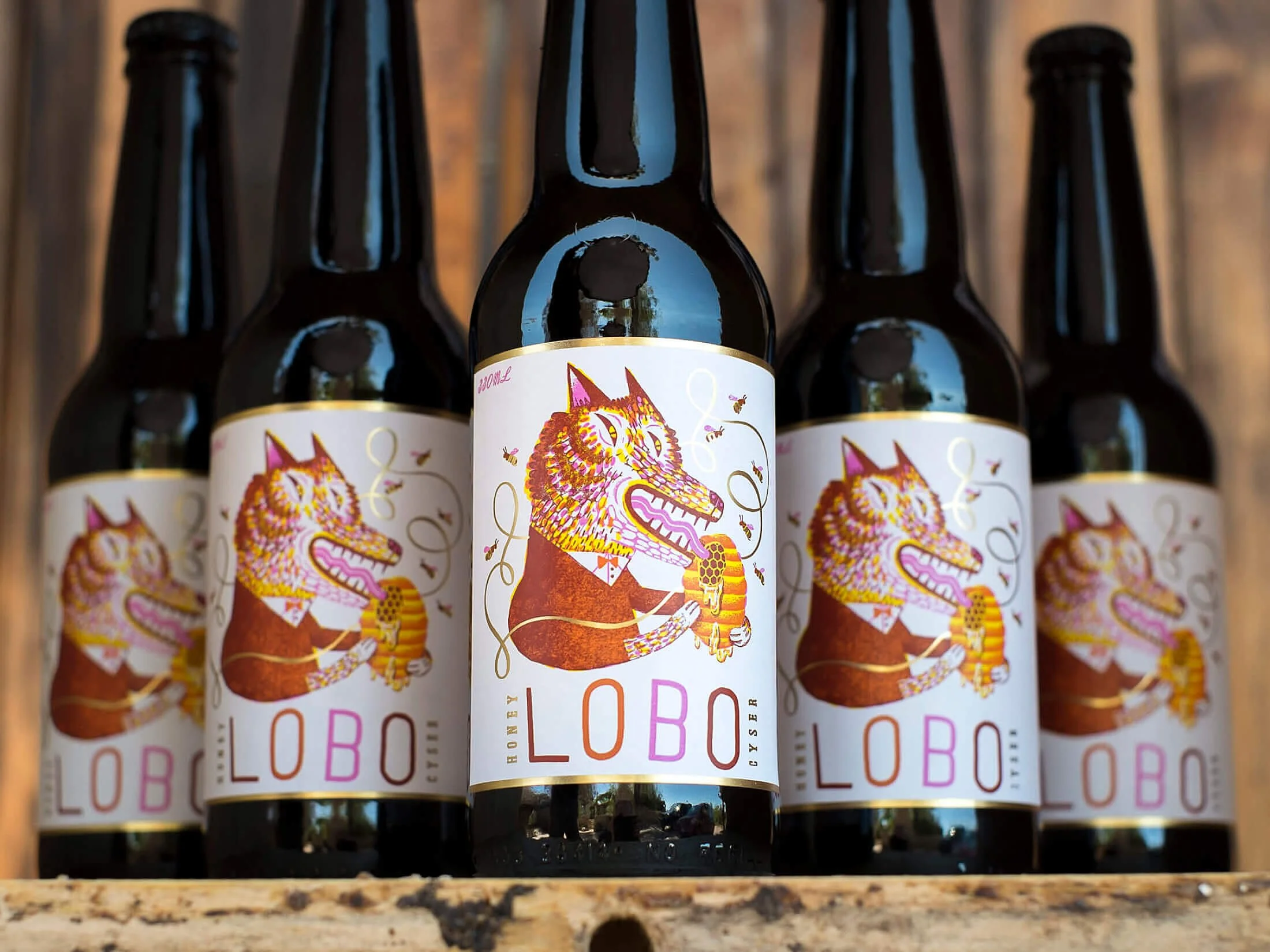
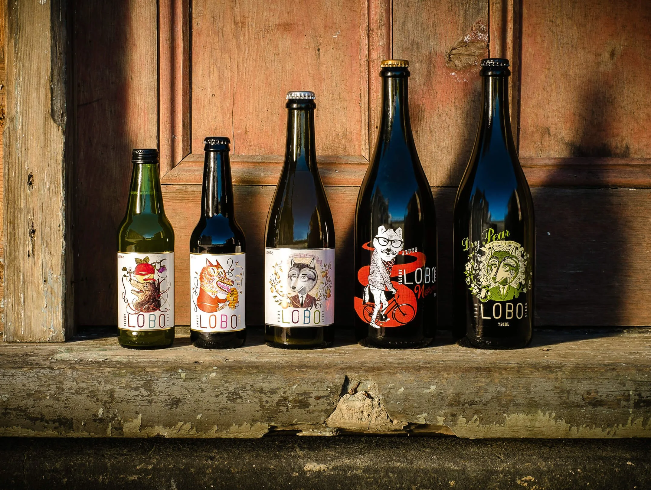
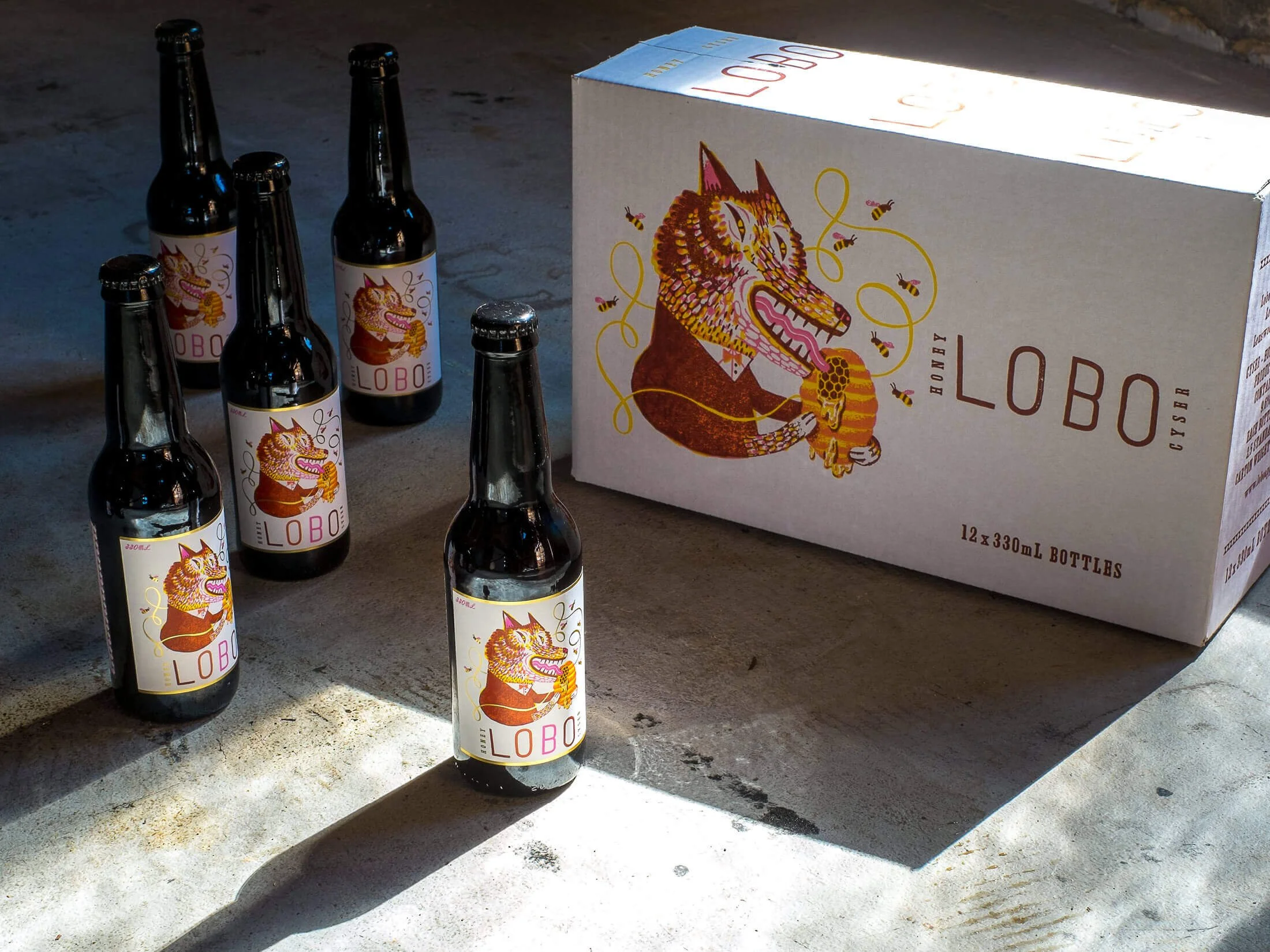
Honey Mead Branding - LOBO Cider & Spirits, Adelaide Hills, South Australia.
LOBO had earned strong recognition and was ready to expand.
Introducing Honey Mead created a risk: mead carries different category expectations, and leaning into them, old-world styling, heritage cues, medieval references, would’ve pulled the range apart and made the brand harder to manage as it grew.
PROBLEM
The Brief: Add Honey Mead Without Fragmenting the LOBO Brand.
DECISION
Extend the Existing Packaging System, Not Build a New One.
No separate aesthetic. No category clichés. Character and storytelling were expressed within the established structure, allowing the product to feel distinctive while remaining unmistakably LOBO.
OUTCOME
New Category, Consistent Shelf Presence, No Redesign Since Launch.
AWARDS
Communication Arts Design Annual (USA), Winner, 2014
Ready to move your project forward?
Let's find out if we're a good fit.
Book a 30-minute clarity call no pitch, no pressure.