CASE STUDY
A premium cellar door experience and dated packaging aligned.
Chalk Hill Wines — Wine Label Redesign and Brand Refresh, McLaren Vale
Client
Chalk Hill Wines
Category
Wine
Region
McLaren Vale,
South Australia
Deliverables
Brand strategy
Visual identity
Packaging design
Cellar Door Materials
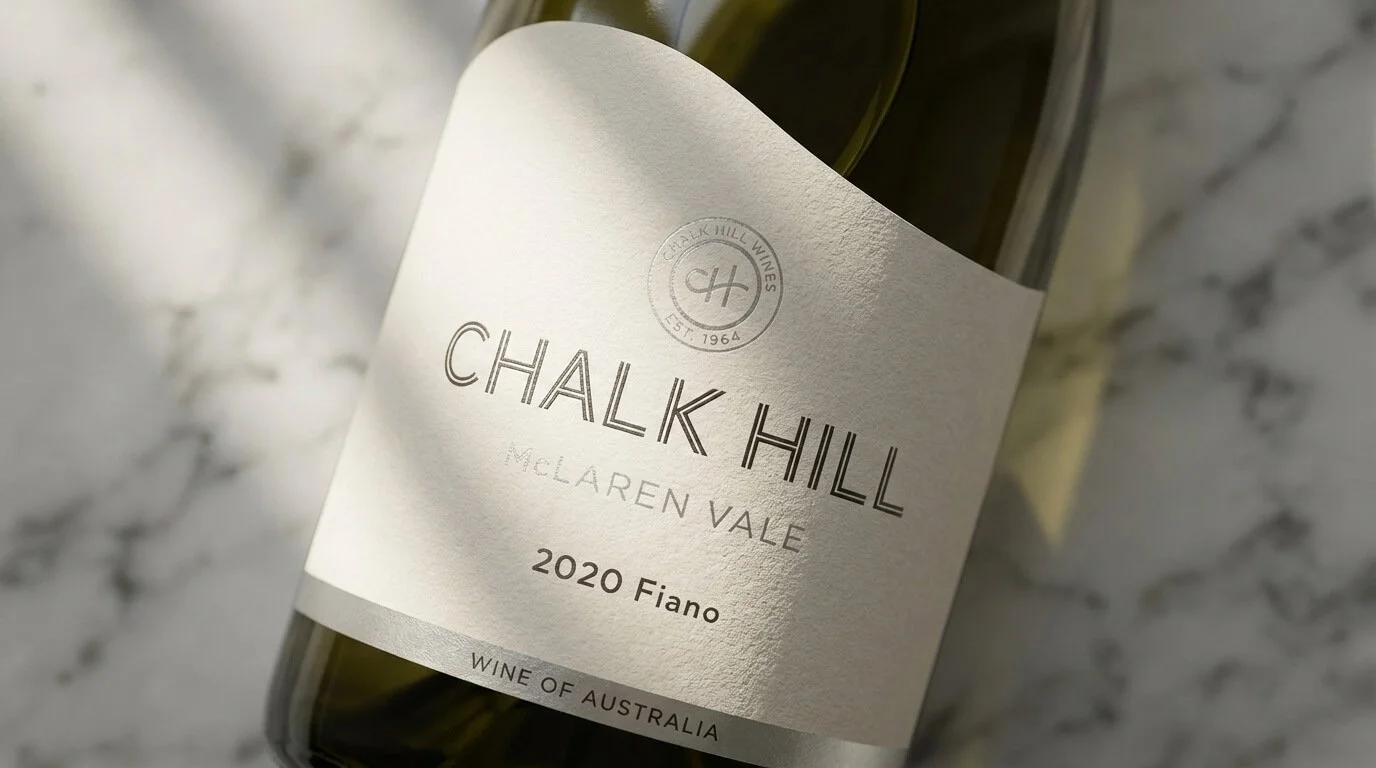
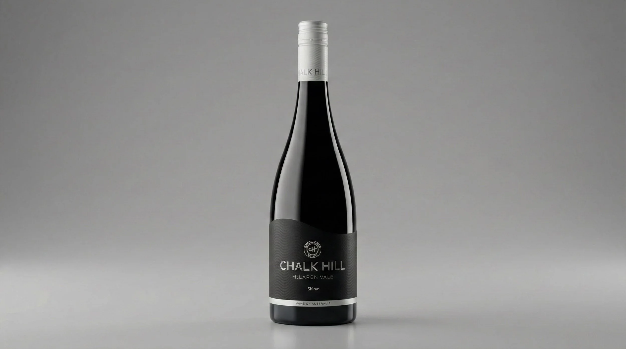
Wine Branding - Chalk Hill Wines, McLaren Vale, South Australia.
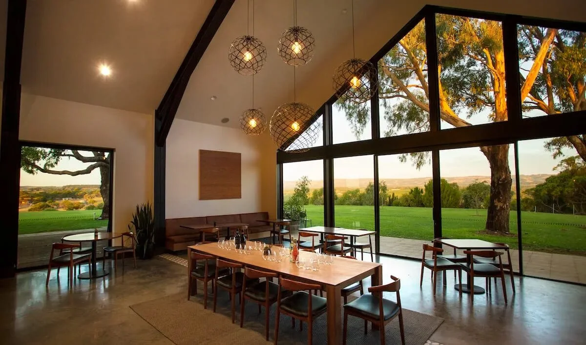
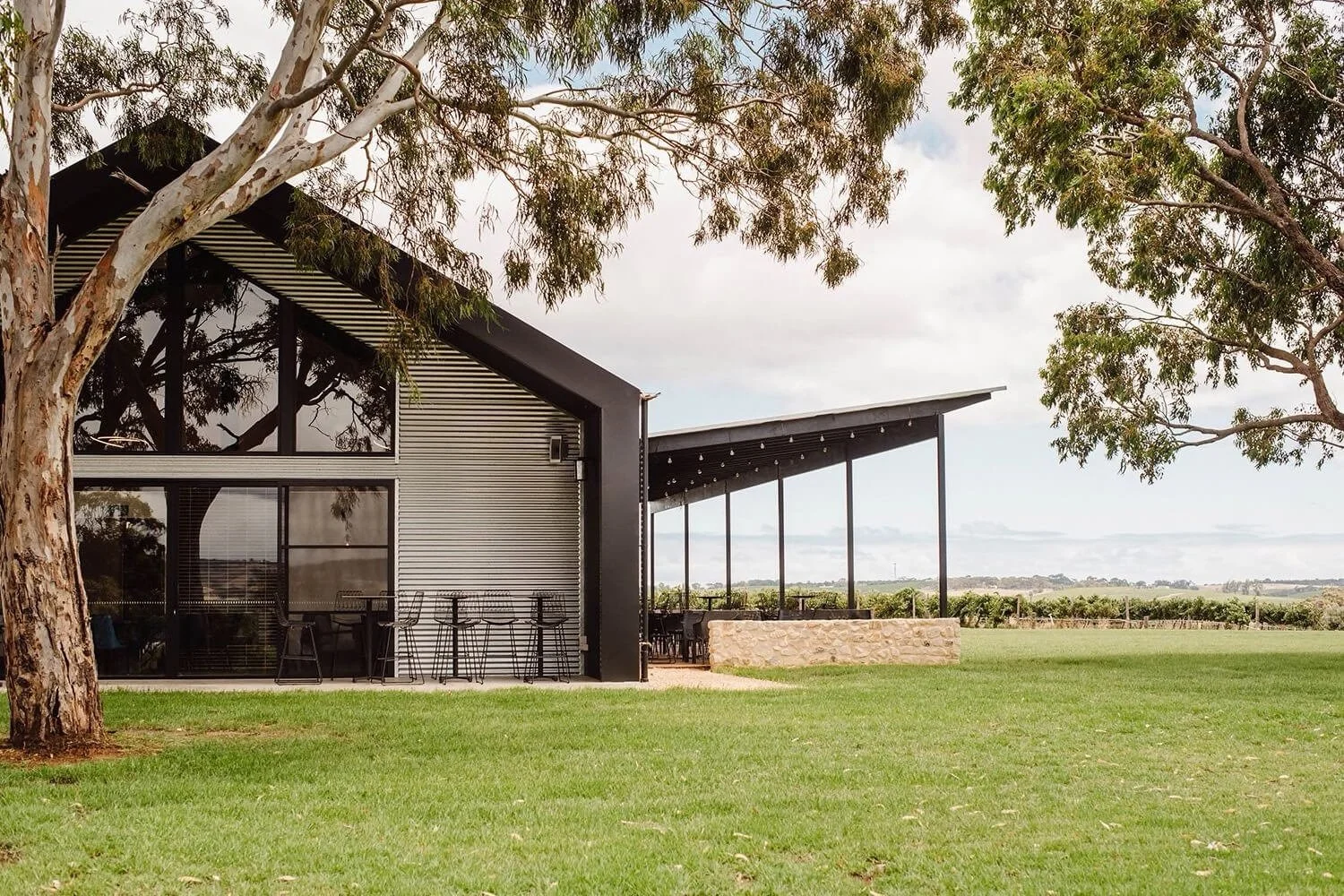
Chalk Hill Wines had invested significantly in a new destination cellar door, designed to attract a younger audience.
The wine quality was never the issue. But the existing labels had been created for a different moment in the brand's evolution. On site, the mismatch was visible, and it was quietly undermining the investment being made in the experience.
PROBLEM
The Brief: Lift the Packaging to Match a Premium Cellar Door.
DECISION
Refine What Works, Remove What Doesn't.
Every decision was guided by one question: does this feel calm, modern, and aligned with the experience visitors are walking into?
OUTCOME
Labels Aligned with the Cellar Door from Day One.
First impressions strengthened. Purchase confidence among a younger, premium-oriented audience increased.
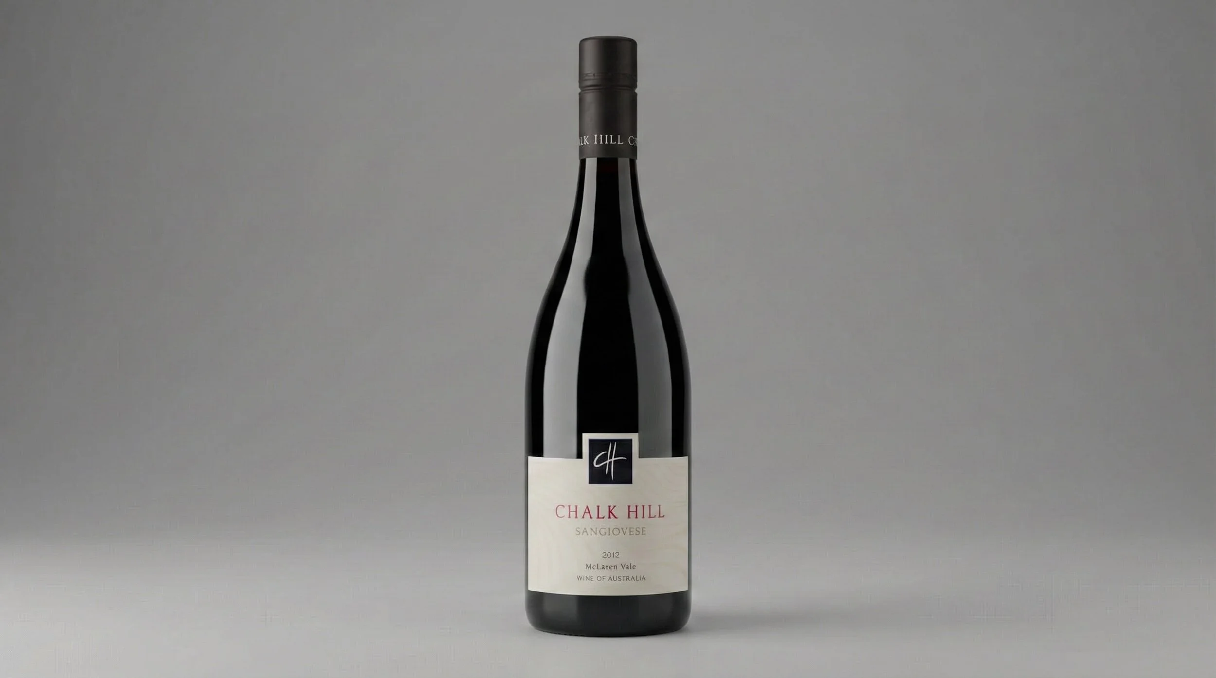
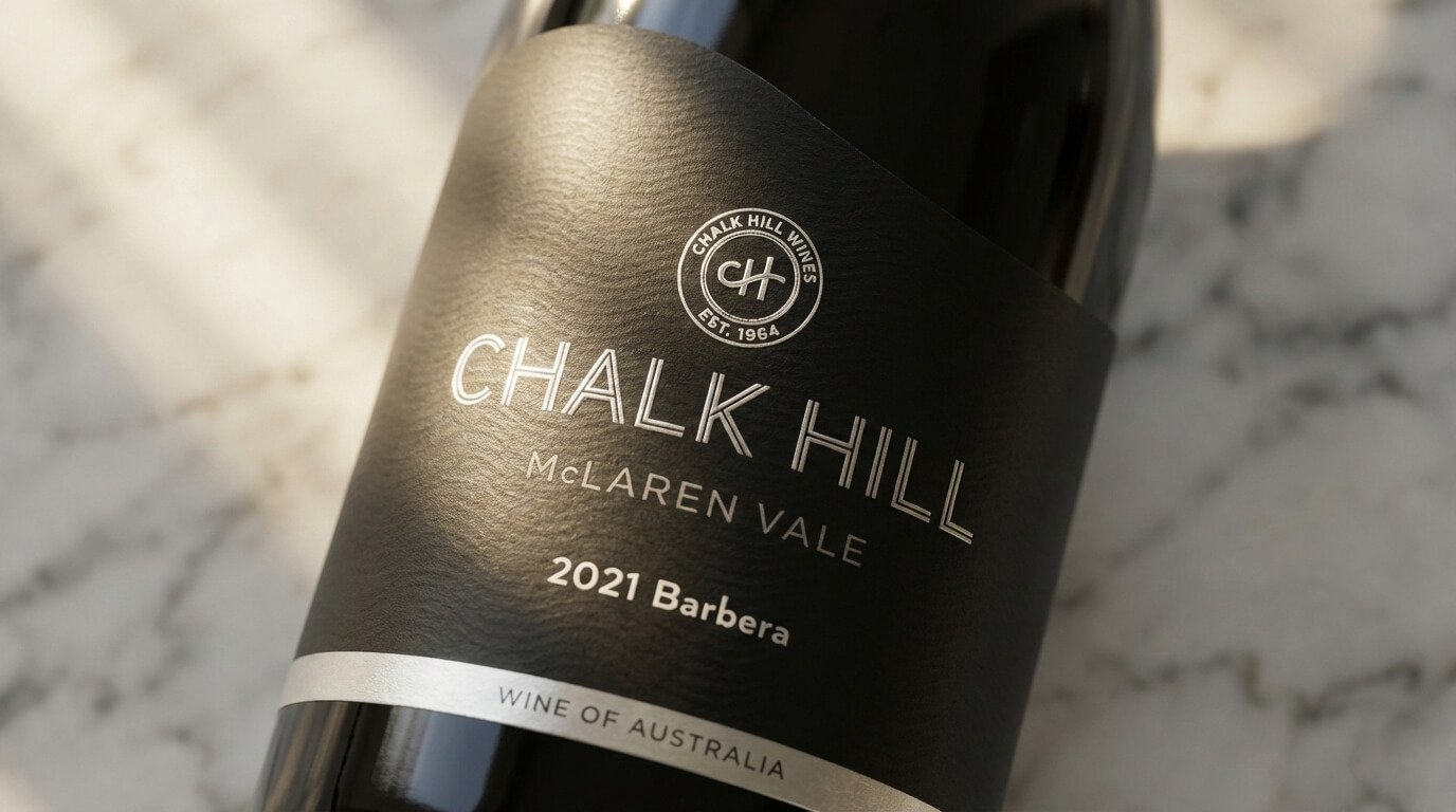
BEFOREAFTER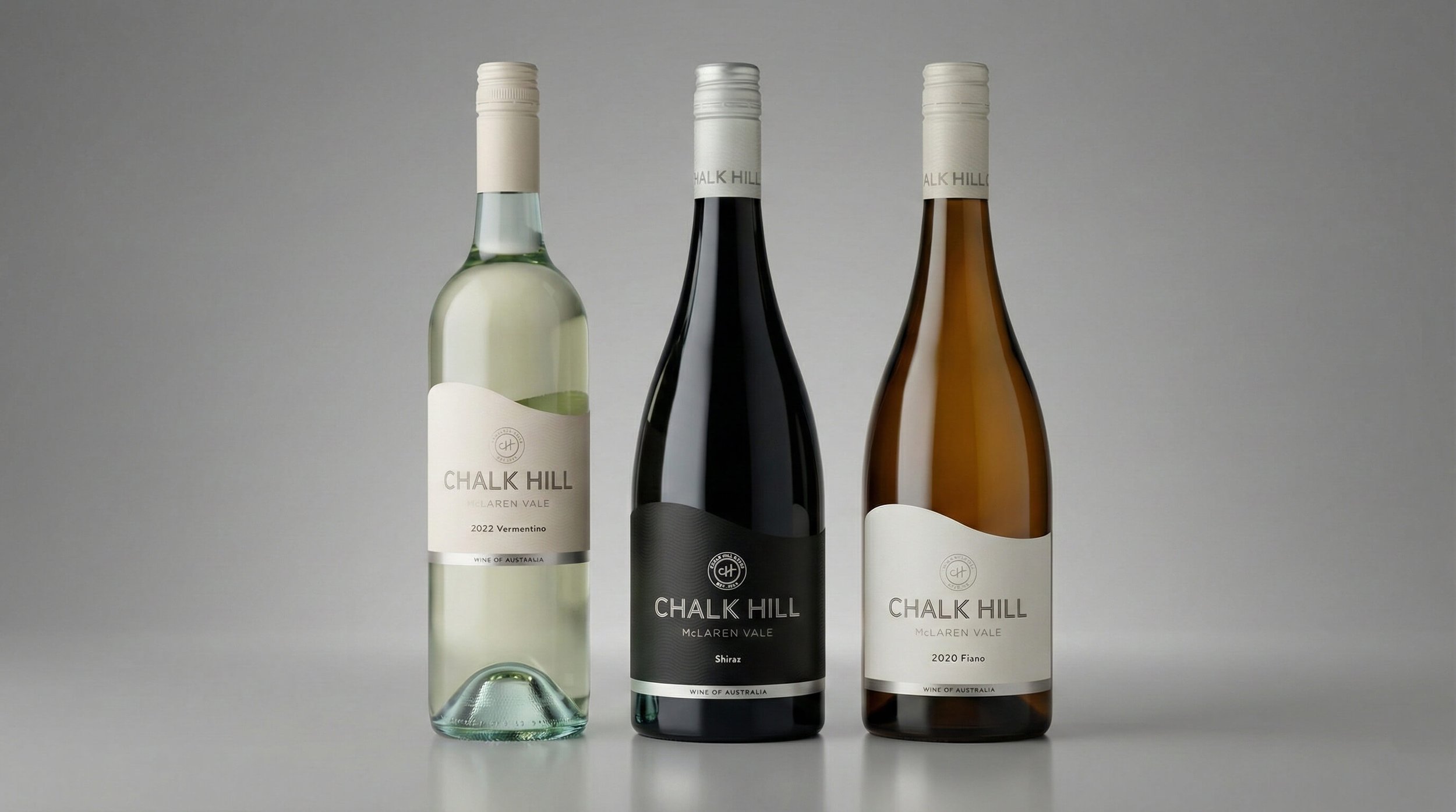
Ready to move your project forward?
Let's find out if we're a good fit.
Book a 30-minute clarity call no pitch, no pressure.