Brand & Sons Single Vineyard Wine Range Strategy and Packaging Design, Coonawarra
CASE STUDY
A wine range is only as strong as the logic behind it.
Client
Brand & Sons
Category
Wine
Region
Coonawarra,
South Australia
Deliverables
Brand strategy
Visual identity
Packaging design
Wine Range Branding - Brand & Sons, Coonawarra, South Australia.
Brand and Sons had a strong core range and a credible icon tier. The gap was in the middle. As the business prepared to introduce a higher-priced super-premium range, the step from core to icon wasn't clear enough for customers or trade.
Without a defined role for the new tier, the price increase was difficult to justify and harder to sell with confidence.
PROBLEM
The Brief: Define a Super-Premium Tier Without Weakening the Portfolio.
DECISION
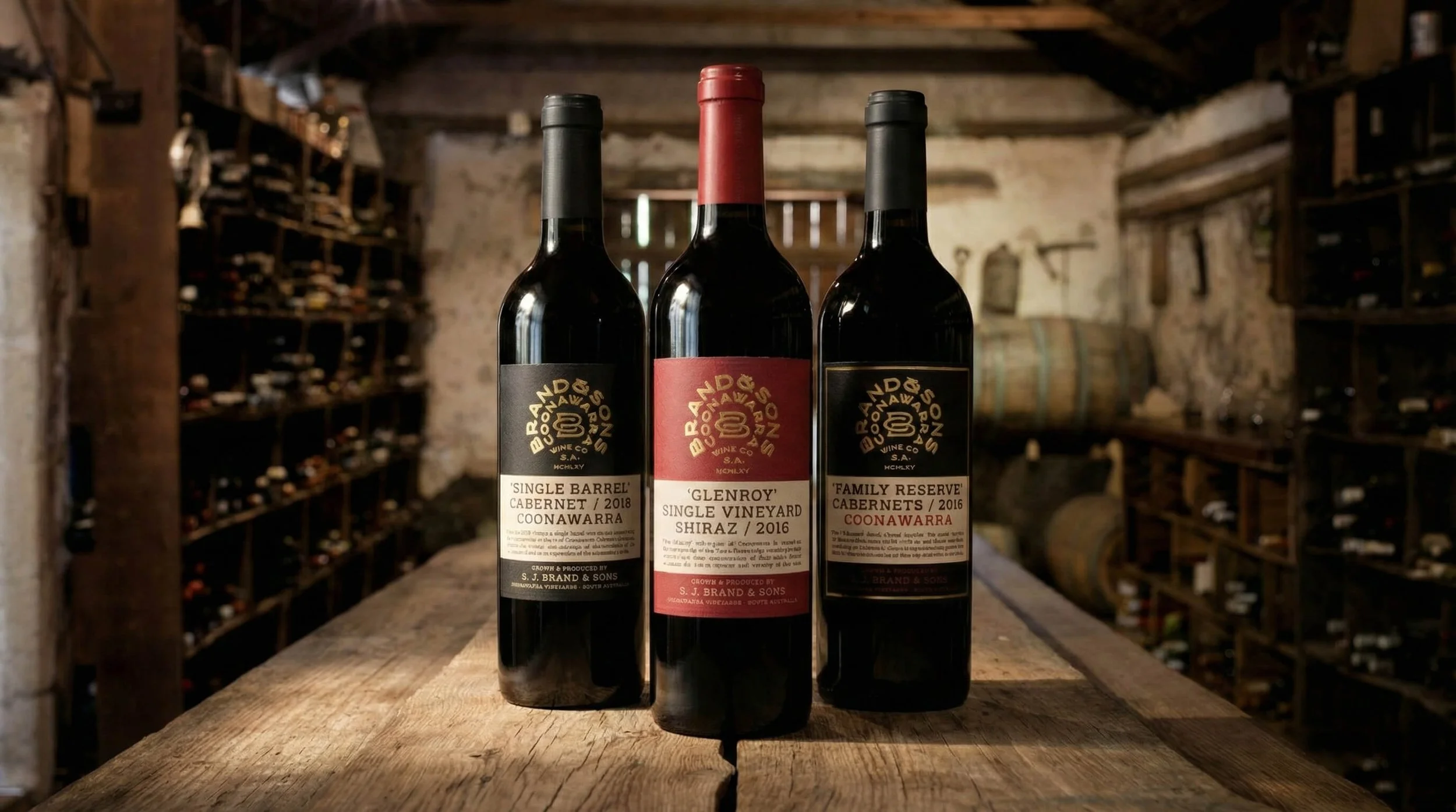
Range Structure Before Label Decisions.
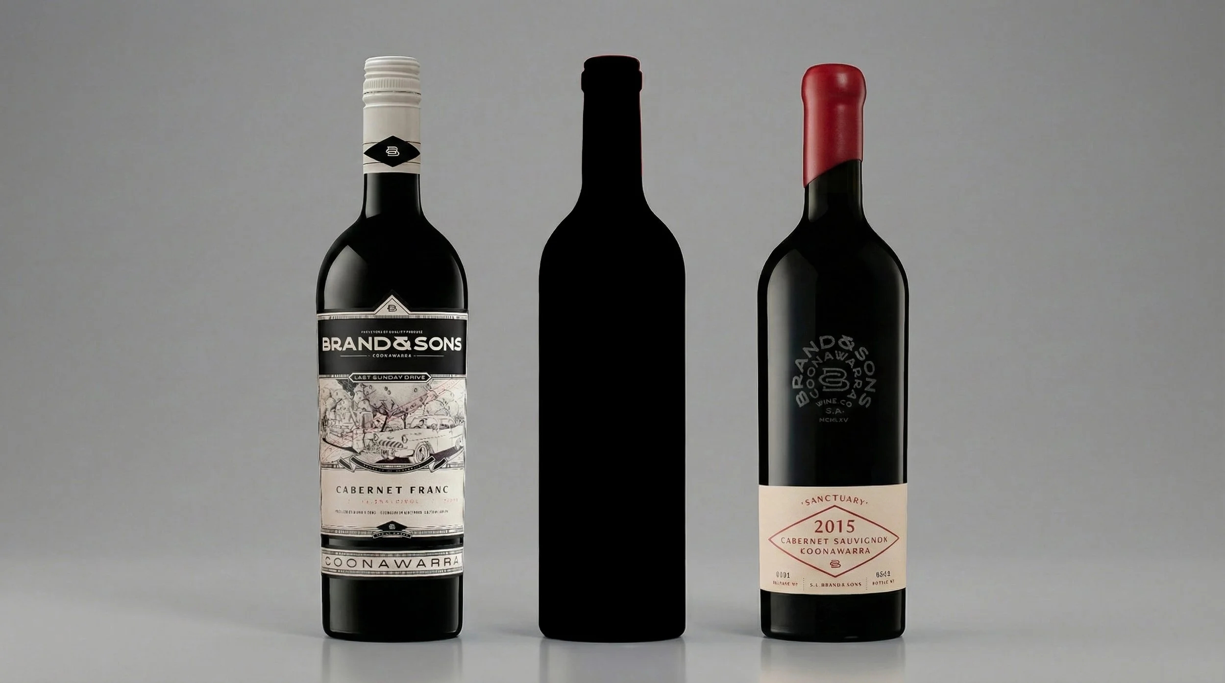
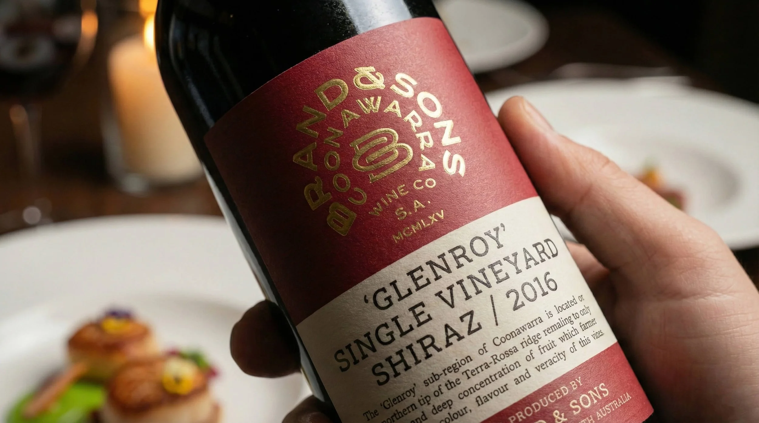
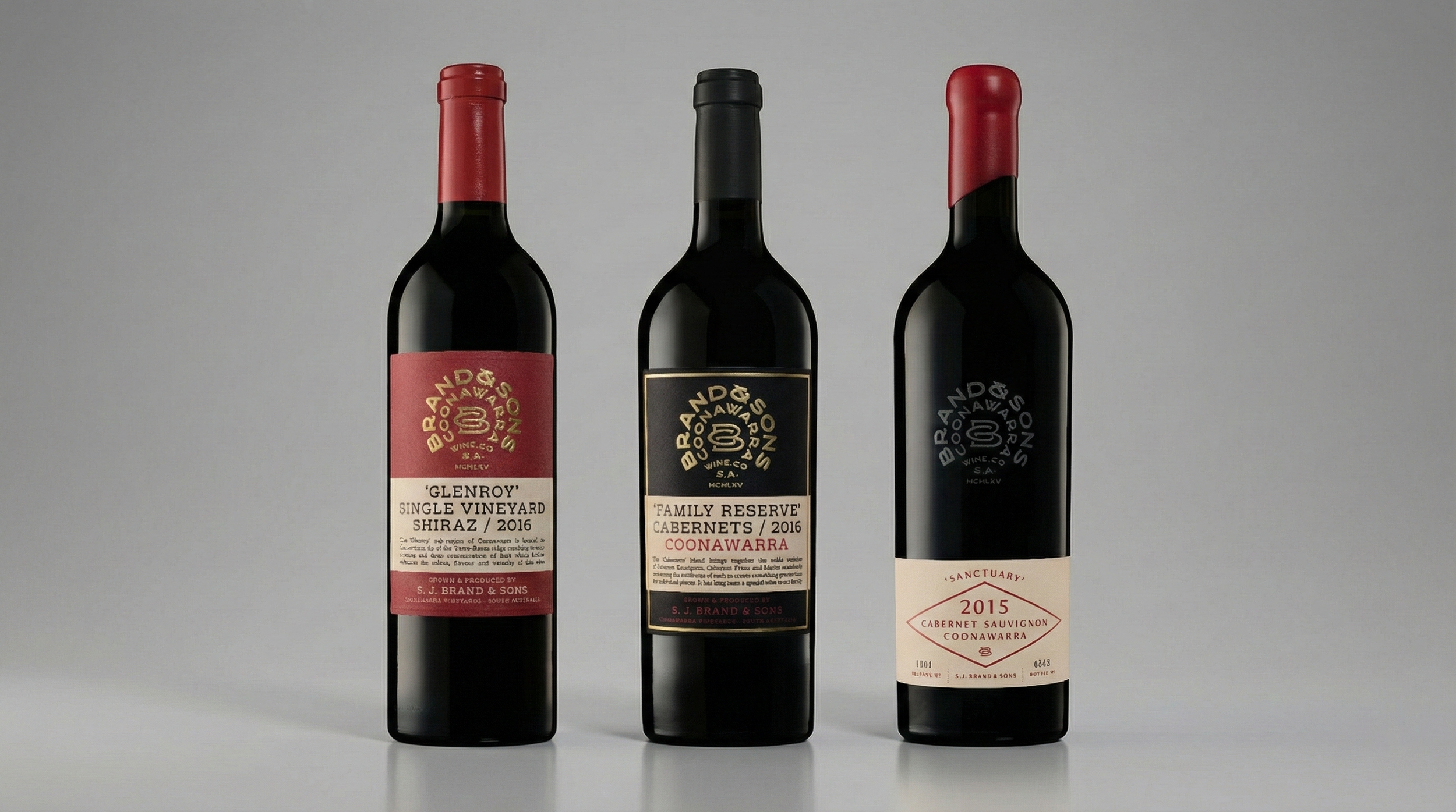
The role of each tier was defined, the boundaries were set, and the new range was anchored in the winery's history and regional credibility. The step up earned its place through clarity, not decoration.
OUTCOME
Clearer Trade Conversations and Defensible Price Points.
The range sat confidently on shelf with a clear progression from core to icon, and the team knew how to present and protect it.
Ready to move your project forward?
Let's find out if we're a good fit.
Book a 30-minute clarity call no pitch, no pressure.