CASE STUDY
An icon wine has to earn its place. Not just look like it has.
Brand & Sons — Premium Wine Branding and Label Design, Coonawarra
Client
Brand & Sons
Category
Wine
Region
Coonawarra,
South Australia
Deliverables
Brand strategy
Visual identity
Packaging design
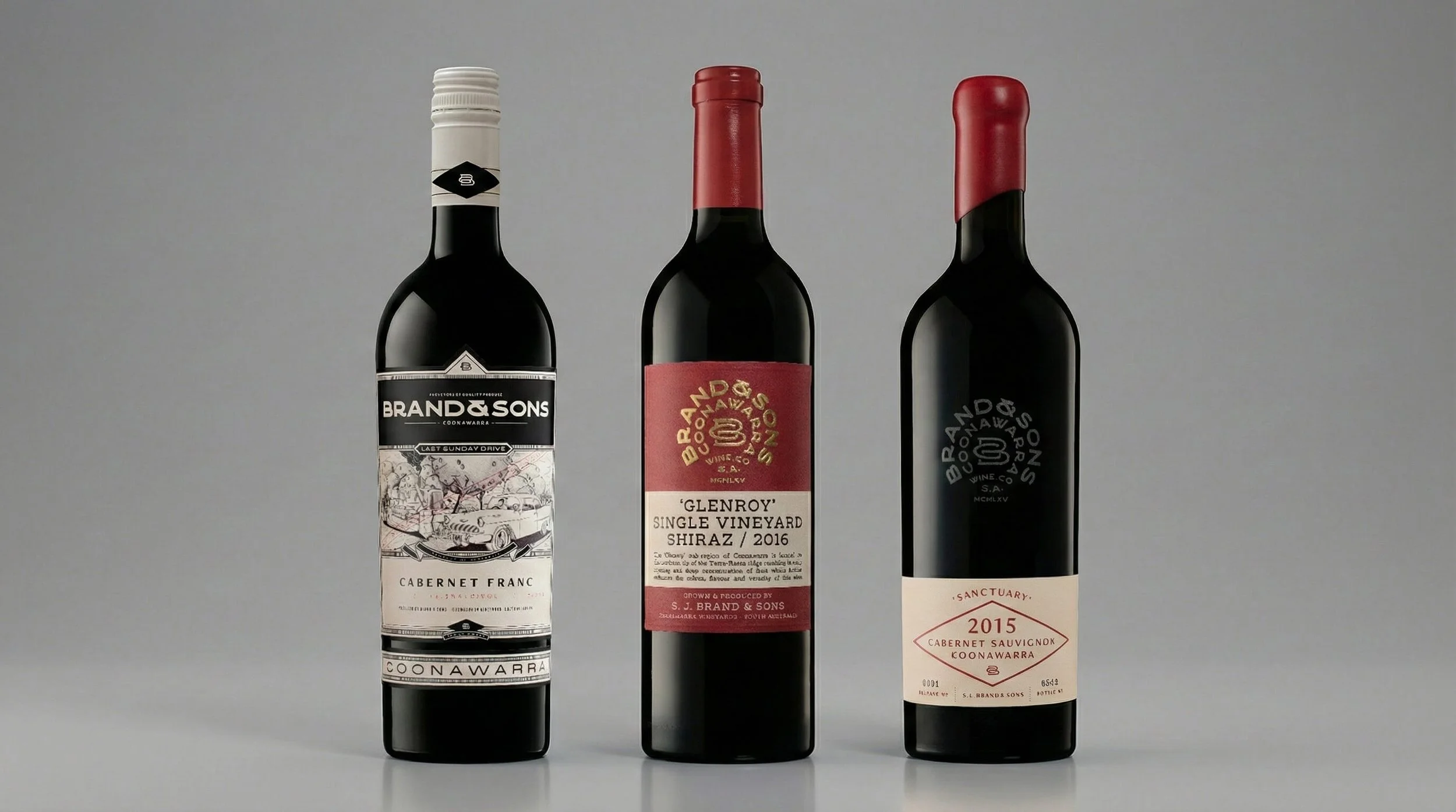
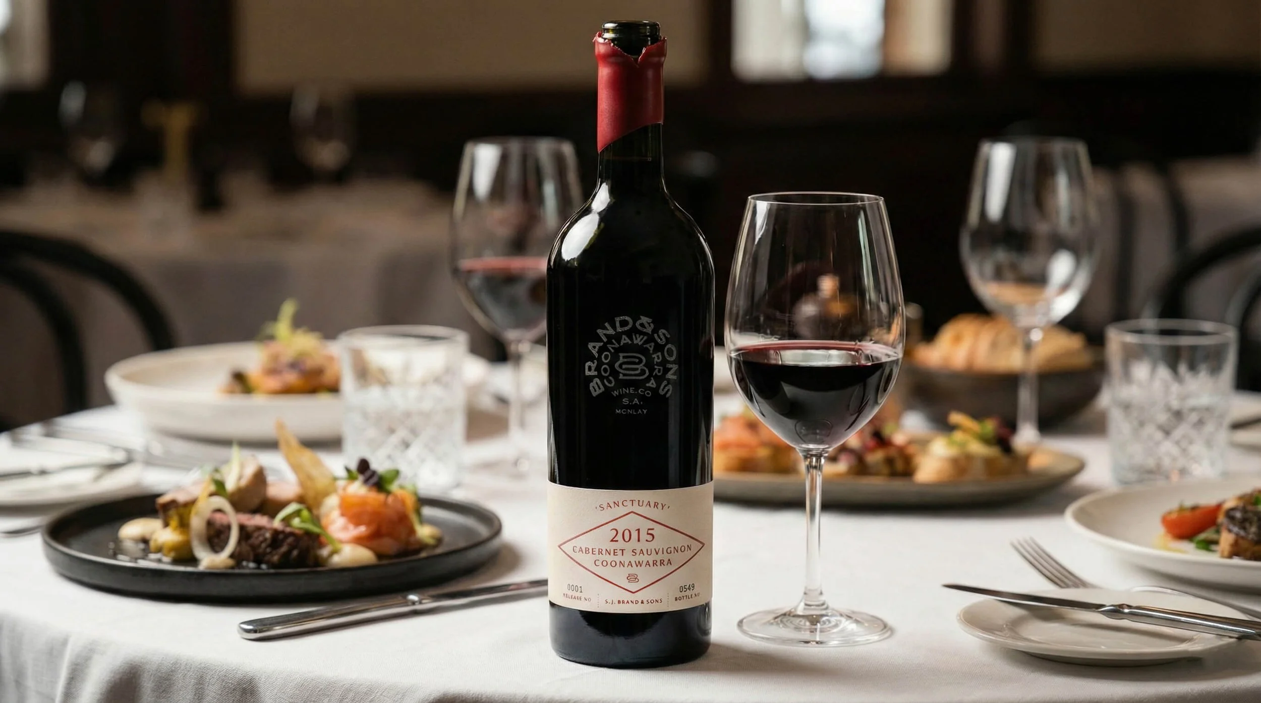
Premium Wine Branding - Brand & Sons, Coonawarra, South Australia.
Brand and Sons had built a strong reputation for quality regional wines. The opportunity to introduce an ultra-premium icon tier from Coonawarra was real, but so was the risk.
Done wrong, a new top tier could confuse buyers instead of impressing them, or risk damaging everything already in the range.
PROBLEM
The Brief: Launch an Icon Wine Without Undermining the Range
DECISION
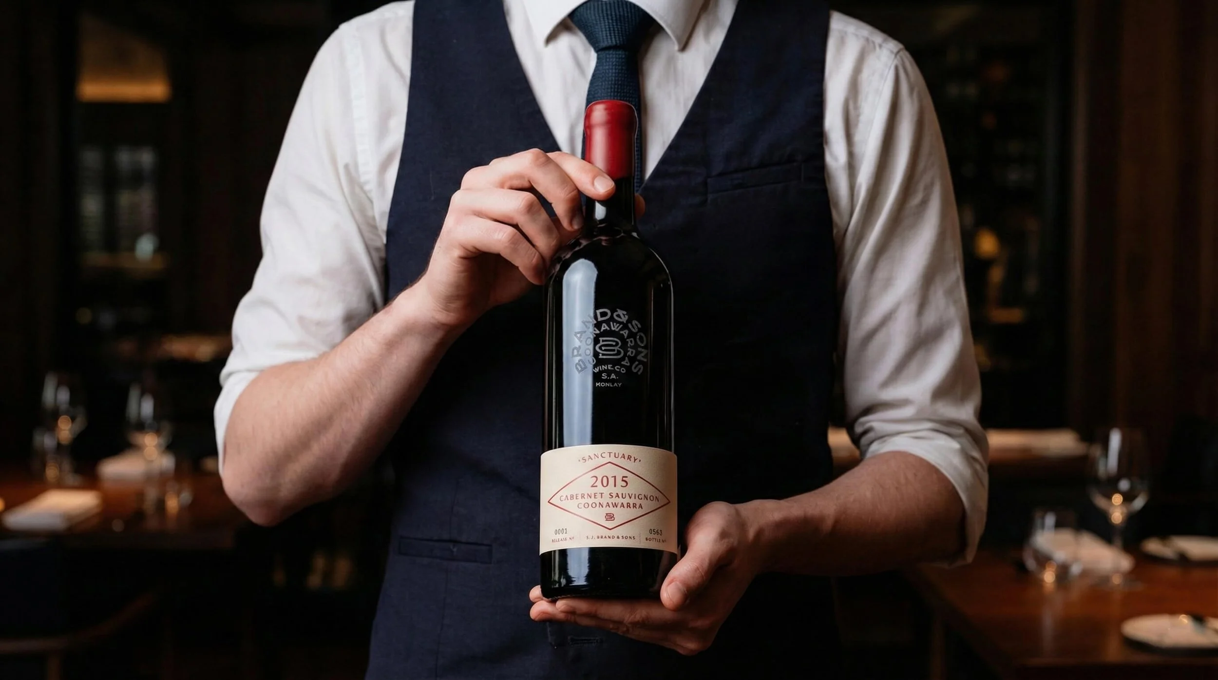
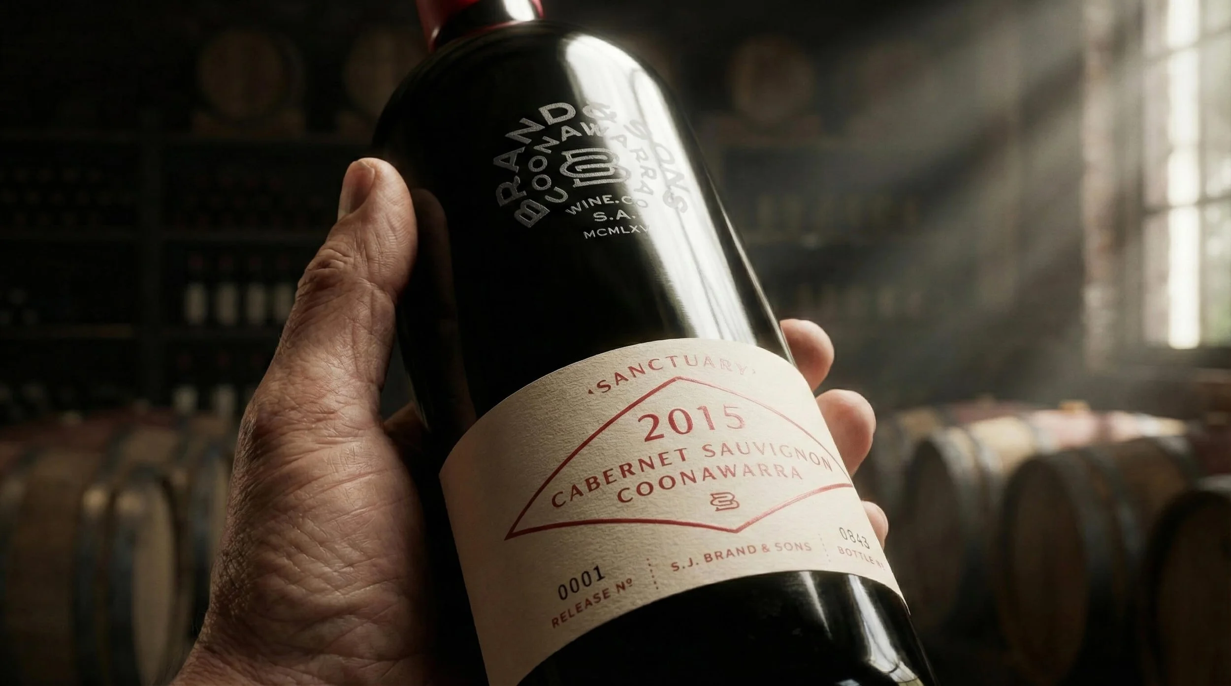
Provenance Over Packaging.
We worked out what this wine needed to do commercially before any design decisions were made. Place, history, and family story did the heavy lifting. No separate premium label. No expensive finishes added just to justify the price. Just a clear, confident statement that this wine sat above the rest, and had earned the right to say so.
OUTCOME
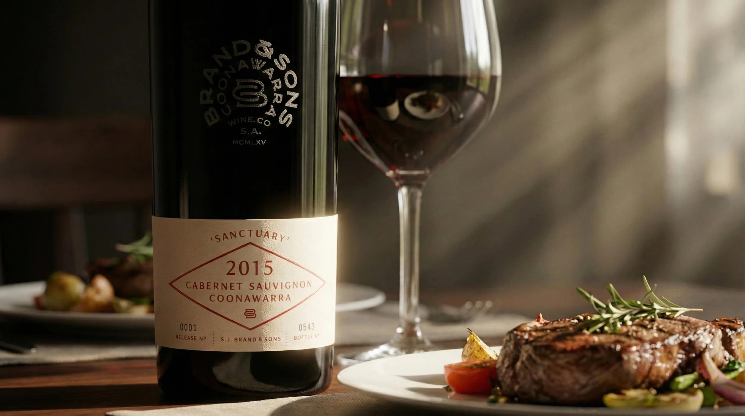
The Sanctuary Range Launched with Immediate Trade Credibility.
Its role was clear, its value understood. The structure has held since launch.
Ready to move your project forward?
Let's find out if we're a good fit.
Book a 30-minute clarity call no pitch, no pressure.